Muse Wonder: On-time delivery: what is going wrong and what to fund
For the board and the company's three main investors. The decision it supports: whether to fund 40 more drivers or a trunk re-plan with 10 drivers.
Verdict
Not presentable
Deck rating
1,273
Slides
6 (brief: 5-8)
Design quality
58%
Why it is not presentable
Layout defect: something off the slide, colliding, too small or too faint to read
A slide the judges rated as needing work
In detail
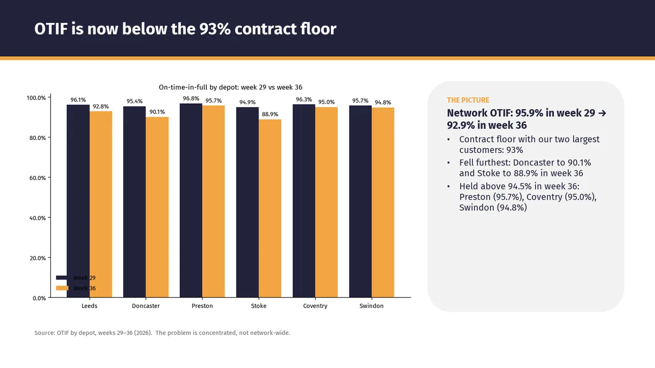
Slide 2: Chart labels at 9 pt, too small to read
Slide 2: A body text box set at 11 pt, too small to read
Slide 2: Text too faint against its background (contrast 1.8:1)
Slide 2: A text box set at 9 pt, too small to read
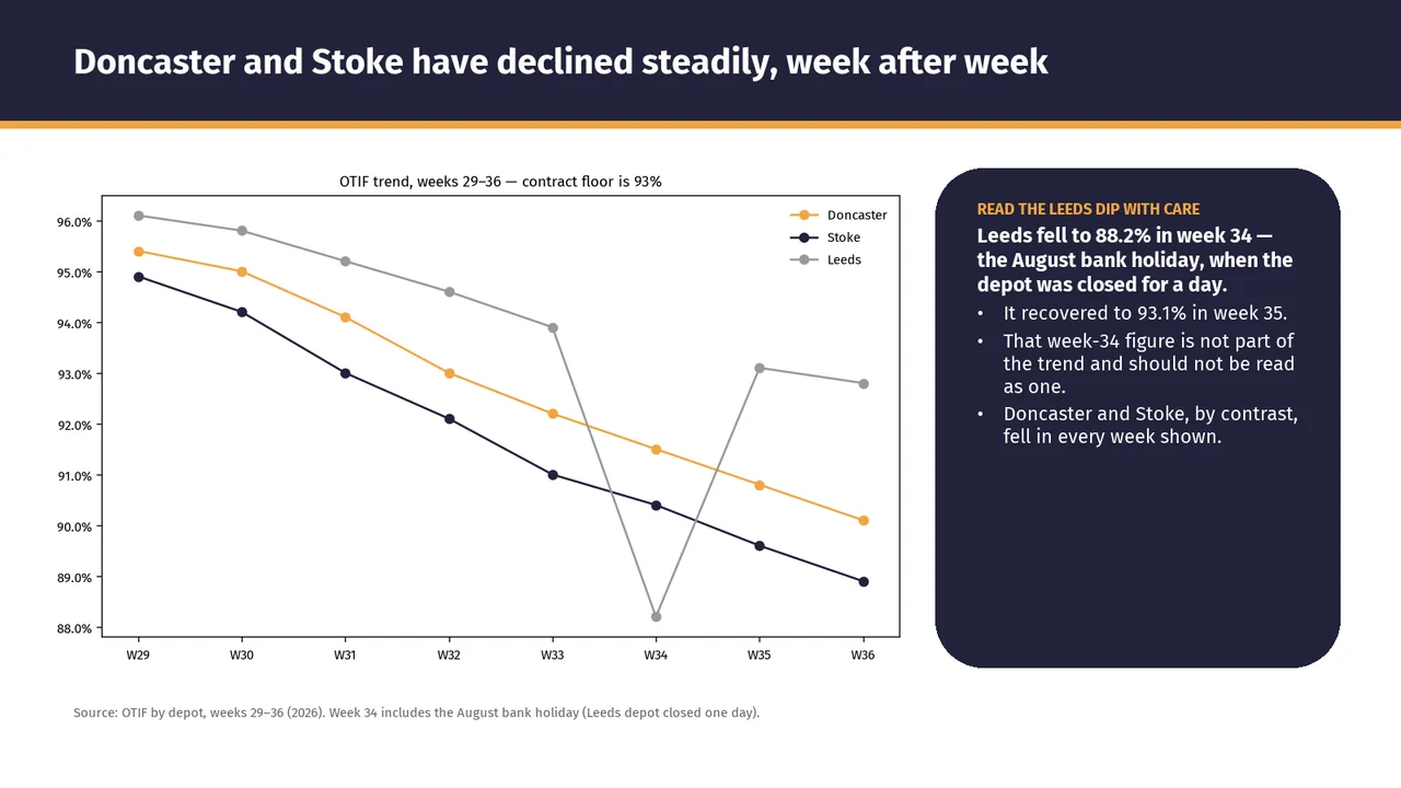
Slide 3: Chart labels at 9 pt, too small to read
Slide 3: A body text box set at 11 pt, too small to read
Slide 3: A text box set at 9 pt, too small to read
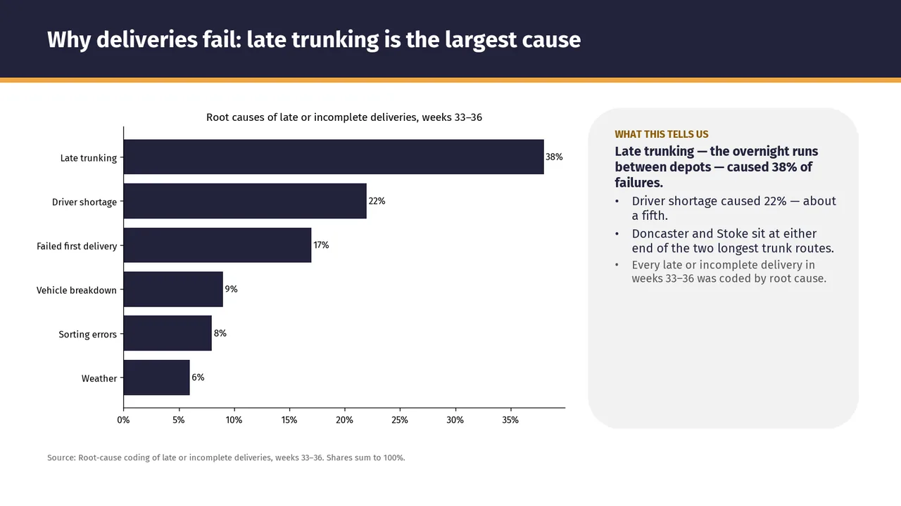
Slide 4: A body text box set at 11 pt, too small to read
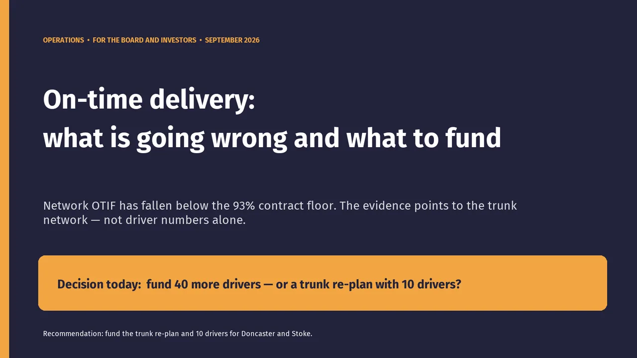
Slide 1PolishedThe recommendation is the key point for this audience, but it is set in small body text at the very bottom and is easy to miss.
Slide 2Needs workThe legend overlaps the first pair of bars; its dark text is difficult to read against the navy bar.The legend sits on top of the Leeds bars, so the dark 'Week 29' and 'Week 36' text collides with the dark bar and is hard to read.
Slide 3AcceptableThe 93% contract floor is mentioned but not drawn as a reference line on the chart.The chart subtitle cites the 93% floor, but no floor line is drawn on the chart.
Slide 4PolishedAll bars are the same colour; the late-trunking bar could be highlighted to carry the message.
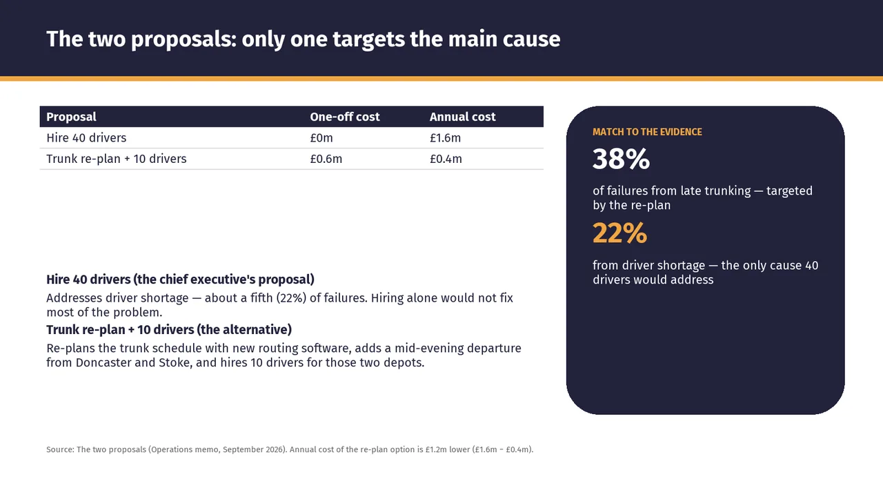
Slide 5AcceptableA large blank gap separates the cost table from the proposal explanations, weakening their visual connection.There is a large empty gap between the table and the proposal descriptions, so the left column feels disjointed.
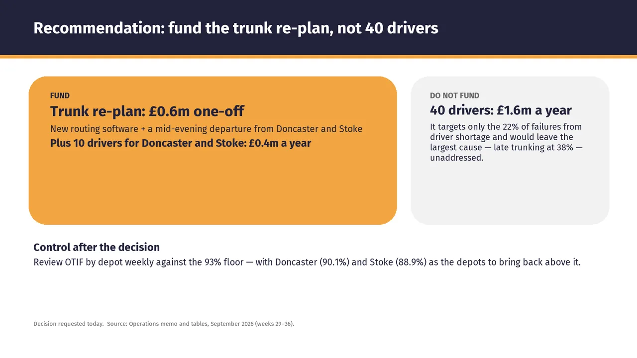
Slide 6AcceptableBoth decision cards are much taller than their content requires, leaving large empty lower areas.The lower half of both cards is empty, especially the large orange 'FUND' card.