Muse Spark 1.3: Manchester store investment review
For the board of directors (non-executives and the chief executive). The decision it supports: whether to approve £480k of capital for a Manchester store.
Verdict
Not presentable
Deck rating
811
Slides
6 (brief: 5-8)
Design quality
58%
Why it is not presentable
Layout defect: something off the slide, colliding, too small or too faint to read
Did not give the analysis's recommendation within the first two slides
In detail
Slide 1: text 5: 8 pt text.
Slide 2: text 3: 9 pt text.
Slide 2: text 7: 9 pt text.
Slide 2: text 9: 11 pt body text.
Slide 2: text 10: 8 pt text.
Slide 3: text 3: 9 pt text.
Slide 3: chart 5: 8 pt.
Slide 3: text 7: 9 pt text.
Slide 1Polished
Slide 2AcceptableThe compact table and much taller callout create an unbalanced layout with substantial unused space.Large empty area below the table leaves the left half bottom-heavy with white space
Slide 3AcceptableThe introductory paragraph packs many metrics into a long line, making it slower to scan.All bars are the same colour, so the adjusted run-rate and assumed bars are not highlighted against the others
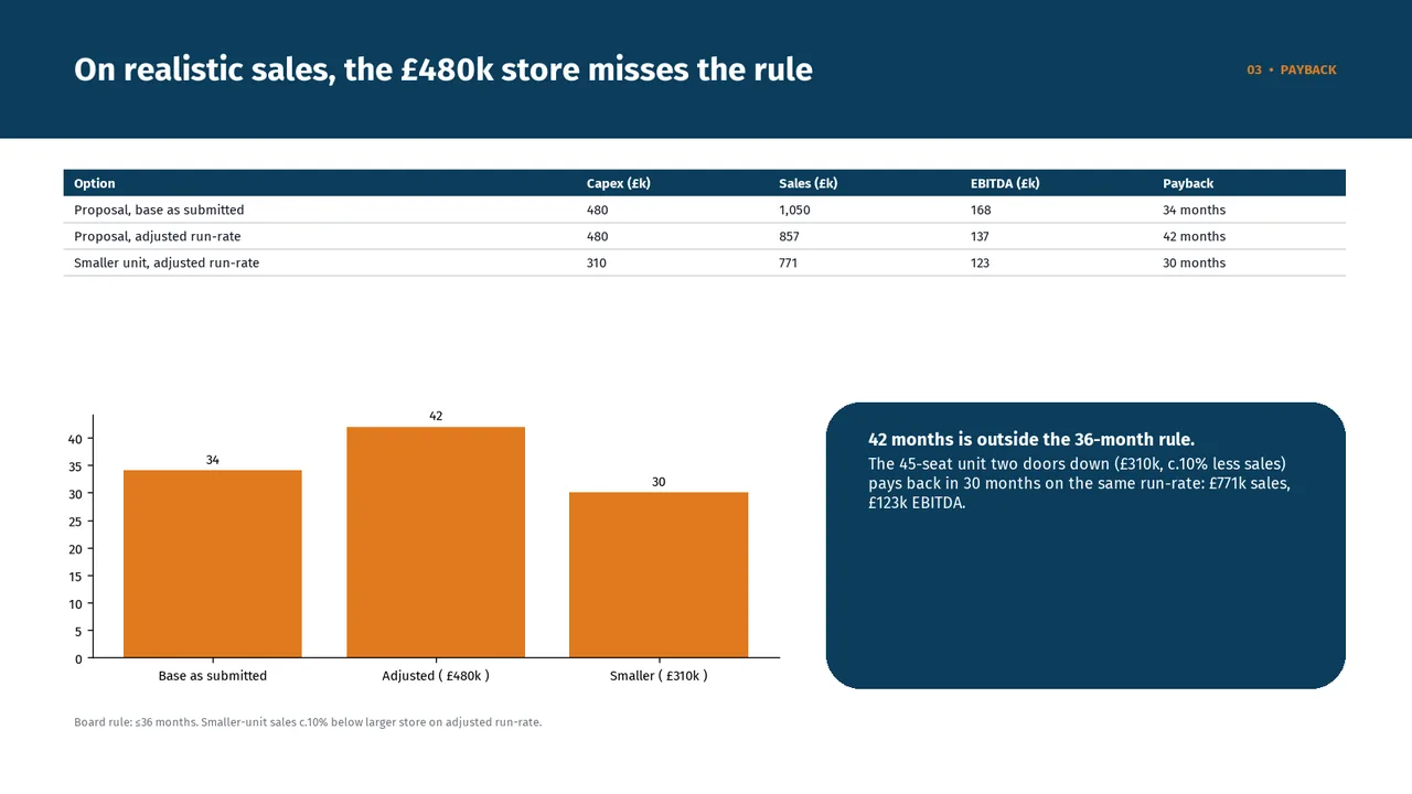
Slide 4AcceptableThe payback chart lacks an explicit months label and a reference line for the central 36-month threshold.No 36-month threshold line on the chart, so 'misses the rule' is not shown visually
Slide 5AcceptableThe oversized right-hand callout contains substantial empty space, making the layout feel top-heavy.Y-axis tick labels are unevenly rounded (0, 2, 5, 8, 10, 12, 15, 18%) but equally spaced, which is confusing and looks like an error
Slide 6AcceptableBoth decision panels are much taller than their content requires, leaving large empty areas.Both cards are mostly empty, with the content packed into the top third