Benchmarks / DeckBench / Hearthside Coffee
Measured by Spring Prompt
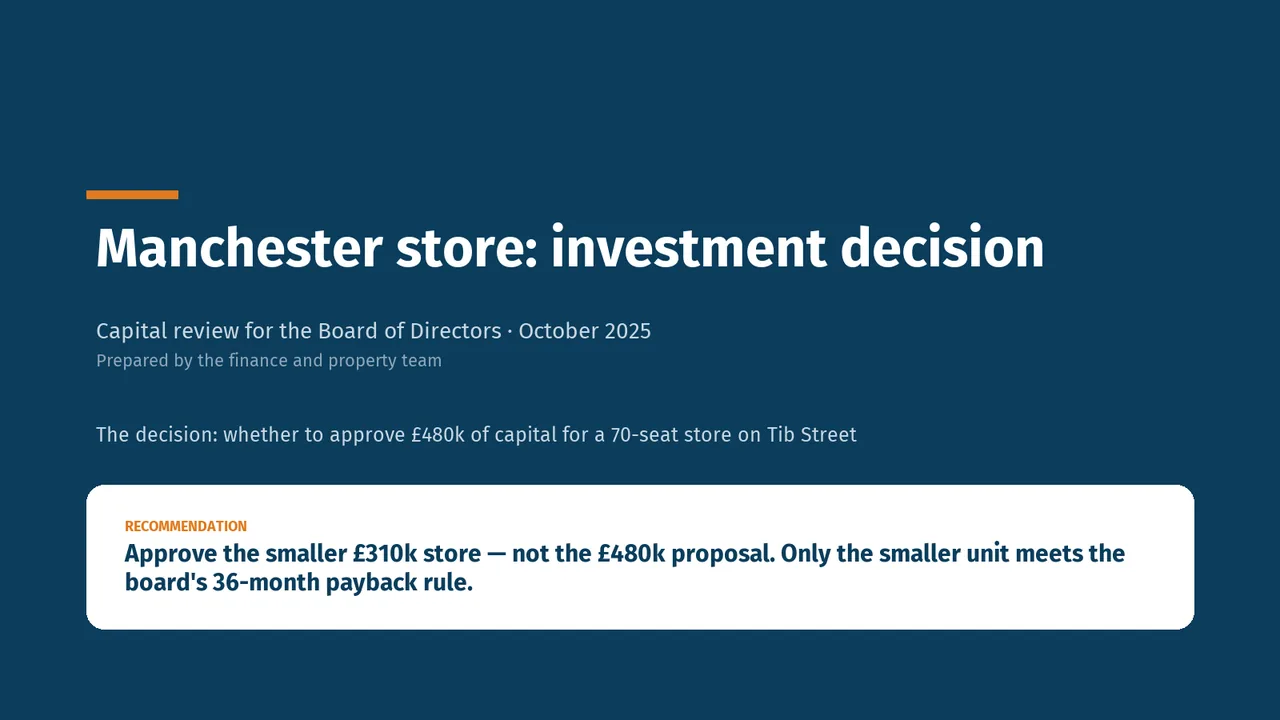
Kimi K3: Manchester store investment review
For the board of directors (non-executives and the chief executive). The decision it supports: whether to approve £480k of capital for a Manchester store.
- Verdict
- Not presentable
- Deck rating
- 1,255
- Slides
- 7 (brief: 5-8)
- Design quality
- 64%
Why it is not presentable
- Layout defect: something off the slide, colliding, too small or too faint to read
- Left out a key finding
- Did not give the analysis's recommendation within the first two slides
- Made a material claim the analysis does not support
- A slide the judges rated as needing work
In detail
- Slide 5: “The 45-seat store needs 6 full-time-equivalent staff, with labour at about 28% of sales, in line with Leeds and Sheffield.” is not supported by the analysis.
- Slide 5: “The store needs a manager, an assistant manager and two weekend part-timers.” is not supported by the analysis.
- Slide 5: “Eight weeks are needed to recruit and train before opening.” is not supported by the analysis.
- Slide 5: “There is no internal candidate yet for the manager role.” is not supported by the analysis.
- Slide 5: “Manchester hiring is taking 6–8 weeks for similar roles.” is not supported by the analysis.
- Slide 5: “The rota is built on two shifts across seven days.” is not supported by the analysis.
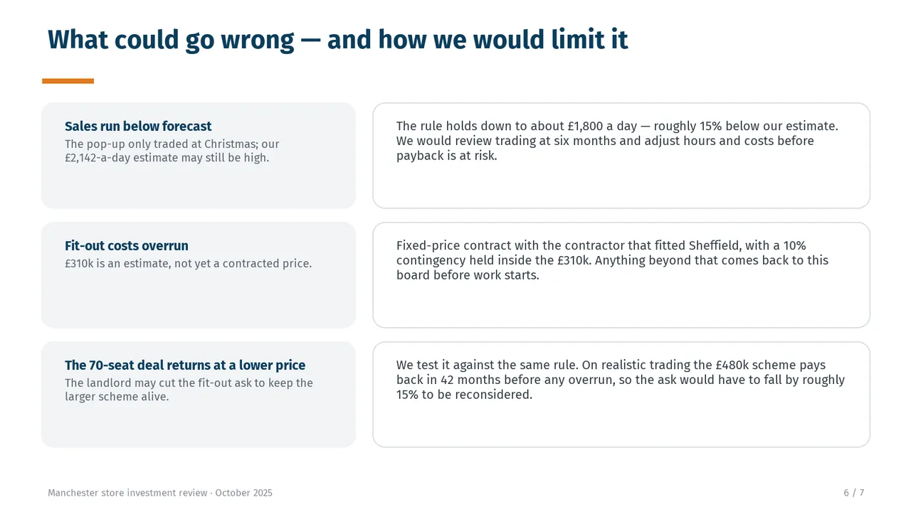
- Slide 6: “£310k is an estimate, not yet a contracted price.” is not supported by the analysis.
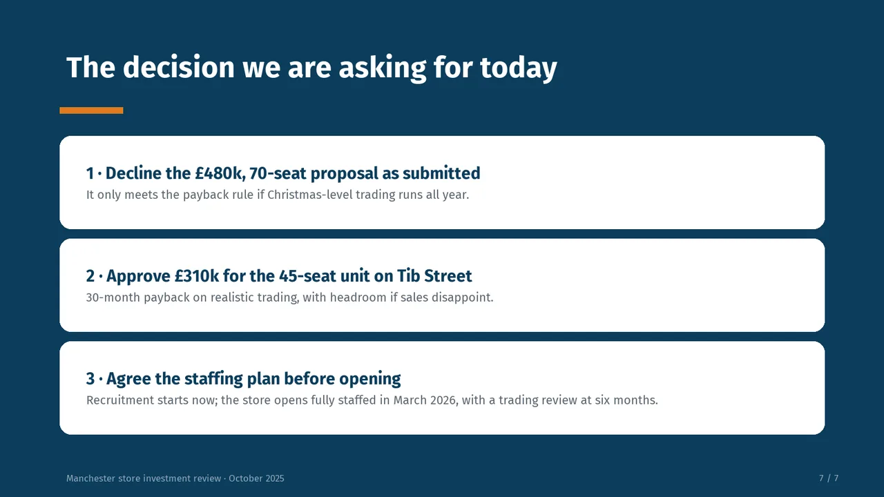
- Slide 7: “The £480k proposal only meets the payback rule if Christmas-level trading runs all year.” is not supported by the analysis.