Benchmarks / DeckBench / Hearthside Coffee

Measured by Spring Prompt

DeepSeek V4.1 Flash 1017: Manchester store investment review

For the board of directors (non-executives and the chief executive). The decision it supports: whether to approve £480k of capital for a Manchester store.

Verdict
Not presentable
Deck rating
1,145
Slides
7 (brief: 5-8)
Design quality
64%

Why it is not presentable

  • Layout defect: something off the slide, colliding, too small or too faint to read

In detail

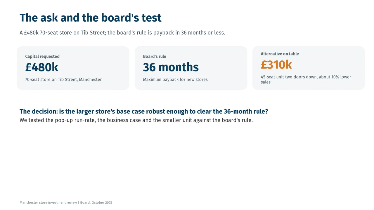
  • Slide 2: 6 body text boxes set at 11 pt, too small to read
  • Slide 2: A text box set at 9 pt, too small to read
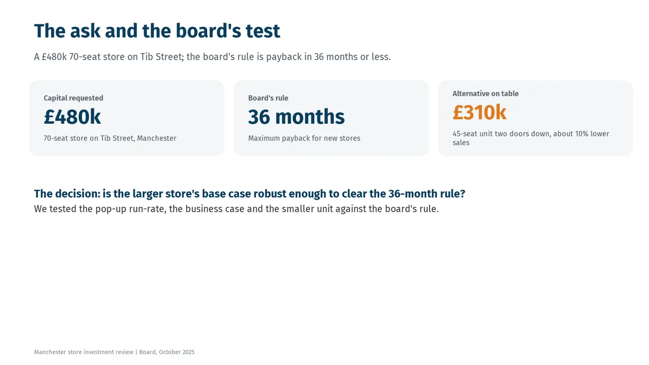
  • Slide 3: A text box set at 9 pt, too small to read
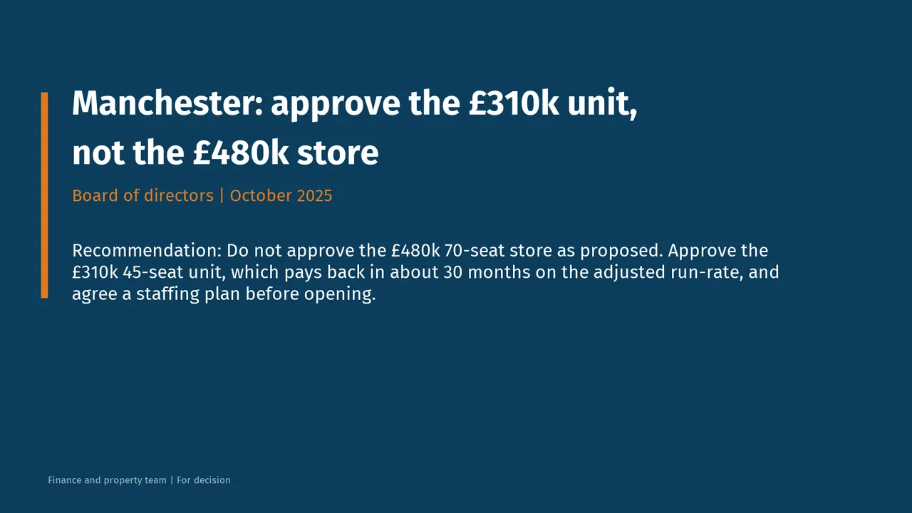
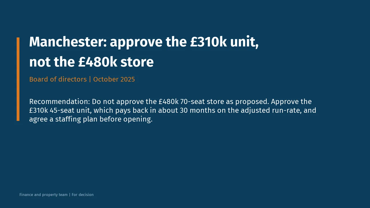
  1. Slide 1 of DeepSeek V4.1 Flash 1017's deck
    Slide 1Download slide imagePolished
  2. Slide 2 of DeepSeek V4.1 Flash 1017's deck
    Slide 2Download slide imageAcceptable The title labels the topic rather than stating a takeaway.The title is a topic label ('The ask and the board's test'), not a takeaway.
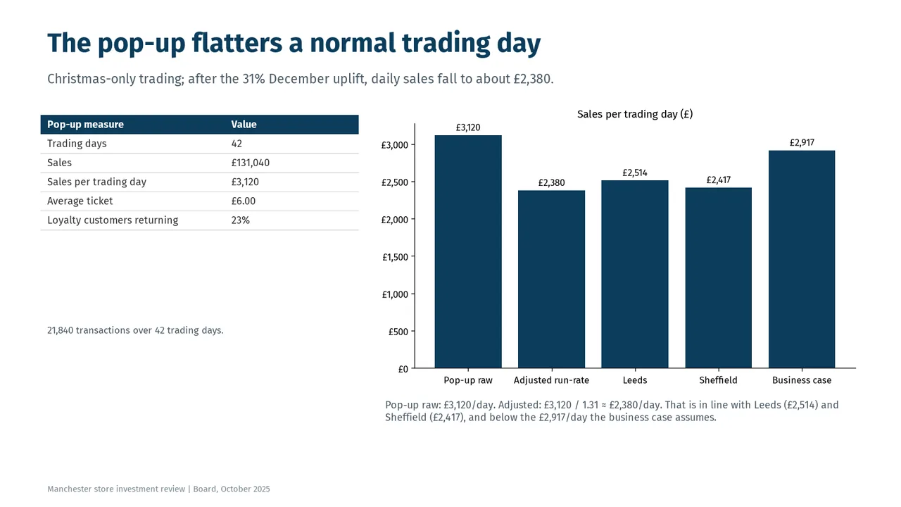
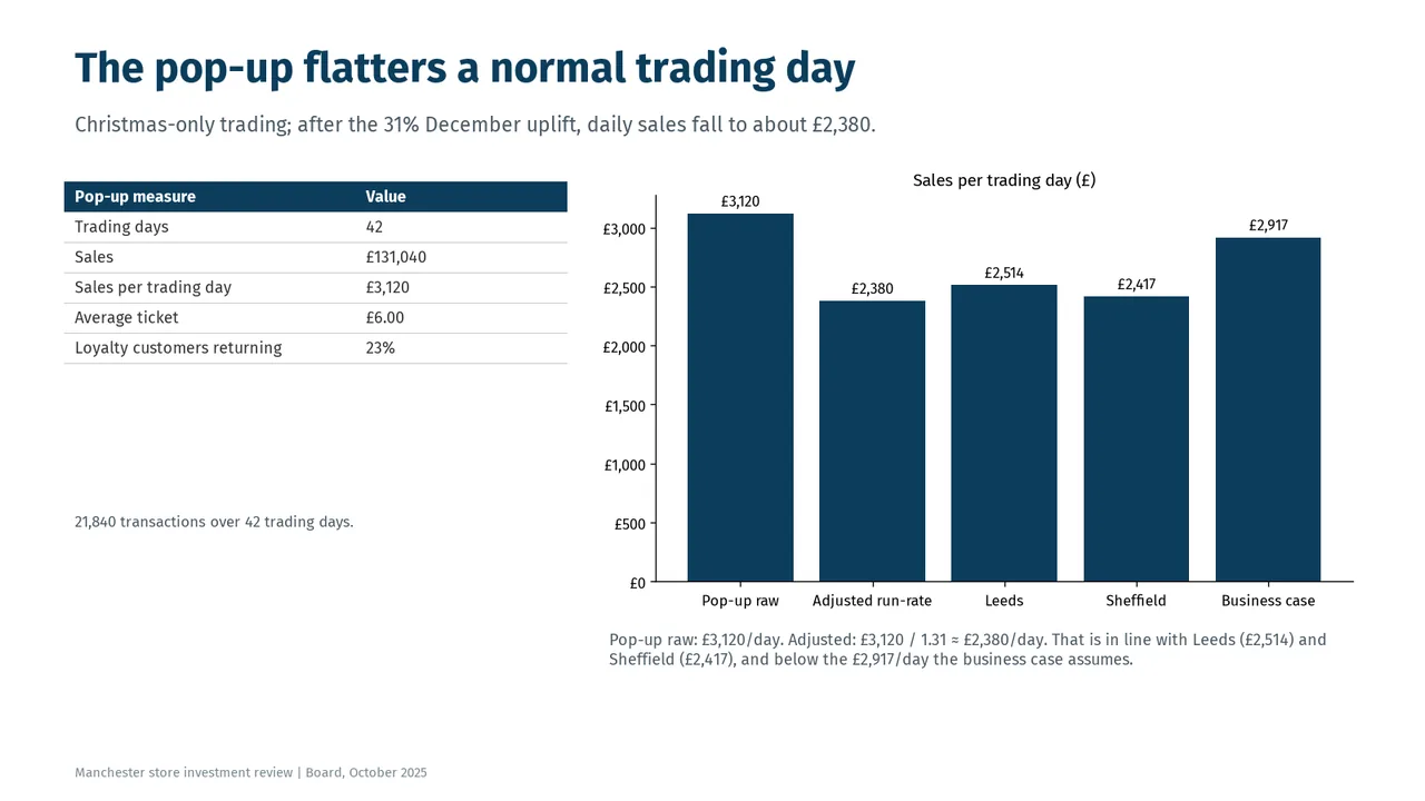
  3. Slide 3 of DeepSeek V4.1 Flash 1017's deck
    Slide 3Download slide imageAcceptable All bars use the same colour, so the central comparison between the raw and adjusted run-rate is not visually emphasised.All bars are the same colour; the adjusted run-rate and business case bars, which carry the point, are not highlighted.
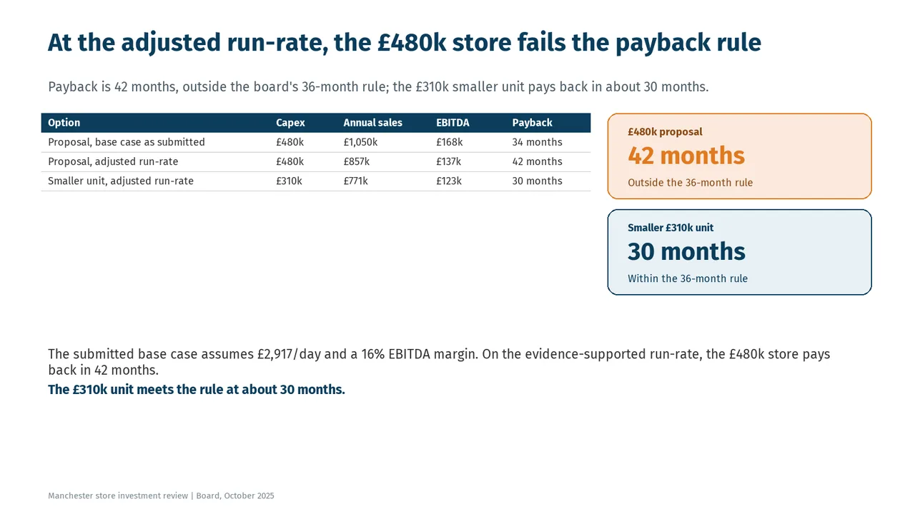
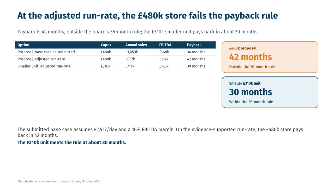
  4. Slide 4 of DeepSeek V4.1 Flash 1017's deck
    Slide 4Download slide imagePolished There is a large empty area under the table before the summary text.
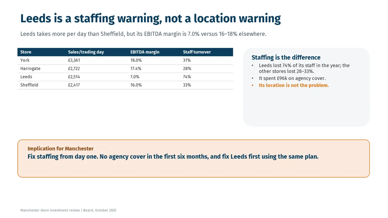
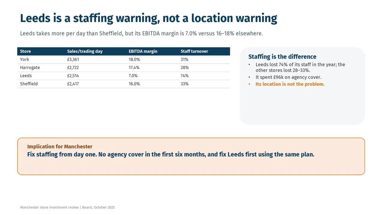
  5. Slide 5 of DeepSeek V4.1 Flash 1017's deck
    Slide 5Download slide imageAcceptable The Leeds row has no visual emphasis despite being the focus of the comparison.The 'Staffing is the difference' card is about half empty below its bullets.
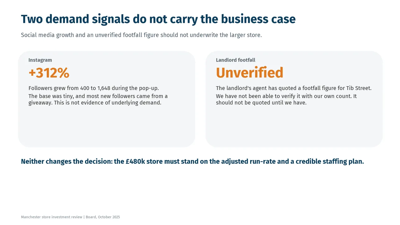
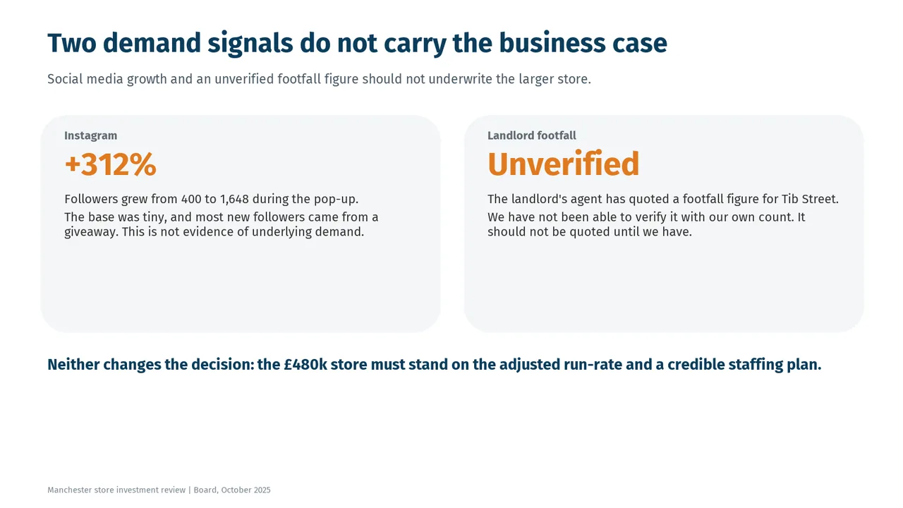
  6. Slide 6 of DeepSeek V4.1 Flash 1017's deck
    Slide 6Download slide imageAcceptable Both cards have substantial unused space below their text.Both cards are oversized, with their lower halves left empty.
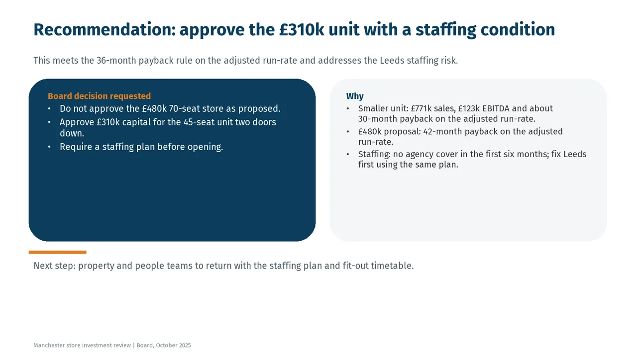
  7. Slide 7 of DeepSeek V4.1 Flash 1017's deck
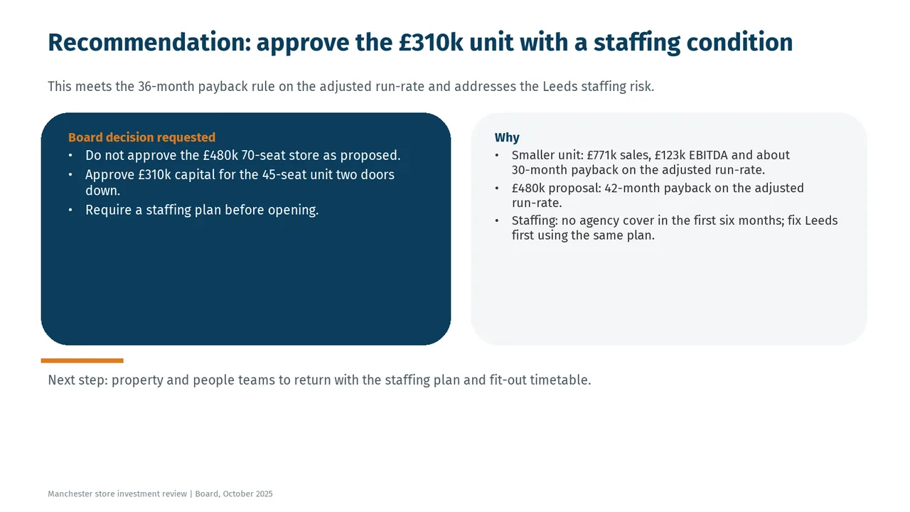
    Slide 7Download slide imageAcceptable The two large panels are mostly empty below the bullets, making the layout feel top-heavy.Both panels have large empty lower halves; the boxes are oversized for their content.