Gemini 3.5 Flash Lite: Starter churn: what to fund in Q1 2026
For the leadership team (chief executive, CFO, heads of product, sales and customer success). The decision it supports: whether to fund a Starter price cut or an onboarding programme in Q1 2026.
Verdict
Not presentable
Deck rating
644
Slides
6 (brief: 6-10)
Design quality
67%
Why it is not presentable
Layout defect: something off the slide, colliding, too small or too faint to read
Quoted a figure the analysis says not to quote
Did not give the analysis's recommendation within the first two slides
In detail
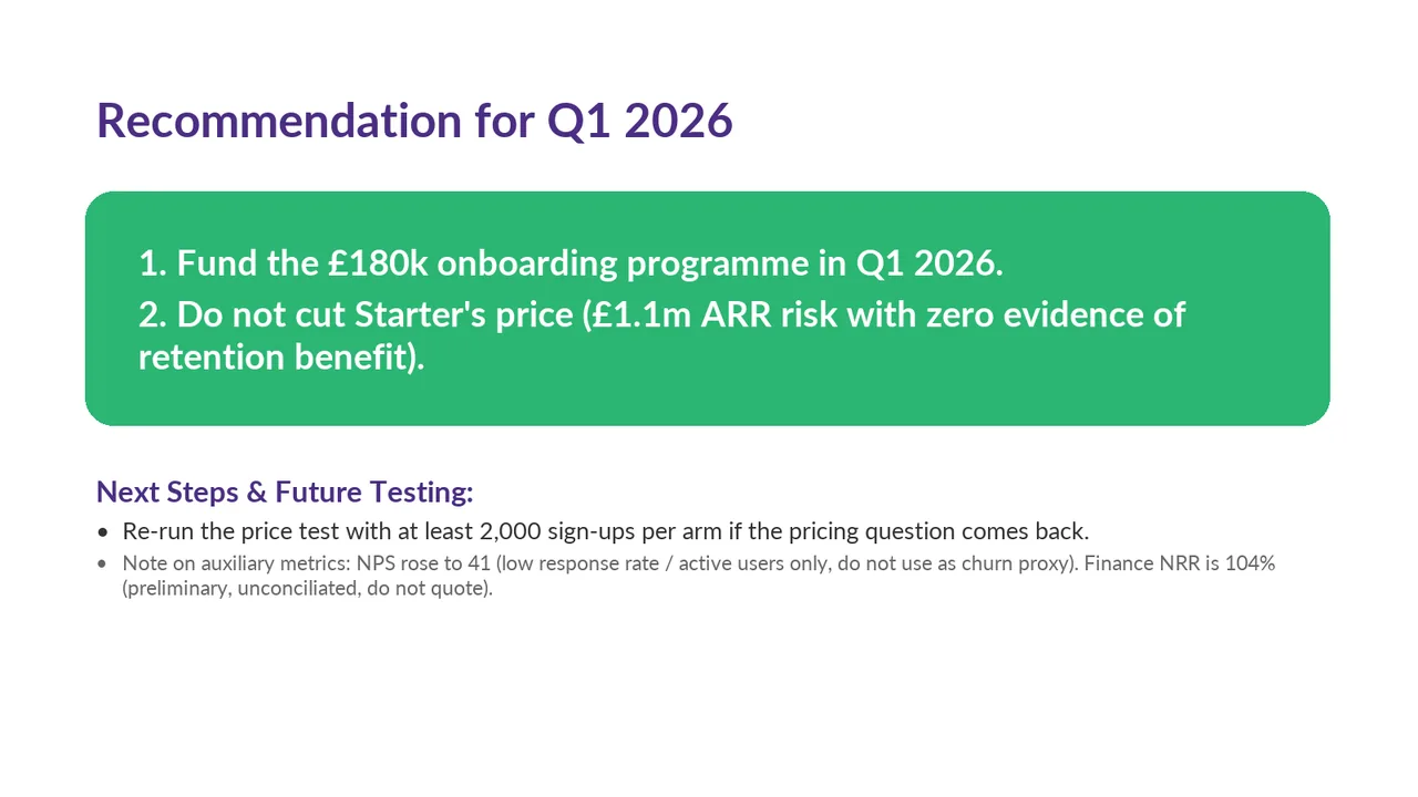
Slide 6 quotes 104%: finance's unreconciled preliminary net revenue retention of 104%.
Slide 5: text 3: #2BB673 on #F4F2F7 is 2.3:1.
Slide 5: text 5: #2BB673 on #F4F2F7 is 2.3:1.
Slide 1PolishedThe green subtitle text on the purple background has low contrast, making it slightly hard to read.
Slide 2AcceptableThe title names the topic rather than stating the takeaway that Starter has the highest churn.Title is a topic label ('Where Churn Is Concentrated'); a takeaway such as 'Starter drives churn at 6–7% a quarter' would land the point faster
Slide 3PolishedTitle is a topic label; the takeaway ('Onboarding is the strongest signal') sits in the subhead instead
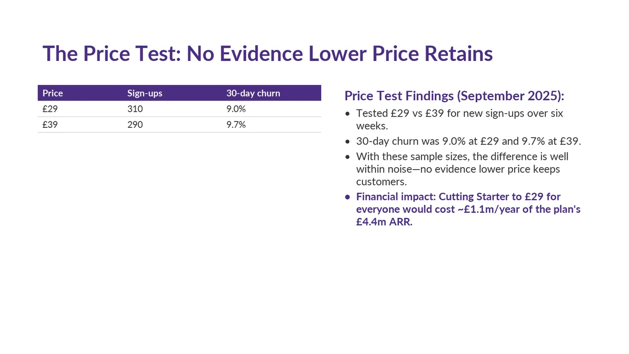
Slide 4AcceptableThe small table on the left and much taller findings block on the right create an uneven visual balance.Small two-row table sits in the top left with a large empty area beneath it, so the layout feels unbalanced
Slide 5AcceptableThe cards are oversized for their content, leaving substantial empty space beneath the bullets.Both cards are mostly empty, with content filling only the top third
Slide 6AcceptableThe auxiliary-metrics note is small grey text and hard to read when projectedThe second bullet point under 'Next Steps & Future Testing' is too small and faint to be comfortably read by an audience.