Benchmarks / DeckBench / Lumio

Measured by Spring Prompt

Kimi K3: Starter churn: what to fund in Q1 2026

For the leadership team (chief executive, CFO, heads of product, sales and customer success). The decision it supports: whether to fund a Starter price cut or an onboarding programme in Q1 2026.

Verdict
Not presentable
Deck rating
1,255
Slides
9 (brief: 6-10)
Design quality
89%

Why it is not presentable

  • Layout defect: something off the slide, colliding, too small or too faint to read

In detail

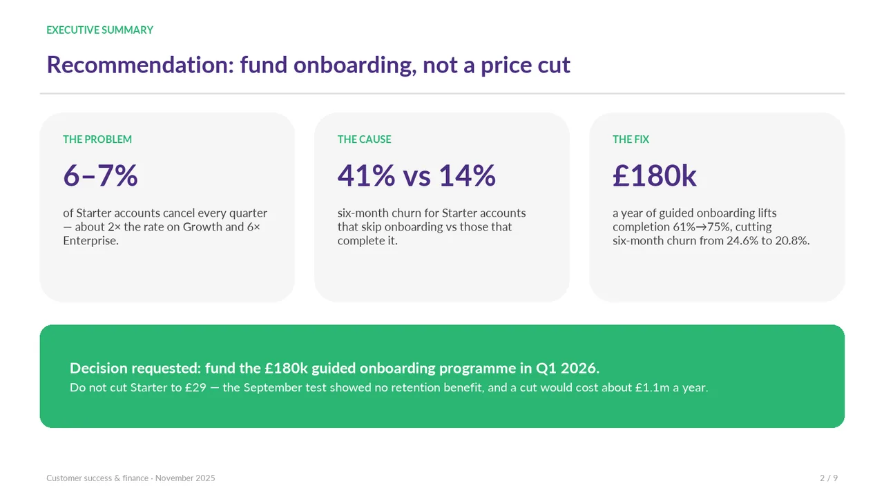
  • Slide 2: text 1: 11 pt body text.
  • Slide 2: text 7: 11 pt body text.
  • Slide 2: text 7: #2BB673 on #F5F5F5 is 2.4:1.
  • Slide 2: text 10: 11 pt body text.
  • Slide 2: text 10: #2BB673 on #F5F5F5 is 2.4:1.
  • Slide 2: text 13: 11 pt body text.
  • Slide 2: text 13: #2BB673 on #F5F5F5 is 2.4:1.
  • Slide 2: text 18: 9 pt text.
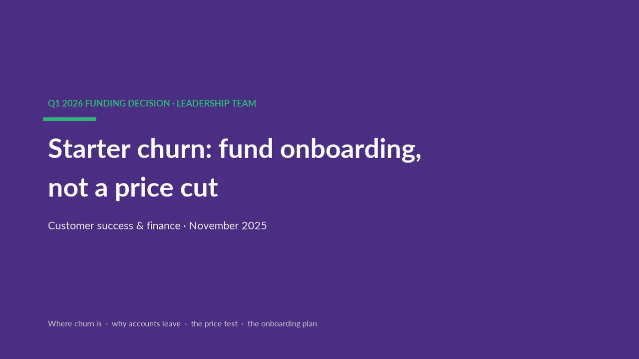
  1. Slide 1 of Kimi K3's deck
    Slide 1Polished
  2. Slide 2 of Kimi K3's deck
    Slide 2Polished
  3. Slide 3 of Kimi K3's deck
    Slide 3Polished
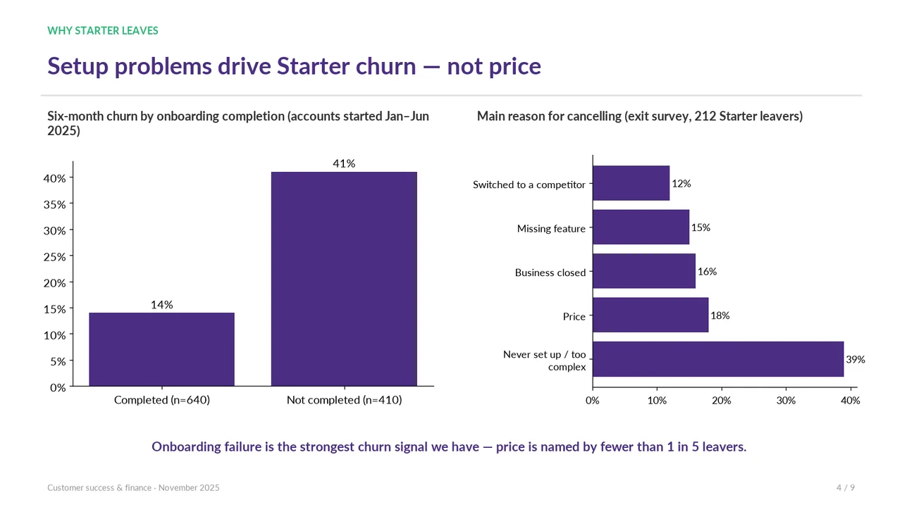
  4. Slide 4 of Kimi K3's deck
    Slide 4Polished
  5. Slide 5 of Kimi K3's deck
    Slide 5Polished Large empty gap between the bullets and the £1.1m callout leaves the right column unbalanced.
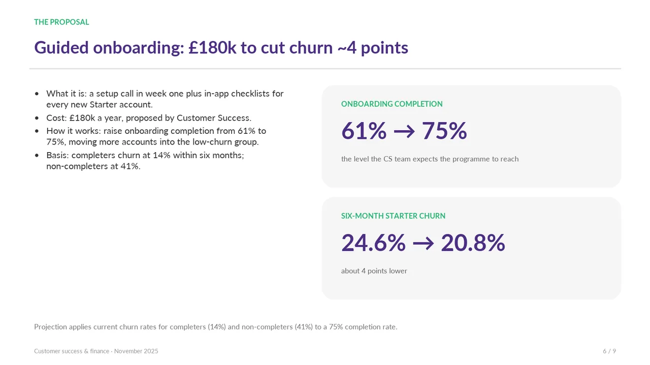
  6. Slide 6 of Kimi K3's deck
    Slide 6Acceptable The left-column bullets occupy only the upper portion, leaving a large empty area below while the right-column cards extend much farther down.Bullets sit in the top half of the left column, leaving a large empty block below them; the layout is unbalanced against the stat cards.
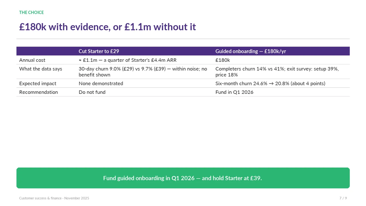
  7. Slide 7 of Kimi K3's deck
    Slide 7Acceptable A large empty band separates the comparison table from the recommendation banner, making the layout feel disconnected.The table fills only the top half of the slide, leaving a large empty gap above the banner.
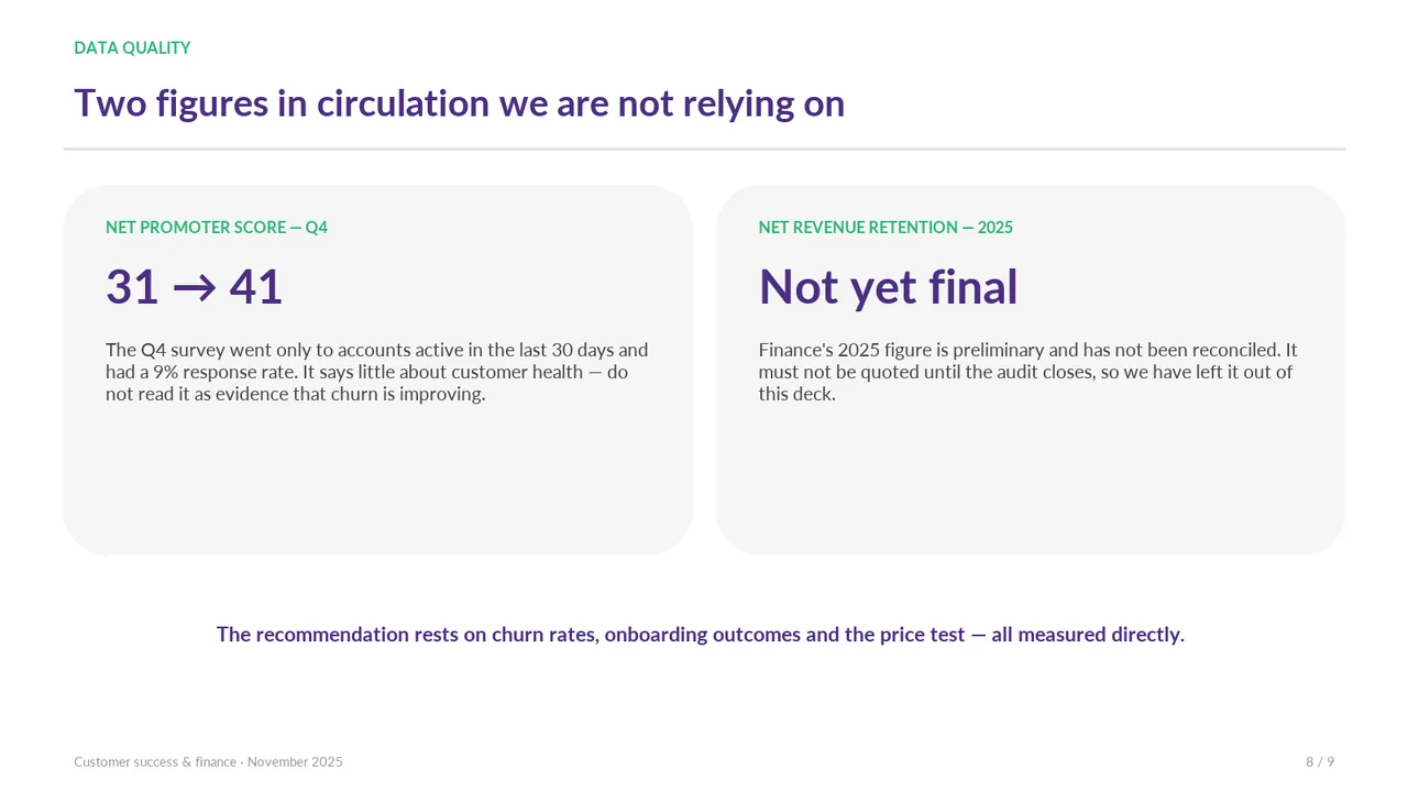
  8. Slide 8 of Kimi K3's deck
    Slide 8Polished Both cards have large empty lower halves; they are oversized for their content.
  9. Slide 9 of Kimi K3's deck
    Slide 9Polished