Muse Spark 1.3: Starter churn: what to fund in Q1 2026
For the leadership team (chief executive, CFO, heads of product, sales and customer success). The decision it supports: whether to fund a Starter price cut or an onboarding programme in Q1 2026.
Verdict
Not presentable
Deck rating
811
Slides
8 (brief: 6-10)
Design quality
62%
Why it is not presentable
Layout defect: something off the slide, colliding, too small or too faint to read
Quoted a figure the analysis says not to quote
In detail
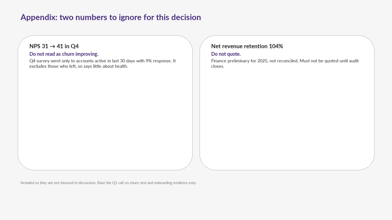
Slide 8 quotes 104%: finance's unreconciled preliminary net revenue retention of 104%.
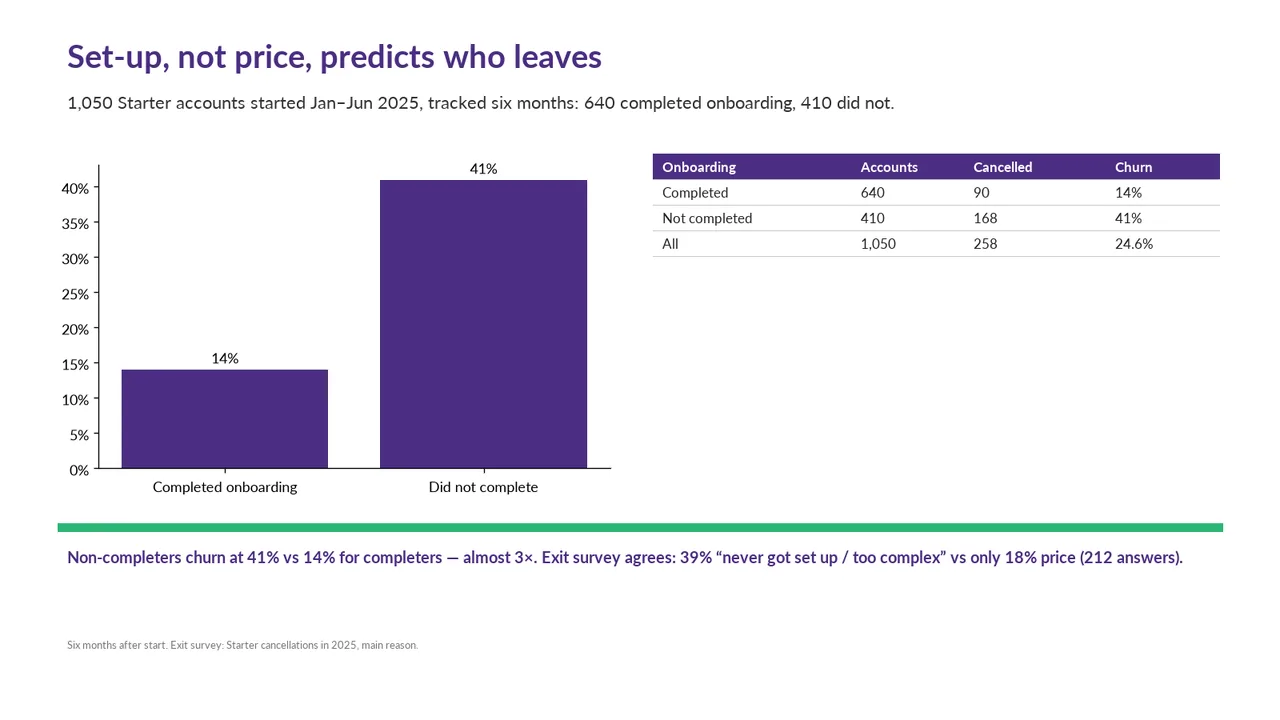
Slide 1: text 5: 8 pt text.
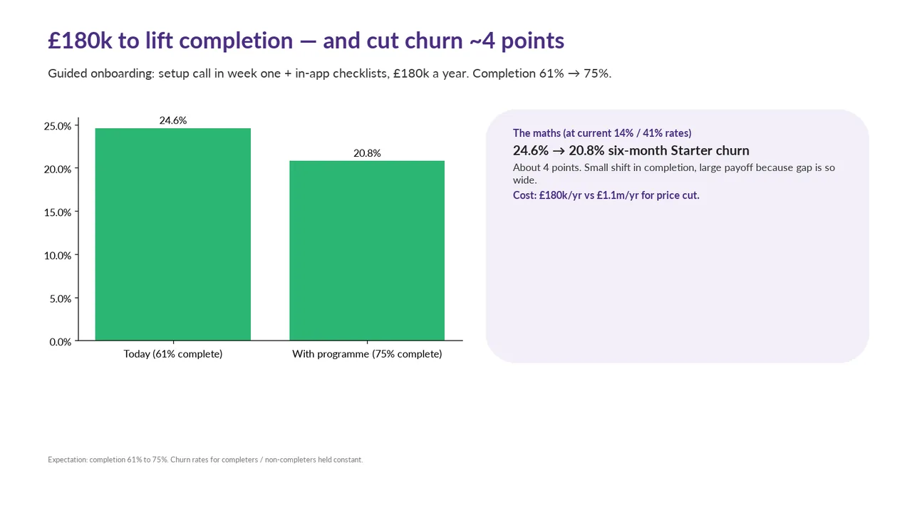
Slide 2: chart 3: 9 pt.
Slide 2: text 5: 11 pt body text.
Slide 2: text 5: 11 pt body text.
Slide 2: text 5: 11 pt body text.
Slide 2: text 5: 11 pt body text.
Slide 2: text 6: 8 pt text.
Slide 1Polished
Slide 2AcceptableThe oversized right-hand panel contains only a short block of text at the top, leaving substantial unused space.Side panel restates the chart's values as text, and its lower half is empty
Slide 3PolishedHeadline numbers vary in size across the cards: 1,250 is larger than the other two
Slide 4AcceptableThe small table at the upper right leaves a large empty area beneath it, making the two-column layout feel unbalanced.Table duplicates the chart data
Slide 5AcceptableThe warning panel is much taller than its text requires, leaving excessive empty space.Pink callout box is mostly empty; its text is small and sits in the top corner
Slide 6AcceptableThe right-hand panel is oversized for its short text block, with most of its lower area unused.Right panel is two-thirds empty
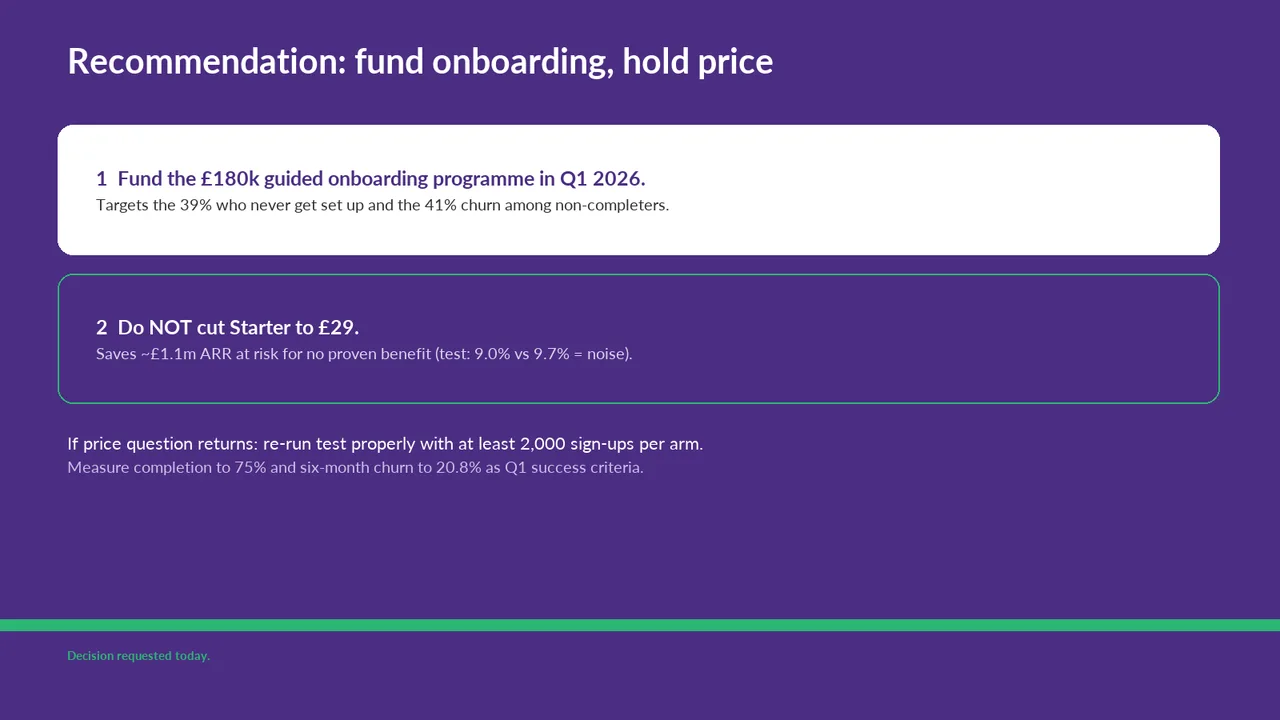
Slide 7AcceptableThe small green 'Decision requested today' footer has weak contrast against the purple background and is easy to miss.Lavender secondary text ('Measure completion…', card 2 subtext) has low contrast on purple
Slide 8AcceptableBoth cards are substantially taller than their content requires, leaving most of the slide empty.Both cards are mostly empty, with text crammed at the top