Benchmarks / DeckBench / Kestrel Logistics

Measured by Spring Prompt

MiniMax M3.1 Flash: On-time delivery: what is going wrong and what to fund

For the board and the company's three main investors. The decision it supports: whether to fund 40 more drivers or a trunk re-plan with 10 drivers.

Verdict
Not presentable
Deck rating
1,300
Slides
6 (brief: 5-8)
Design quality
75%

Why it is not presentable

  • Layout defect: something off the slide, colliding, too small or too faint to read

In detail

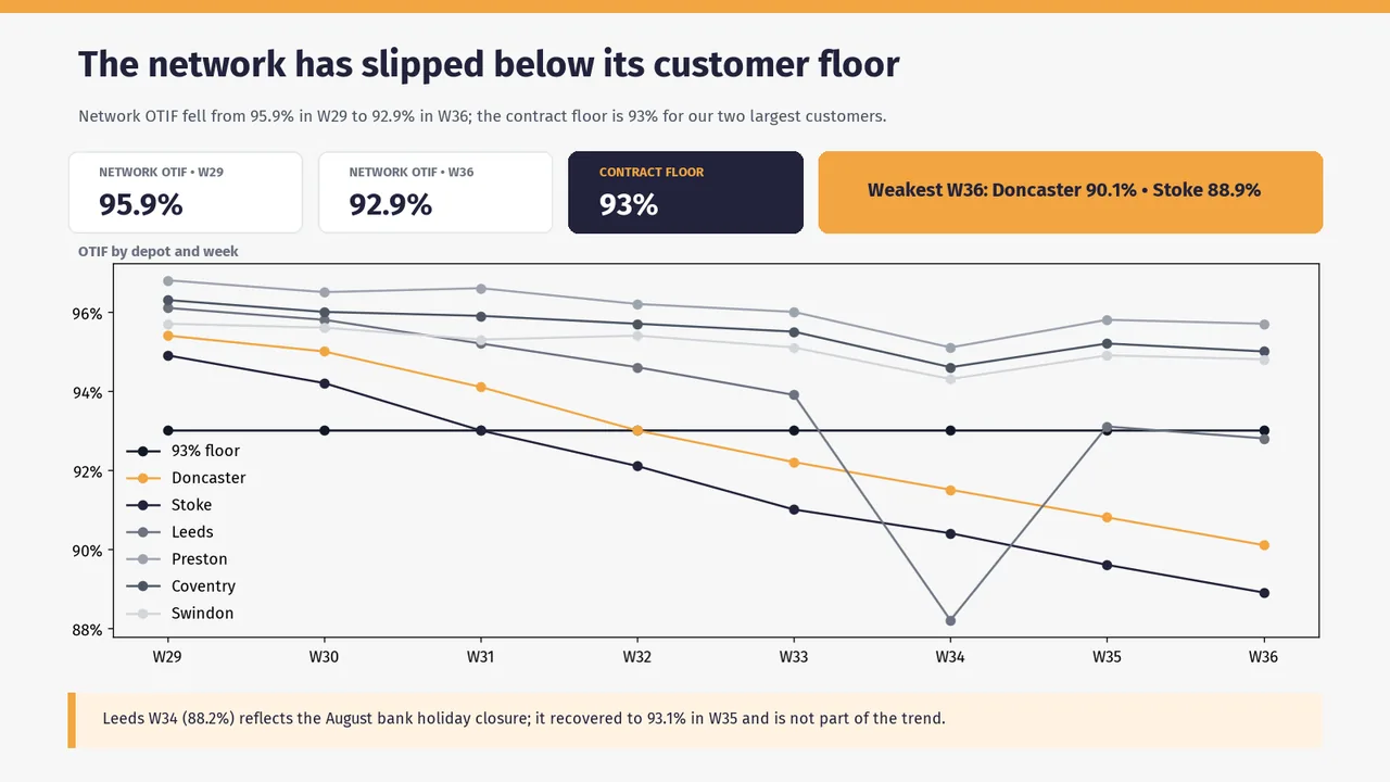
  • Slide 1: 4 body text boxes set at 11 pt, too small to read
  • Slide 1: Text too faint against its background (contrast 2.1:1)
  • Slide 1: Text too faint against its background (contrast 1.9:1)
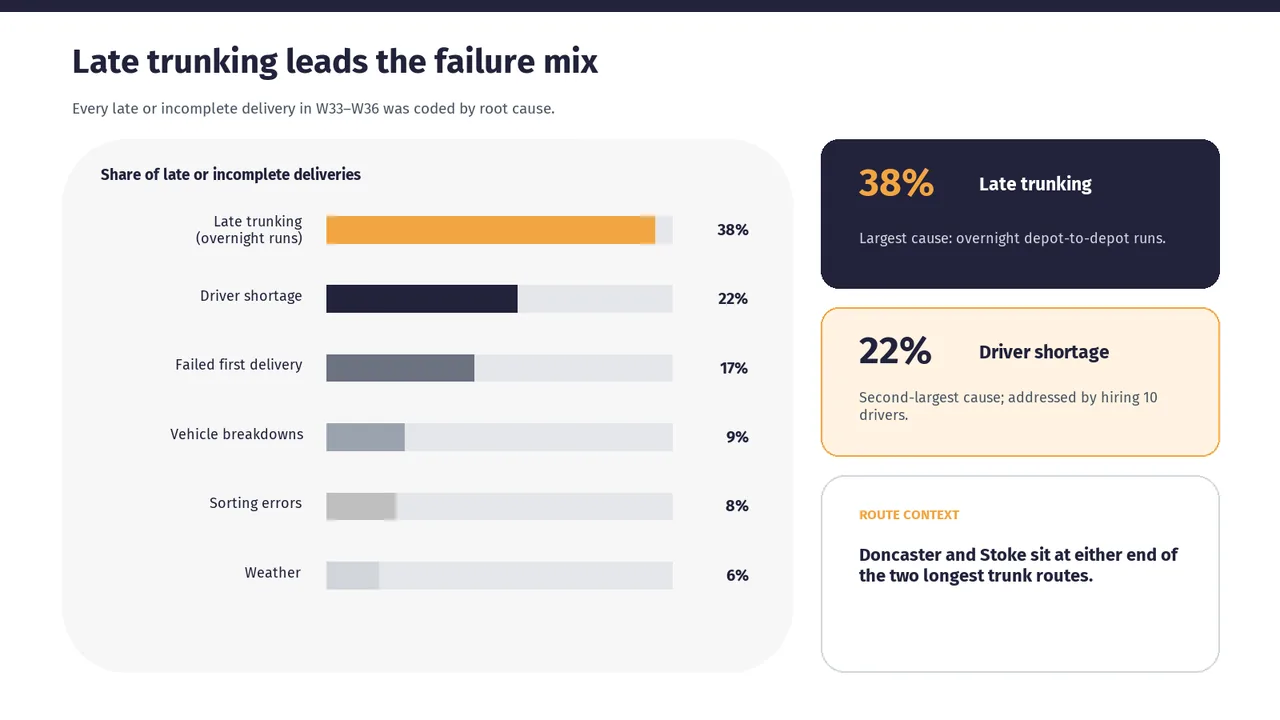
  • Slide 2: A body text box set at 11.5 pt, too small to read
  • Slide 2: A text box set at 9 pt, too small to read
  1. Slide 1 of MiniMax M3.1 Flash's deck
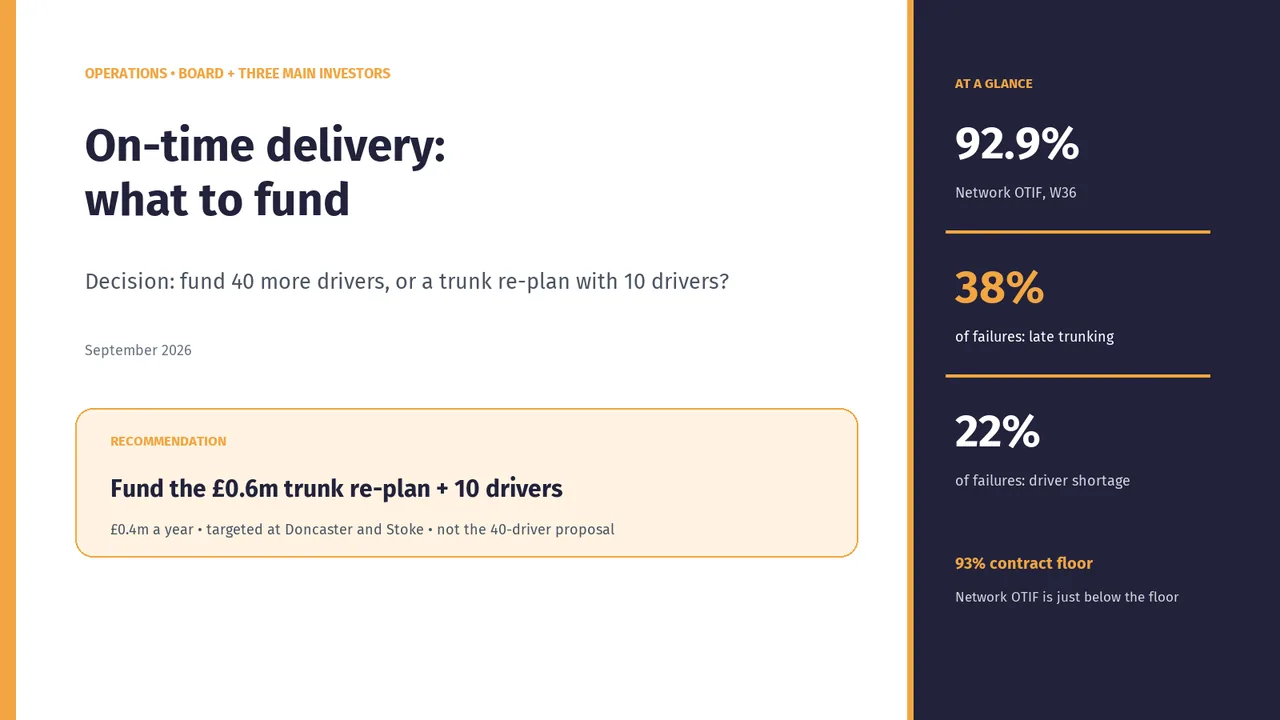
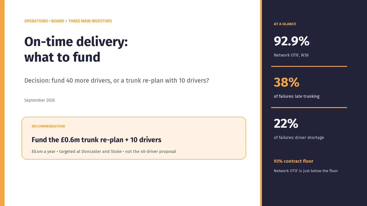
    Slide 1Download slide imagePolished
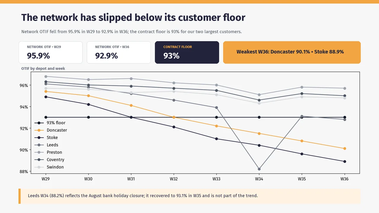
  2. Slide 2 of MiniMax M3.1 Flash's deck
    Slide 2Download slide imageAcceptable Several depot lines use similar grey tones, making them harder to distinguish and requiring repeated reference to the legend.The 93% floor line and the Stoke series use the same dark navy with identical markers, so the legend cannot tell them apart and the floor reads as a data series.
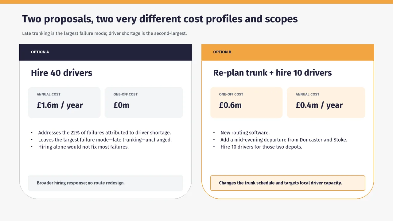
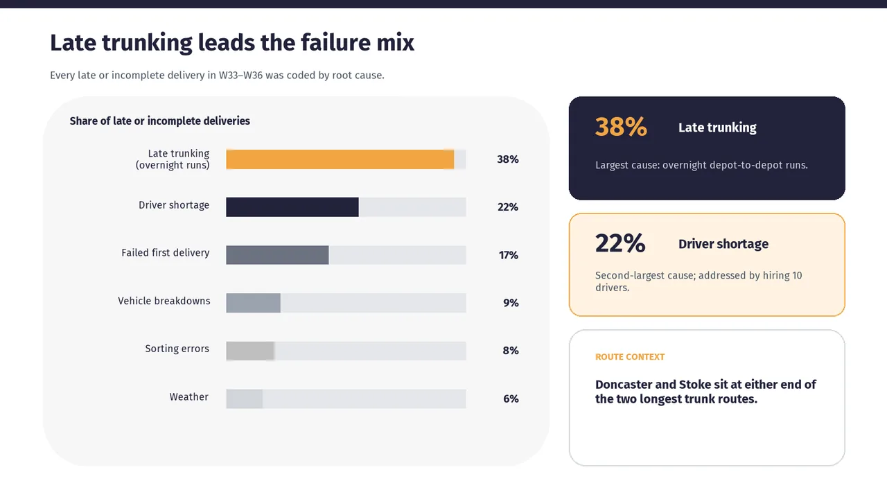
  3. Slide 3 of MiniMax M3.1 Flash's deck
    Slide 3Download slide imagePolished
  4. Slide 4 of MiniMax M3.1 Flash's deck
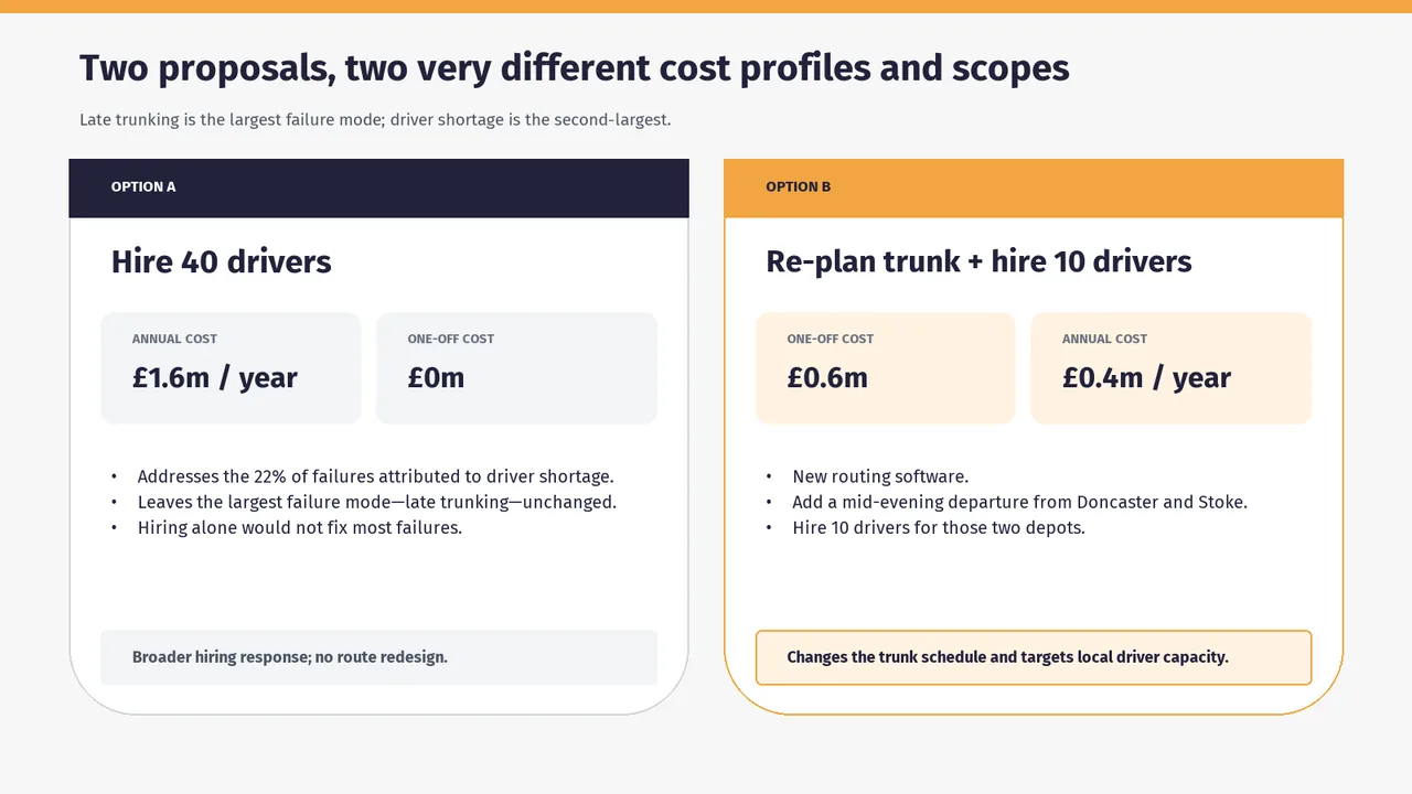
    Slide 4Download slide imageAcceptable Annual and one-off costs switch positions between the two options, slowing side-by-side comparison.Cost tiles are in opposite order: Option A shows annual then one-off, Option B shows one-off then annual, which makes side-by-side comparison harder.
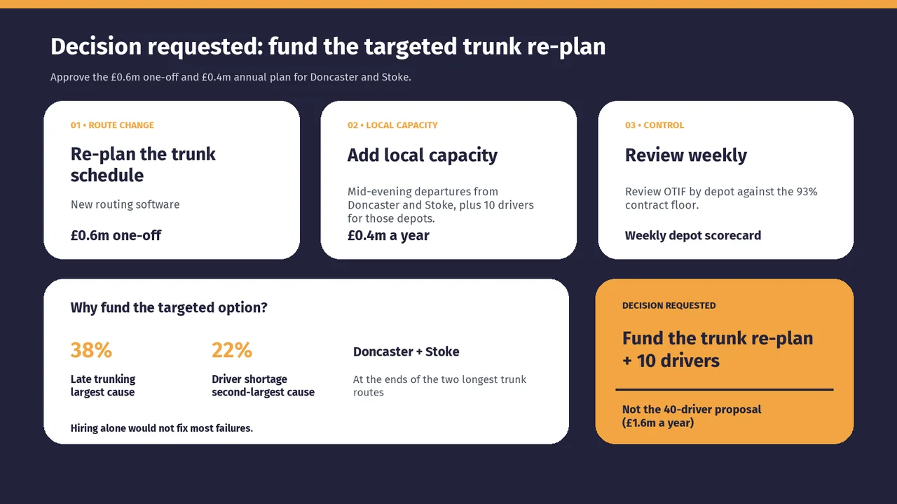
  5. Slide 5 of MiniMax M3.1 Flash's deck
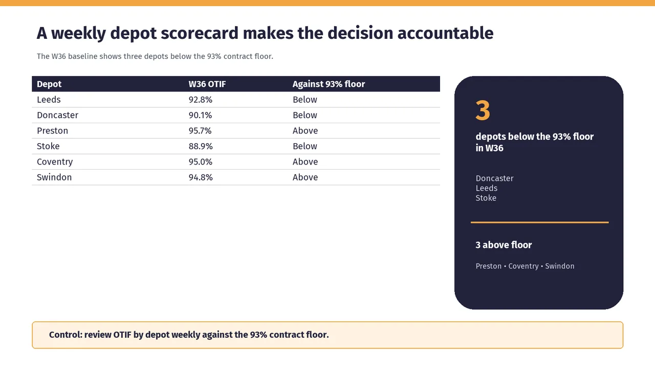
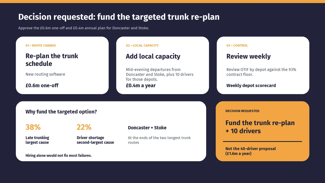
    Slide 5Download slide imagePolished In card 02 the three-line body text runs right into the '£0.4m a year' line, leaving almost no spacing, unlike cards 01 and 03.
  6. Slide 6 of MiniMax M3.1 Flash's deck
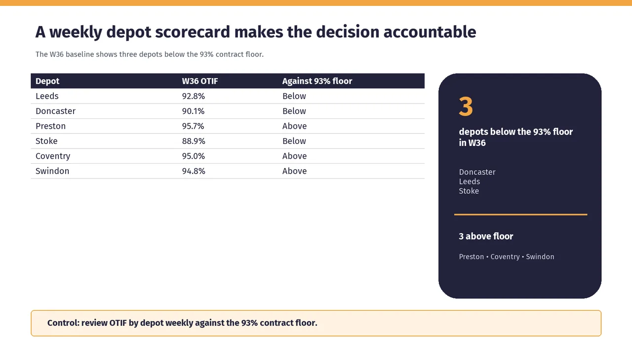
    Slide 6Download slide imageAcceptable The short table leaves a large empty area beneath it, while the tall summary panel makes the layout feel right-heavy.Large empty area below the table; the left half of the slide looks unfinished.