For the CMO and the finance director. The decision it supports: how to allocate the £2.4m paid media budget for H1 2026.
Verdict
Not presentable
Deck rating
635
Slides
7 (brief: 5-8)
Design quality
50%
Why it is not presentable
Quoted a figure the analysis says not to quote
Made a material claim the analysis does not support
In detail
Slide 6 quotes 15,000: the agency's unvalidated forecast of 15,000 new TikTok customers.
Slide 4: “Minimal display budget retained for retargeting only.” is not supported by the analysis.
Slide 4: “Meta's small budget increase is to match inflation and test new audiences.” is not supported by the analysis.
Slide 4: “Minimal budget retained for retargeting only.” is not supported by the analysis.
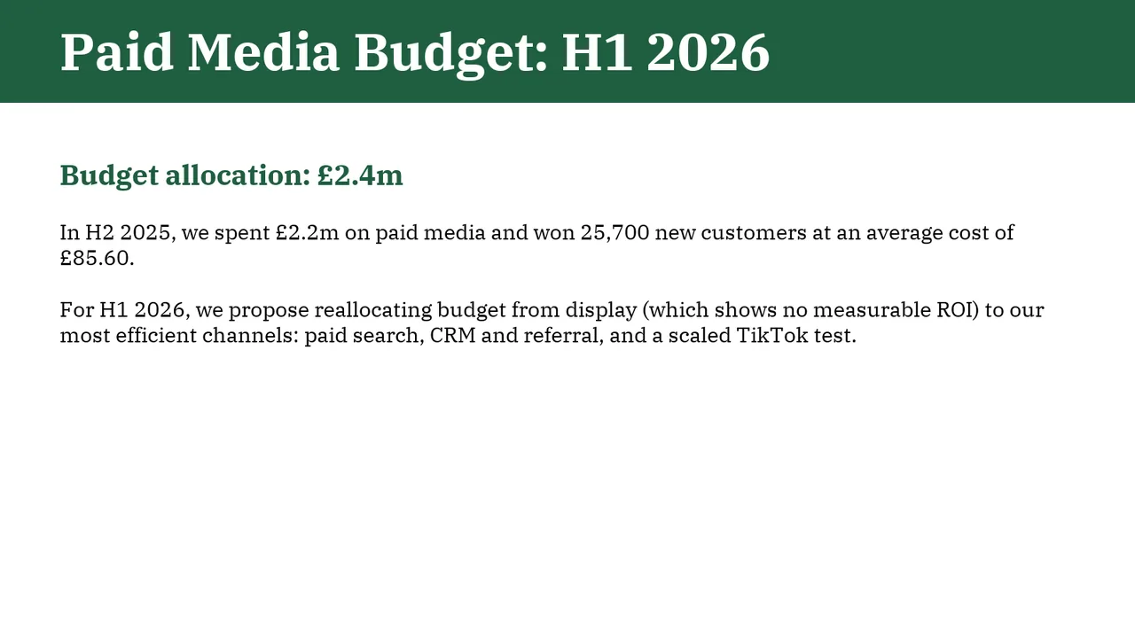
Slide 1AcceptableThe reallocation recommendation is buried in a paragraph rather than expressed in the title or a prominent takeaway.Header bar is taller and the title larger than on every other slide, so it is inconsistent with the deck
Slide 2AcceptableThe title names the topic without stating the performance takeaway.Topic label title; no takeaway (e.g. CRM most efficient, display not working)
Slide 3AcceptableLong explanatory paragraphs make the supporting argument slower to scan.Small holdout table occupies only the left third, leaving the right side empty
Slide 4AcceptableSix equally emphasized channel blocks require reading before the overall reallocation story becomes clear.Topic label title; no overall takeaway
Slide 5AcceptableThe chart omits an explicit thousands unit; its axis and data labels read as pounds, while the table specifies £k.Topic label title rather than a takeaway
Slide 6AcceptableLarge vertical gaps separate the test-design heading, questions and bottom note, making the composition feel fragmented.Grey caveat line and grey footnote are light and small for important content
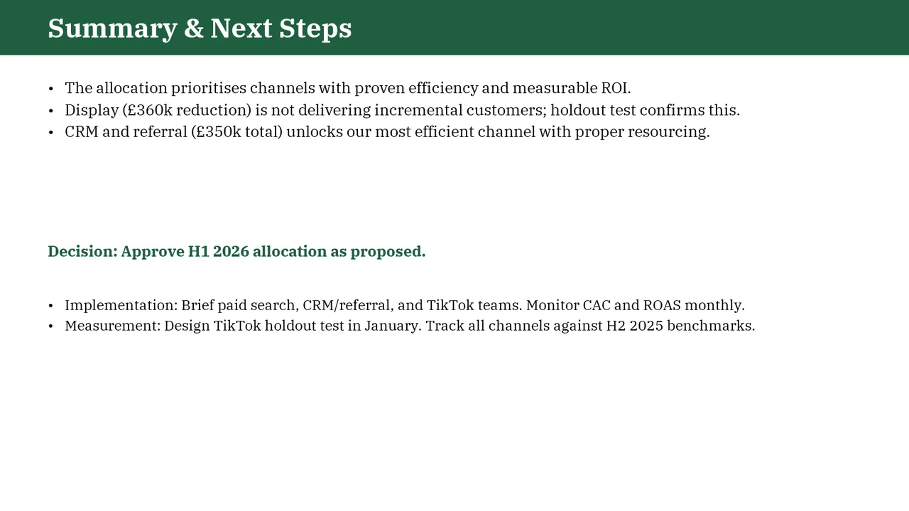
Slide 7AcceptableThe approval request appears below the summary bullets rather than leading the slide.The decision ask is buried mid-slide at subheading size and needs to stand out more strongly