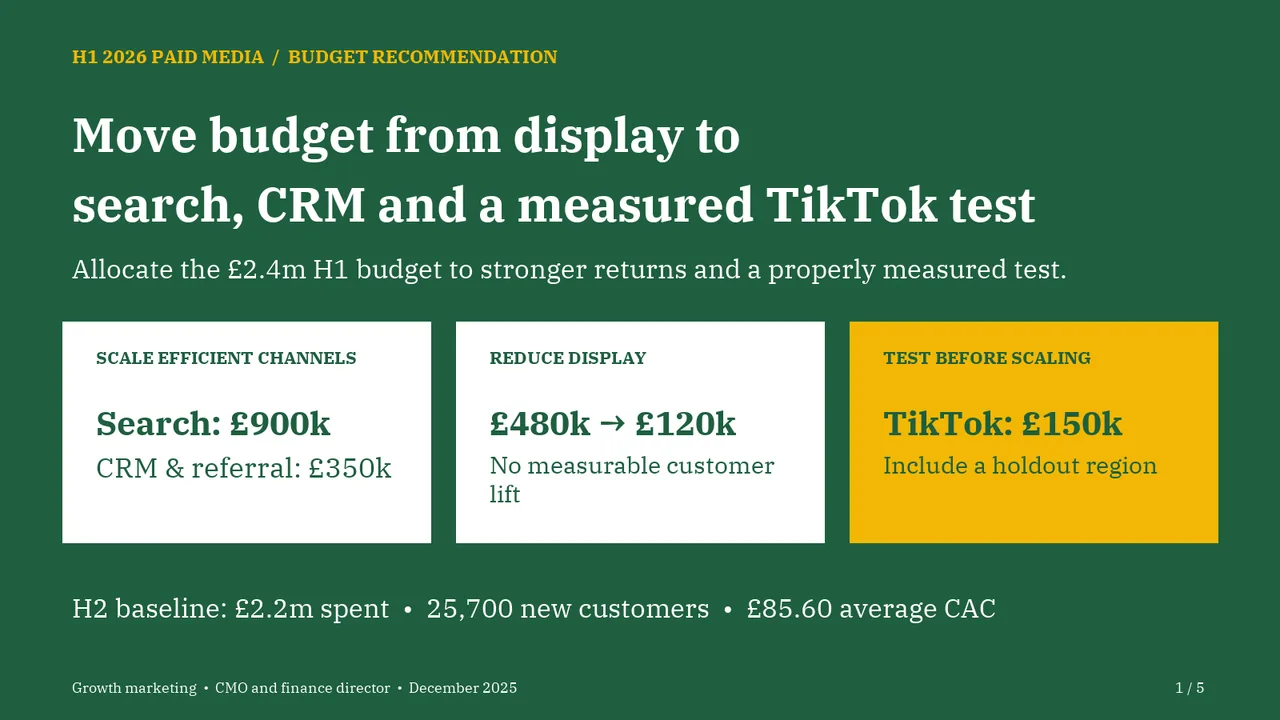
For the CMO and the finance director. The decision it supports: how to allocate the £2.4m paid media budget for H1 2026.
Verdict
Not presentable
Deck rating
1,412
Slides
5 (brief: 5-8)
Design quality
70%
Why it is not presentable
A slide the judges rated as needing work
Slide 1Polished
Slide 2Needs workEvery bar-value label wraps its final digit onto a second line, making the values difficult to read and creating clutter between rows. Widen the label boxes so each value stays on one line.Bar value labels wrap mid-number (e.g. '5.1' / '2', '0.7' / '9') and are hard to read
Slide 3Polished
Slide 4PolishedThe divider line in the green panel is drawn as two misaligned segments and extends past the text margin on the left
Slide 5AcceptableThe proposed-budget column and total row have the same visual weight as the historical figures, so the requested allocation is not immediately emphasised.Numeric columns are left-aligned rather than right-aligned, which makes the figures harder to compare