For the CMO and the finance director. The decision it supports: how to allocate the £2.4m paid media budget for H1 2026.
Verdict
Not presentable
Deck rating
811
Slides
6 (brief: 5-8)
Design quality
50%
Why it is not presentable
Layout defect: something off the slide, colliding, too small or too faint to read
In detail
Slide 1: text 6: 9 pt text.
Slide 2: text 4: 11 pt body text.
Slide 2: text 5: 8 pt text.
Slide 3: text 4: 11 pt body text.
Slide 3: text 4: 11 pt body text.
Slide 3: text 5: 8 pt text.
Slide 4: text 3: 11 pt body text.
Slide 4: text 3: 11 pt body text.
Slide 1AcceptableThe title identifies the topic rather than the recommendation; the actual proposal is much smaller and positioned well below it.Proposal text at the bottom is slightly small and hard to read against the green background
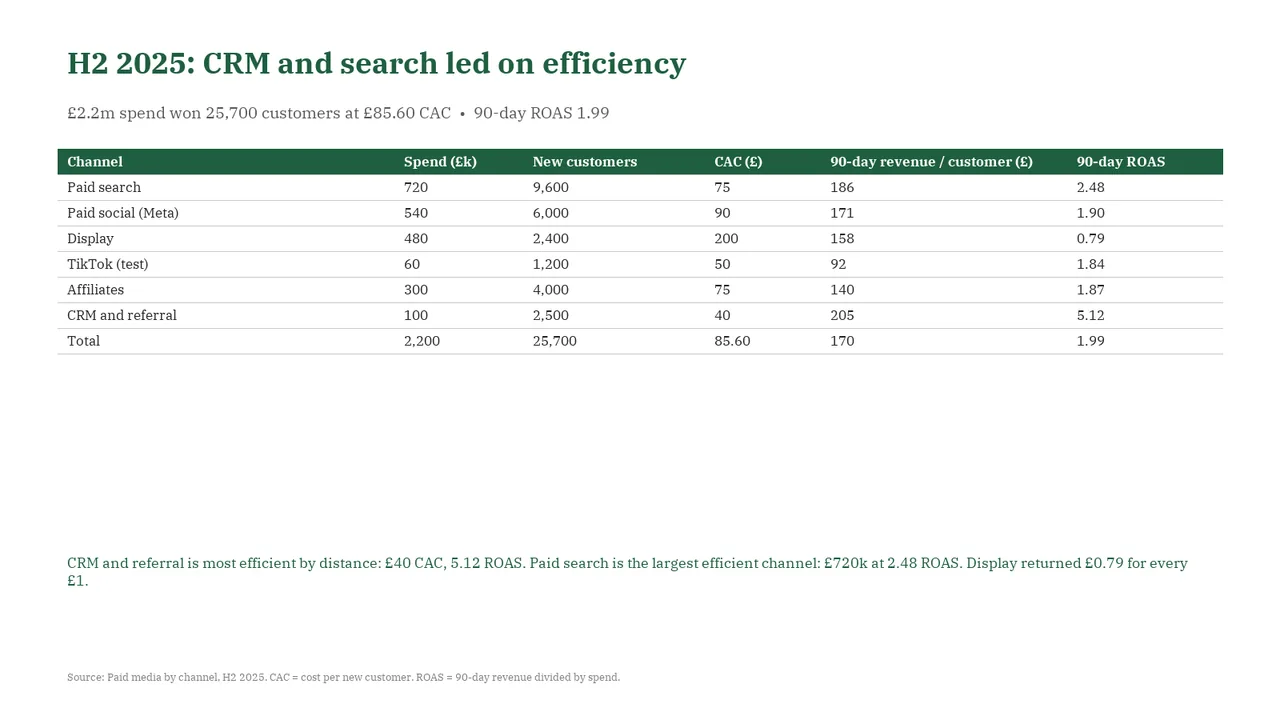
Slide 2AcceptableThe table gives every row and value equal emphasis, so the channels supporting the headline do not stand out.Table is plain, with no highlighting of the CRM, search and display rows that the title and takeaway refer to
Slide 3AcceptableThe chart's vertical axis does not identify the metric or unit; viewers must find that context in the adjacent text.The right-hand card is mostly empty; its three bullets fill only the top fifth of a tall box
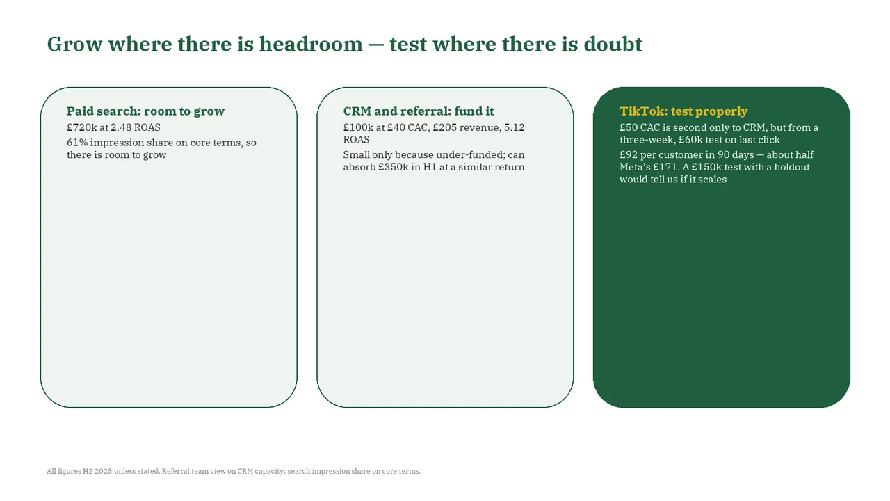
Slide 4AcceptableThe three cards are much taller than their content, leaving most of each card empty.All three cards are oversized; their text fills only the top quarter, leaving large empty areas
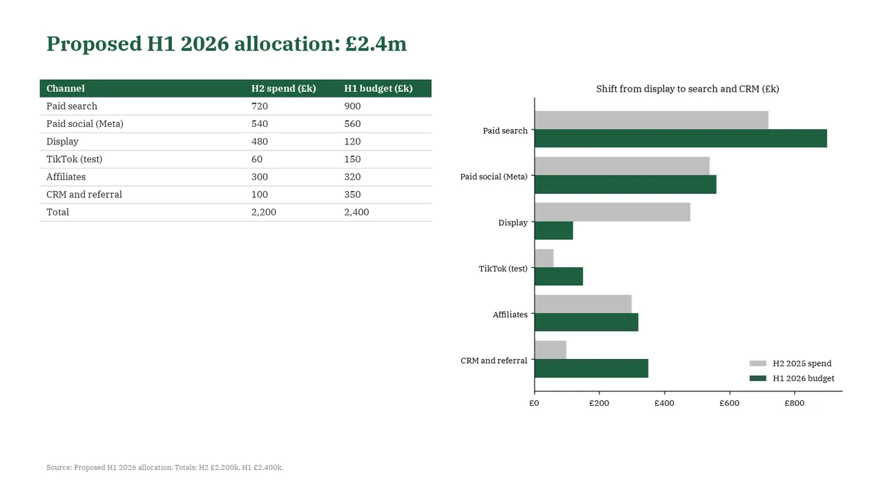
Slide 5AcceptableThe short table and tall chart create an unbalanced layout with substantial unused space below the table.The table and chart show the same numbers, which is redundant
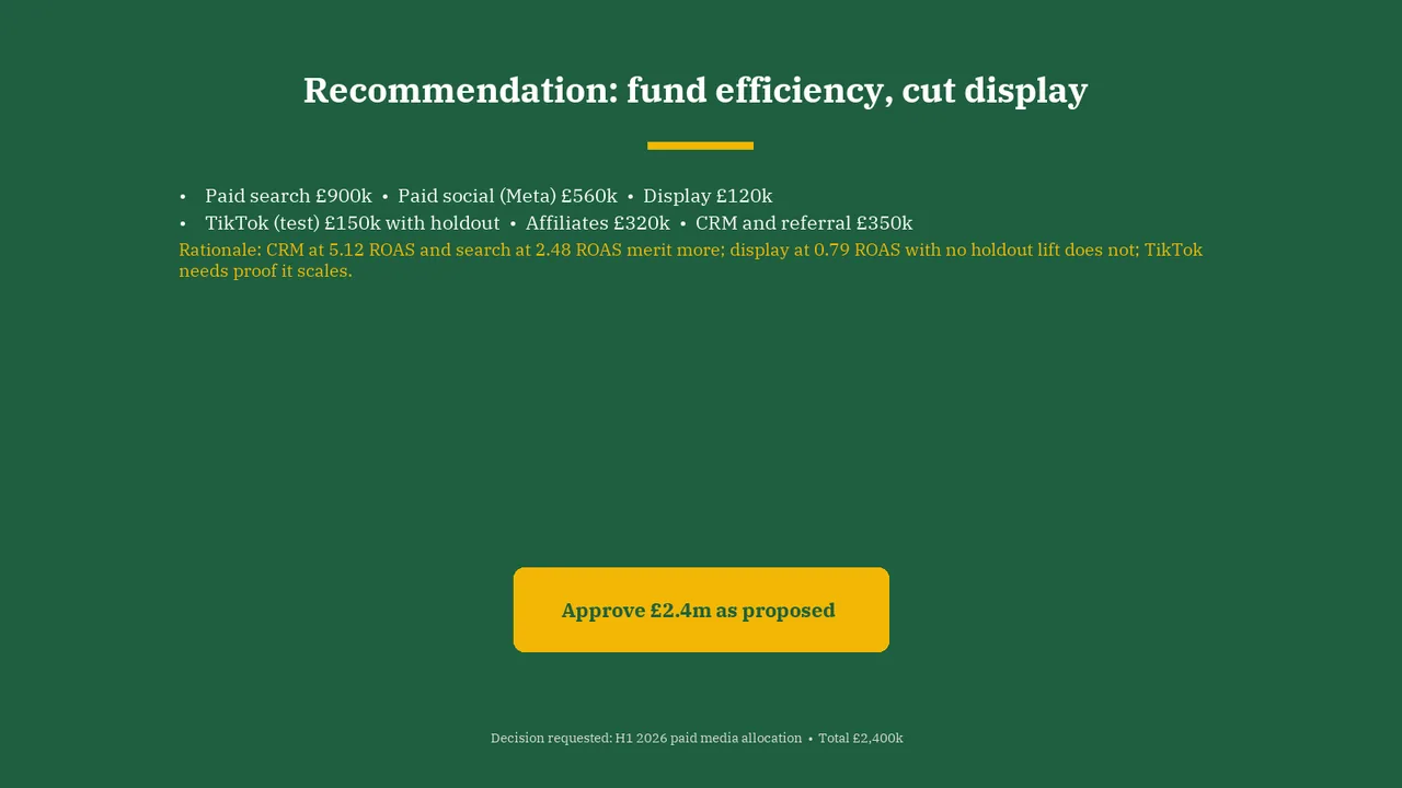
Slide 6AcceptableThe channel allocations are packed into two long bullet lines, making individual amounts harder to scan.Bullets use inline bullet separators within bullets, so the allocation is hard to scan; a short list or table would read better