Claude Fable 5.1: Responsive repairs: in-house team or renewed contract
For the board of trustees of a housing association, including two tenant board members. The decision it supports: whether to approve £1.2m to set up an in-house repairs team or renew the contract.
Verdict
Not presentable
Deck rating
1,300
Slides
8 (brief: 6-9)
Design quality
62%
Why it is not presentable
Layout defect: something off the slide, colliding, too small or too faint to read
A slide the judges rated as needing work
In detail
Slide 2: text 20: 9 pt text.
Slide 2: text 21: 9 pt text.
Slide 2: text 15 and text 16 collide.
Slide 3: text 11: 9 pt text.
Slide 3: text 12: 9 pt text.
Slide 4: text 8: 9 pt text.
Slide 4: text 9: 9 pt text.
Slide 5: text 9: 9 pt text.
Slide 1Polished
Slide 2Needs workIn the third card, the large orange word 'saved' overlaps the grey explanatory text, making both difficult to read.In the third card, the headline '£0.4m a year saved' wraps onto a second line and 'saved' overprints the caption '£3.9m a year in-house vs £4.3m…', making both unreadable
Slide 3Polished
Slide 4AcceptableThe right-hand panel is text-heavy, with four multi-line bullets and little emphasis within them.The title says 'the adjusted figures say no', but the chart plots only the unadjusted reported line, so the visual shows the October jump the slide argues against
Slide 5PolishedThe title wraps to two lines and the orange accent bar collides with the second line, cutting through 'whose'
Slide 6AcceptableAnnual running costs are repeated in the table, chart and callout, adding visual bulk without a distinct role for each.The title wraps to two lines and the orange accent bar collides with 'in about'
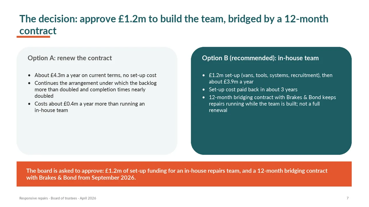
Slide 7AcceptableBoth option cards rely on multi-line bullets, making the comparison slower to scan than aligned comparison rows would be.The title wraps to two lines and the orange accent bar collides with 'contract'
Slide 8AcceptableThe title identifies the appendix topic but does not state a takeaway.Numbers are left-aligned rather than right-aligned, which makes the columns harder to compare