Benchmarks / DeckBench / Wrenfield Borough Council

Measured by Spring Prompt

MiniMax M3.1 Flash: Library services: choosing how to save £350,000

For the council's cabinet (elected members), meeting in public. The decision it supports: which of three options to adopt to save £350,000 a year from libraries.

Verdict
Not presentable
Deck rating
1,300
Slides
7 (brief: 5-8)
Design quality
79%

Why it is not presentable

  • Layout defect: something off the slide, colliding, too small or too faint to read
  • Drew a conclusion from a figure without its caveat

In detail

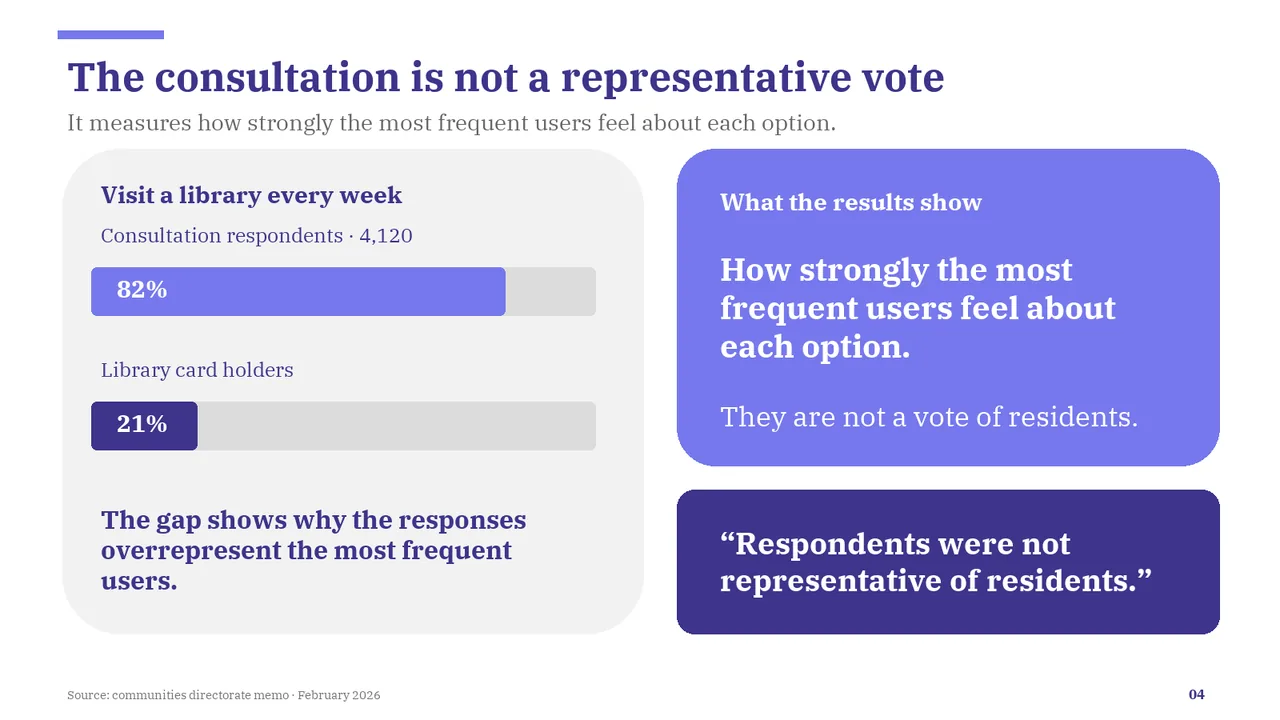
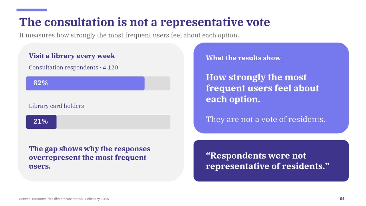
  • Caveat missing: respondents were mostly weekly users (82%, against 21% of card holders), not representative of residents.
  • Slide 1: A text box set at 9 pt, too small to read
  • Slide 2: A text box set at 9 pt, too small to read
  • Slide 3: A text box set at 9 pt, too small to read
  • Slide 4: A text box set at 9 pt, too small to read
  • Slide 5: A text box set at 9 pt, too small to read
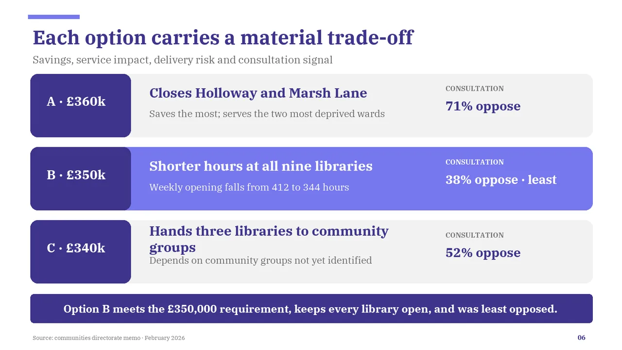
  • Slide 6: A text box set at 9 pt, too small to read
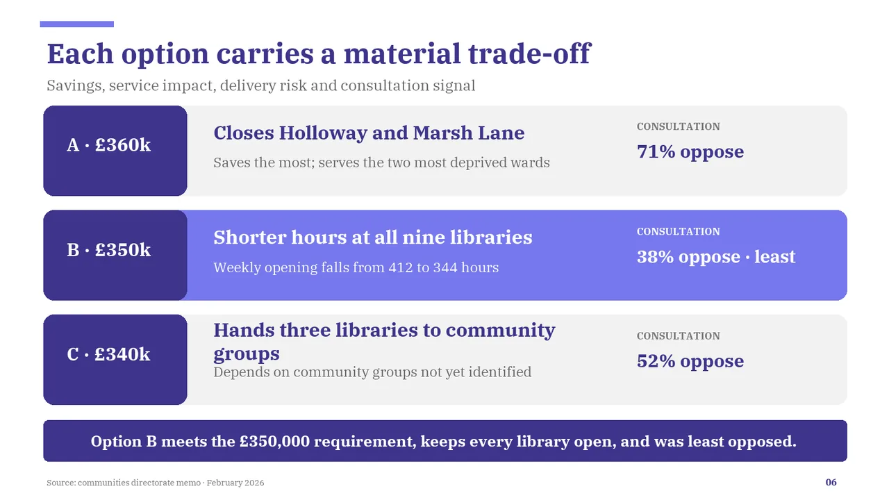
  • Slide 6: Two text boxes overlap
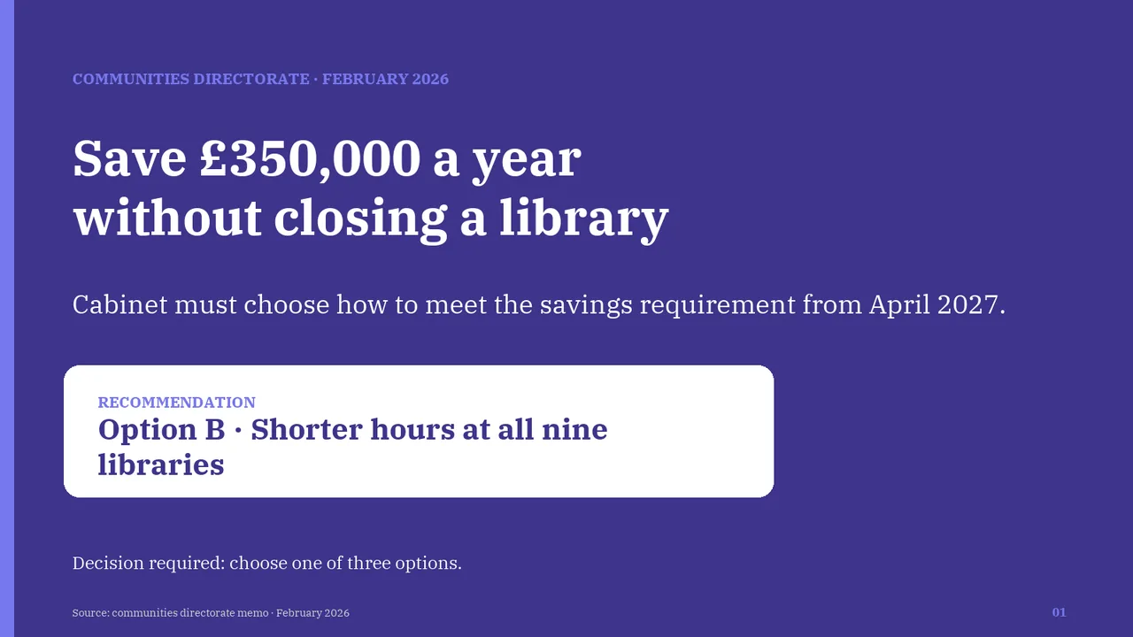
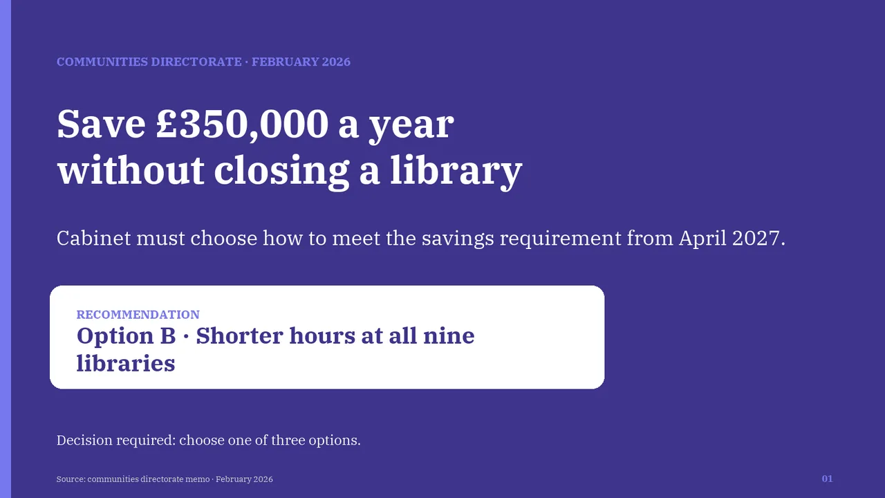
  1. Slide 1 of MiniMax M3.1 Flash's deck
    Slide 1Download slide imagePolished The recommendation text wraps 'libraries' onto a second line even though the white card has room to spare; the text box is narrower than the card.
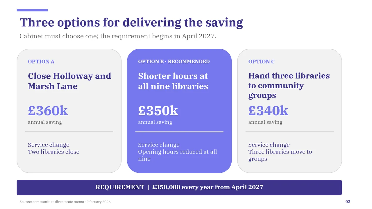
  2. Slide 2 of MiniMax M3.1 Flash's deck
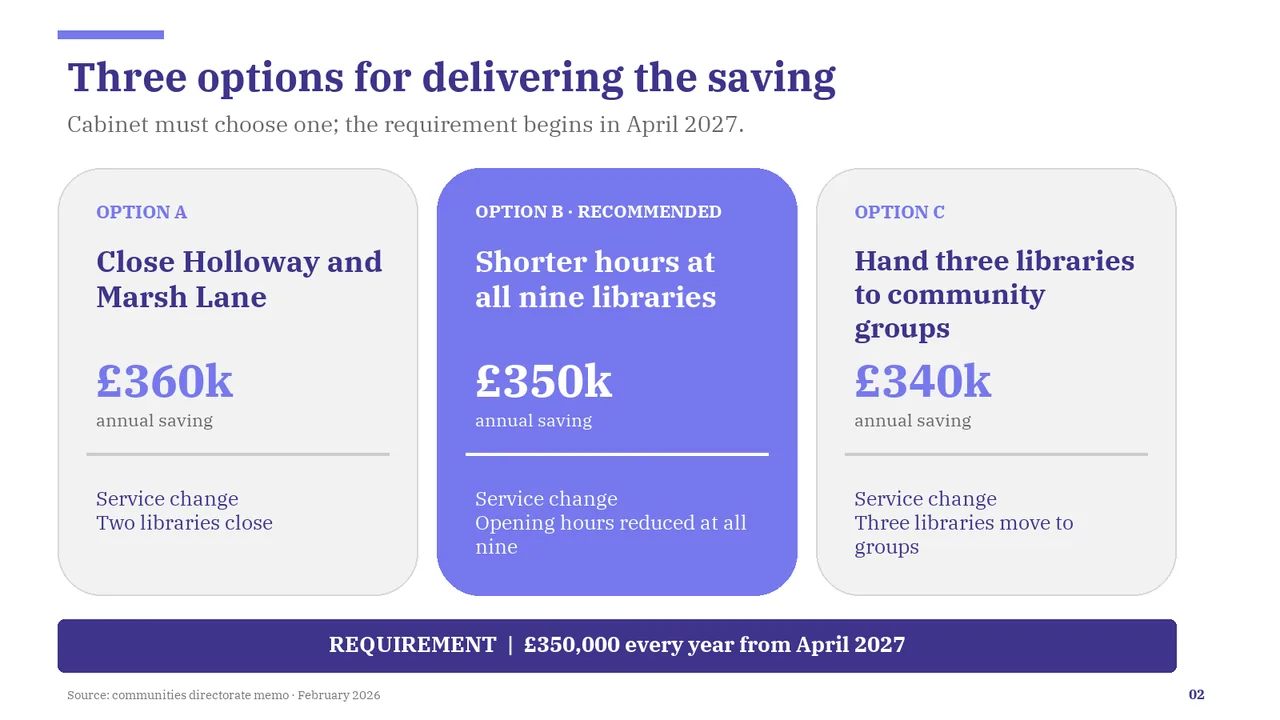
    Slide 2Download slide imagePolished The Option C title wraps to three lines and sits almost on top of the £340k figure; Options A and B have a clear gap there, so the spacing is inconsistent.
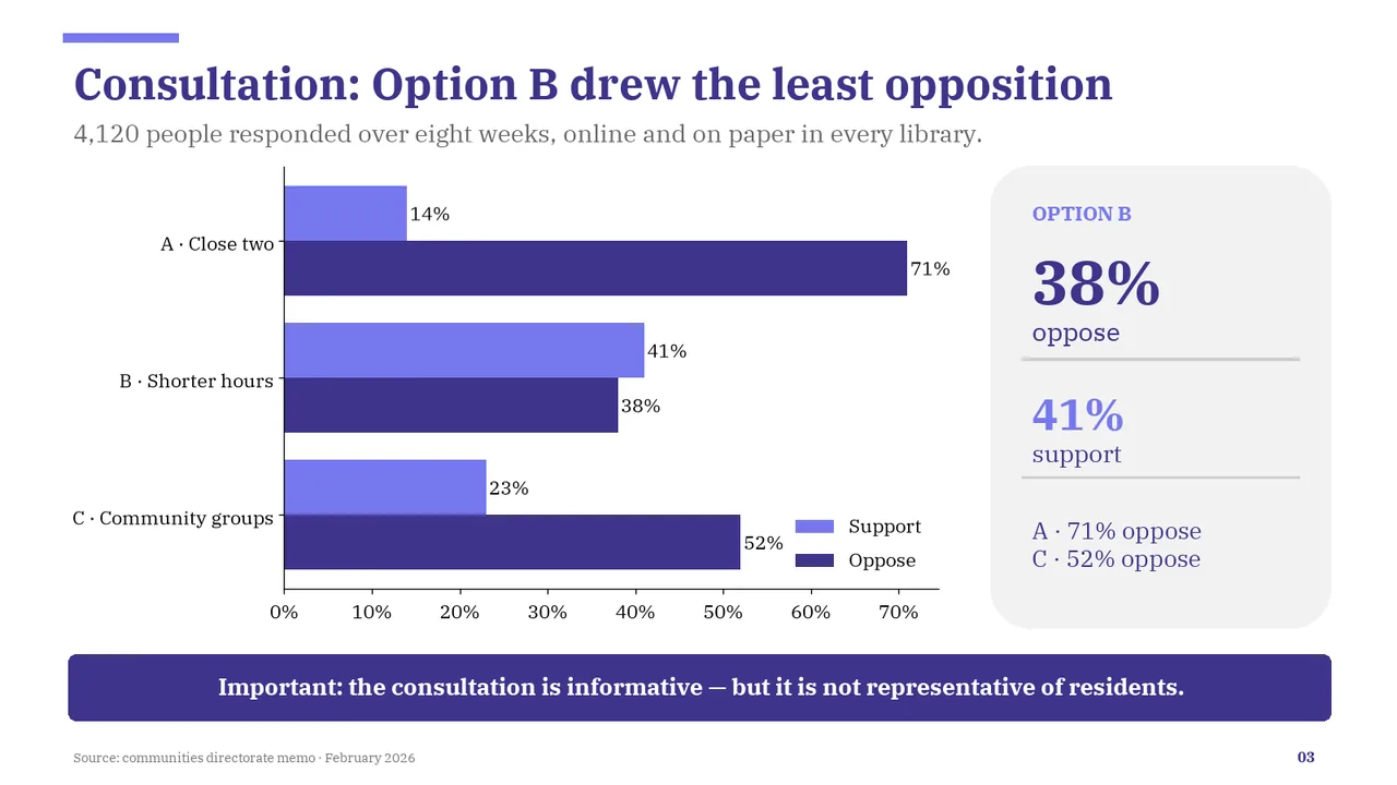
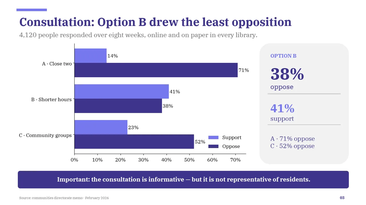
  3. Slide 3 of MiniMax M3.1 Flash's deck
    Slide 3Download slide imageAcceptable The legend sits inside the plot area, close to the 52% data label.The legend text 'Support' and 'Oppose' is slightly small, though legible
  4. Slide 4 of MiniMax M3.1 Flash's deck
    Slide 4Download slide imageAcceptable The subtitle, explanatory panel and quotation repeat the title's message, making the slide more text-heavy than necessary.The same point appears four times (subtitle, the 'What the results show' panel, the quote box, and the left-panel takeaway), making the slide text-heavy.
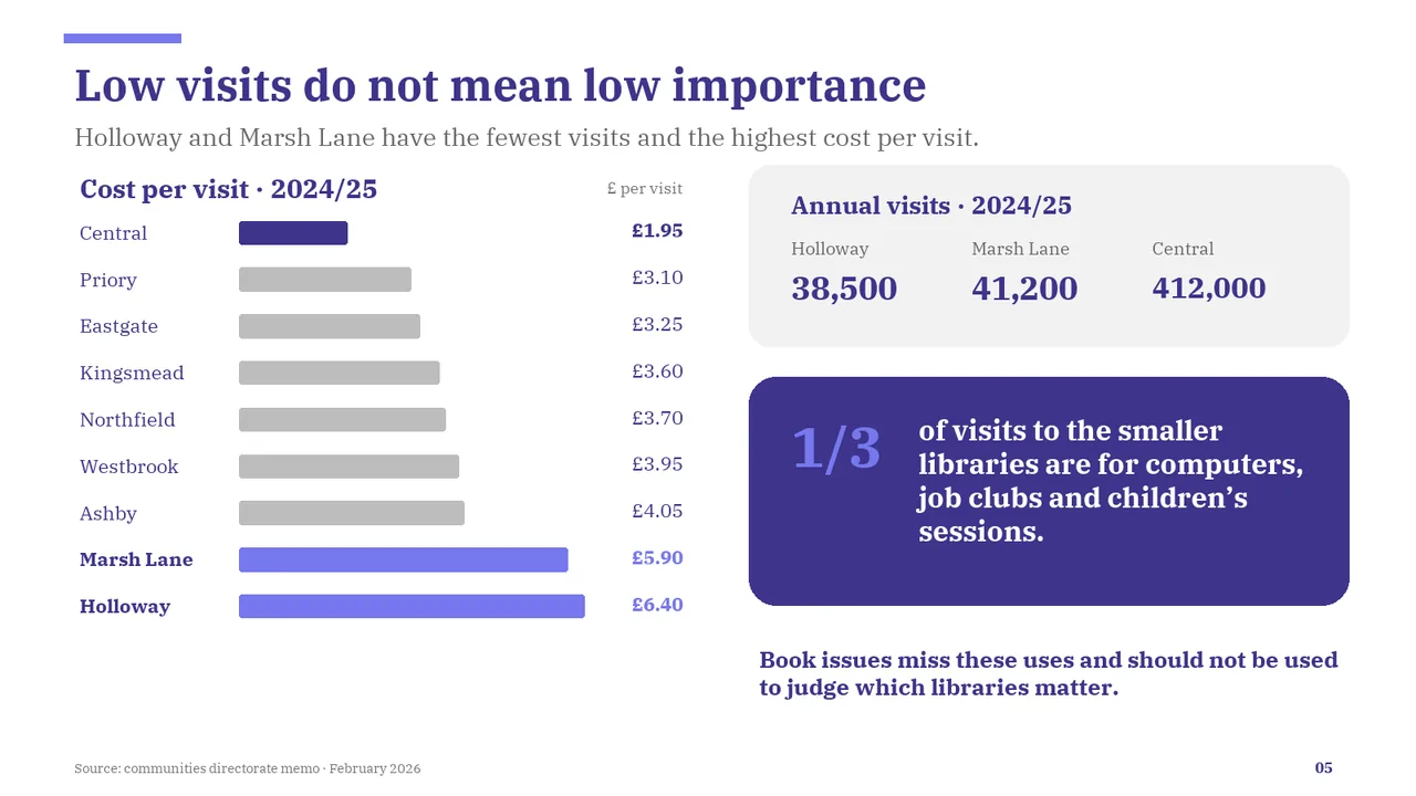
  5. Slide 5 of MiniMax M3.1 Flash's deck
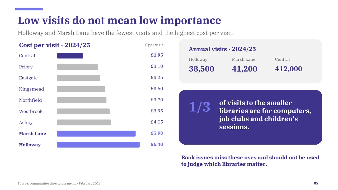
    Slide 5Download slide imagePolished The title says importance, but the chart shows cost per visit; the visual does not carry the title's point.
  6. Slide 6 of MiniMax M3.1 Flash's deck
    Slide 6Download slide imageAcceptable Option C's two-line heading sits too close to its supporting sentence, unlike the more generous spacing in the other rows.In row C, the title wraps to two lines and its descriptor line collides with 'groups', leaving no gap between them.
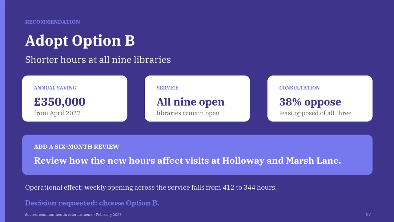
  7. Slide 7 of MiniMax M3.1 Flash's deck
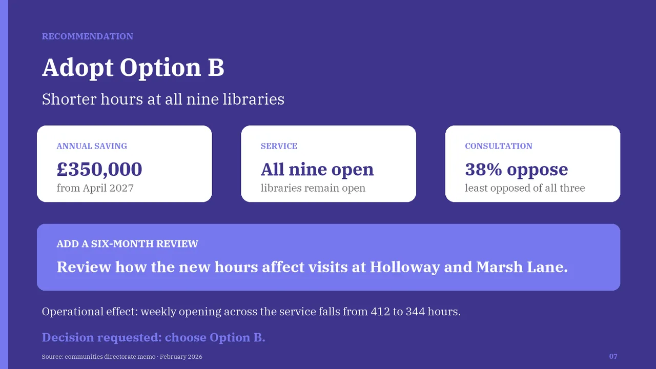
    Slide 7Download slide imagePolished