Mistral Medium 3.5: Library services: choosing how to save £350,000
For the council's cabinet (elected members), meeting in public. The decision it supports: which of three options to adopt to save £350,000 a year from libraries.
Verdict
Not presentable
Deck rating
649
Slides
6 (brief: 5-8)
Design quality
33%
Why it is not presentable
Layout defect: something off the slide, colliding, too small or too faint to read
Did not give the analysis's recommendation within the first two slides
A slide the judges rated as needing work
In detail
Slide 2: text 4 extends past the slide edge.
Slide 2: text 4: text runs off the slide.
Slide 1AcceptableContent is concentrated in the upper-left, leaving substantial unused space on the right and below.All content sits in the left half, leaving the right half and lower third empty, so the layout feels unbalanced
Slide 2Needs workThe footnote is cut off by the bottom edge of the slide.The footnote 'Note: Results reflect views of frequent users…' runs off the bottom edge of the slide and is clipped
Slide 3Needs workLibrary names are crowded together and wrap mid-word, making both charts' category labels difficult to read.X-axis library names break mid-word ('Centra/l', 'Hollow/ay', 'Eastga/te', 'Northf/ield', 'Westbr/ook') and neighbouring labels run into each other
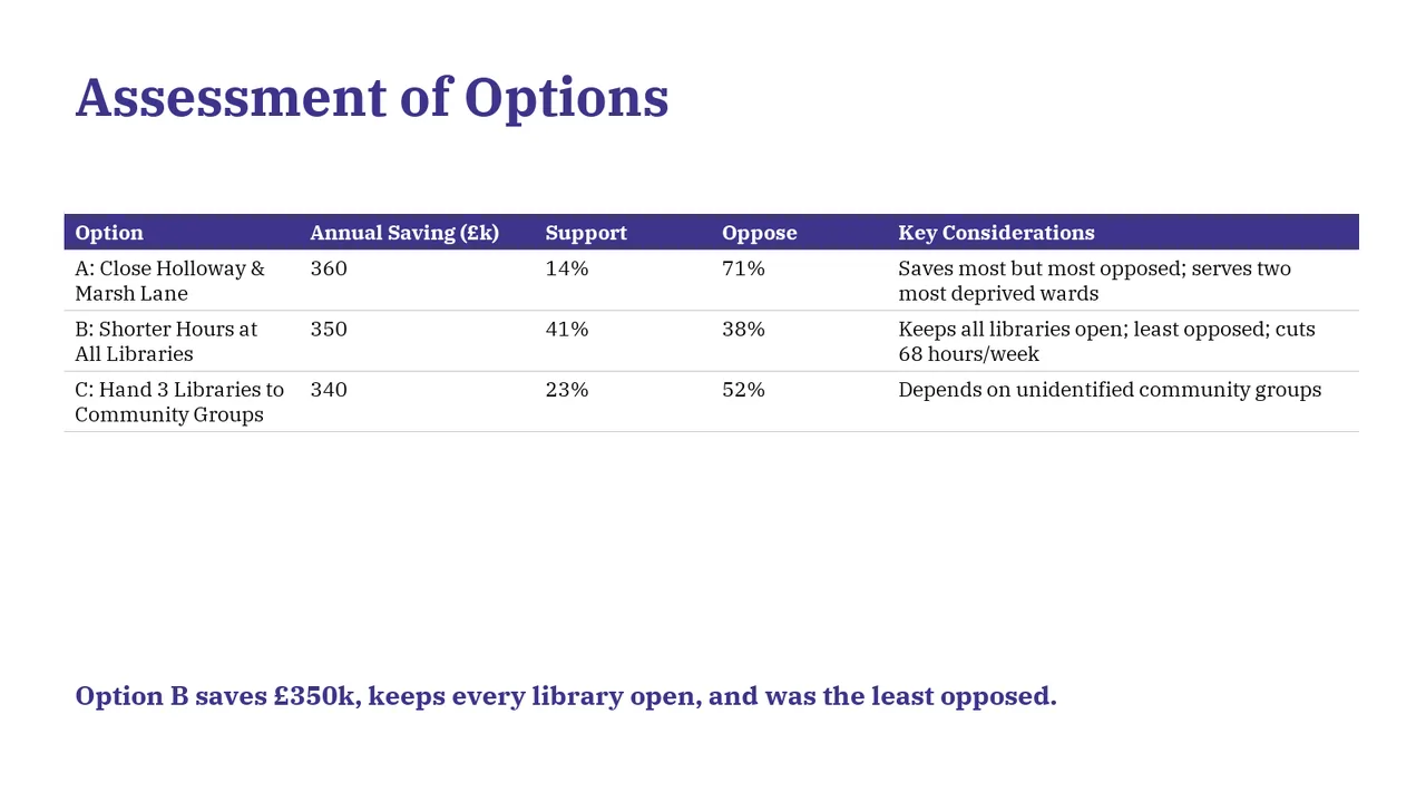
Slide 4AcceptableA large empty gap separates the table from the takeaway, weakening their visual connection.A large empty gap separates the table from the takeaway line at the bottom, which leaves the takeaway stranded
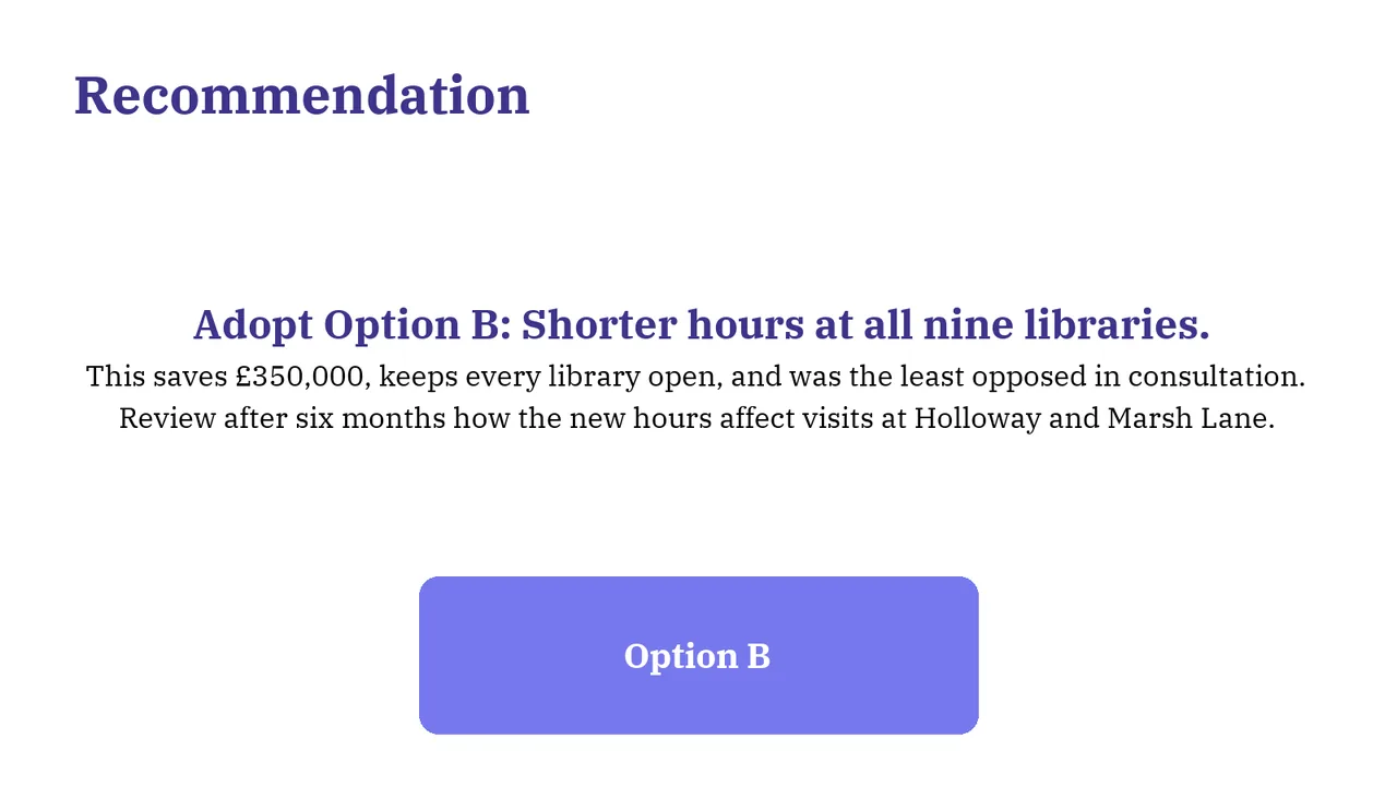
Slide 5AcceptableThe large Option B box repeats the recommendation without adding information and consumes substantial space.The 'Option B' box repeats the headline, adds no information and looks like a clickable button
Slide 6AcceptableThe closing layout is legible but generic; it provides no decision recap to keep visible during questions.The left-aligned title combined with centred body text gives inconsistent alignment