Muse Wonder: Starter churn: what to fund in Q1 2026
For the leadership team (chief executive, CFO, heads of product, sales and customer success). The decision it supports: whether to fund a Starter price cut or an onboarding programme in Q1 2026.
Verdict
Not presentable
Deck rating
1,273
Slides
8 (brief: 6-10)
Design quality
81%
Why it is not presentable
Layout defect: something off the slide, colliding, too small or too faint to read
A slide the judges rated as needing work
In detail
Slide 1: A text box set at 9 pt, too small to read
Slide 2: A text box set at 8 pt, too small to read
Slide 3: A text box set at 8 pt, too small to read
Slide 4: A text box set at 8 pt, too small to read
Slide 5: A text box set at 8 pt, too small to read
Slide 6: A text box set at 8 pt, too small to read
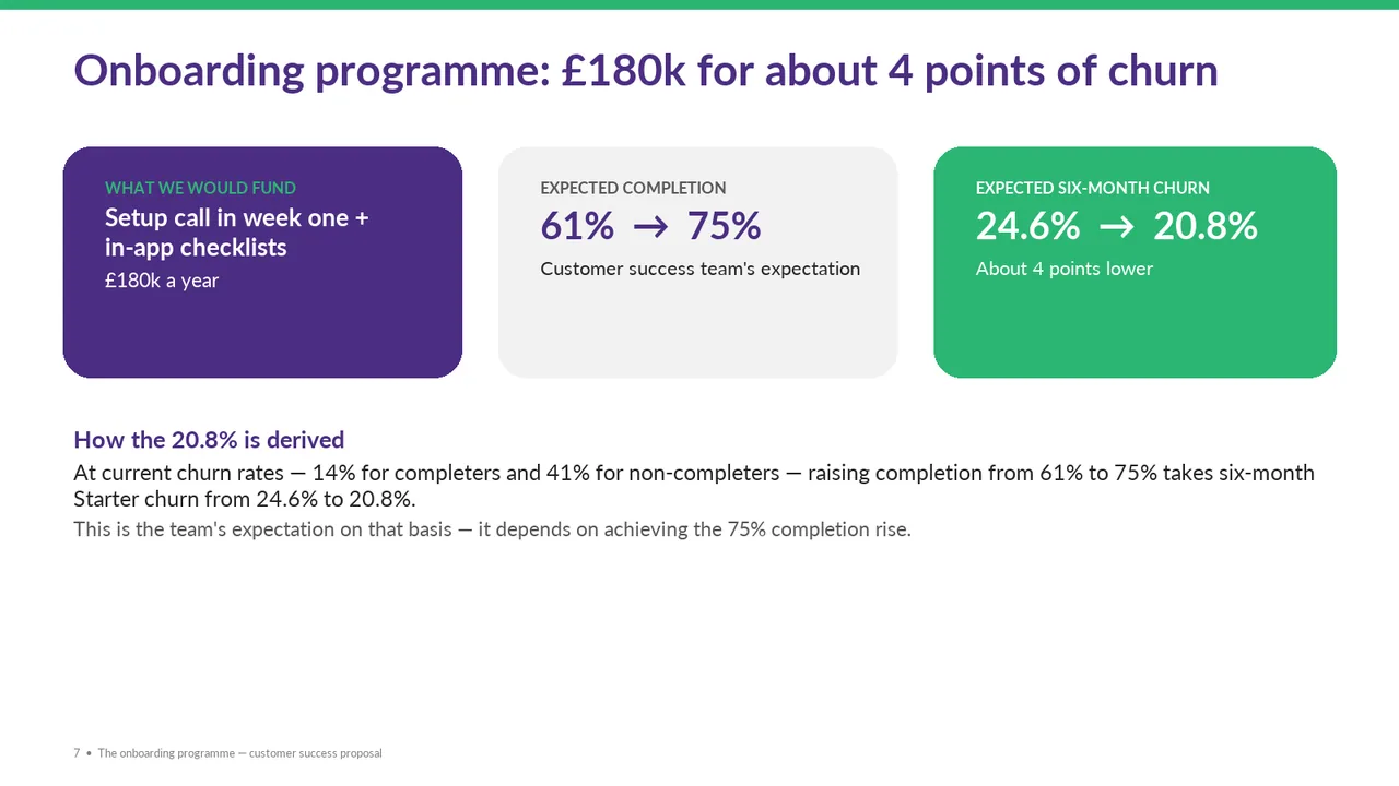
Slide 7: 2 body text boxes set at 11 pt, too small to read
Slide 1Polished
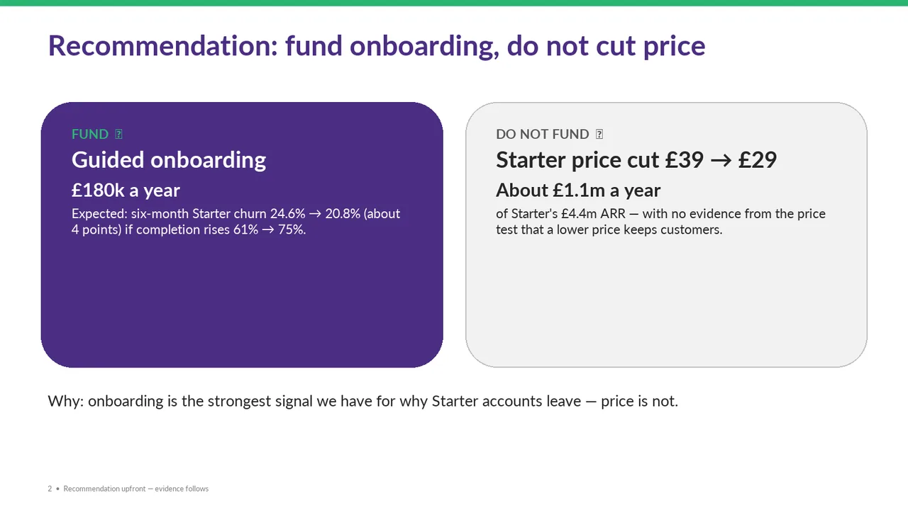
Slide 2Needs workThe symbols after 'FUND' and 'DO NOT FUND' appear as missing-glyph boxes; replace them with supported icons or remove them.Missing-glyph boxes (tofu) appear after 'FUND' and 'DO NOT FUND'; the icon characters failed to render
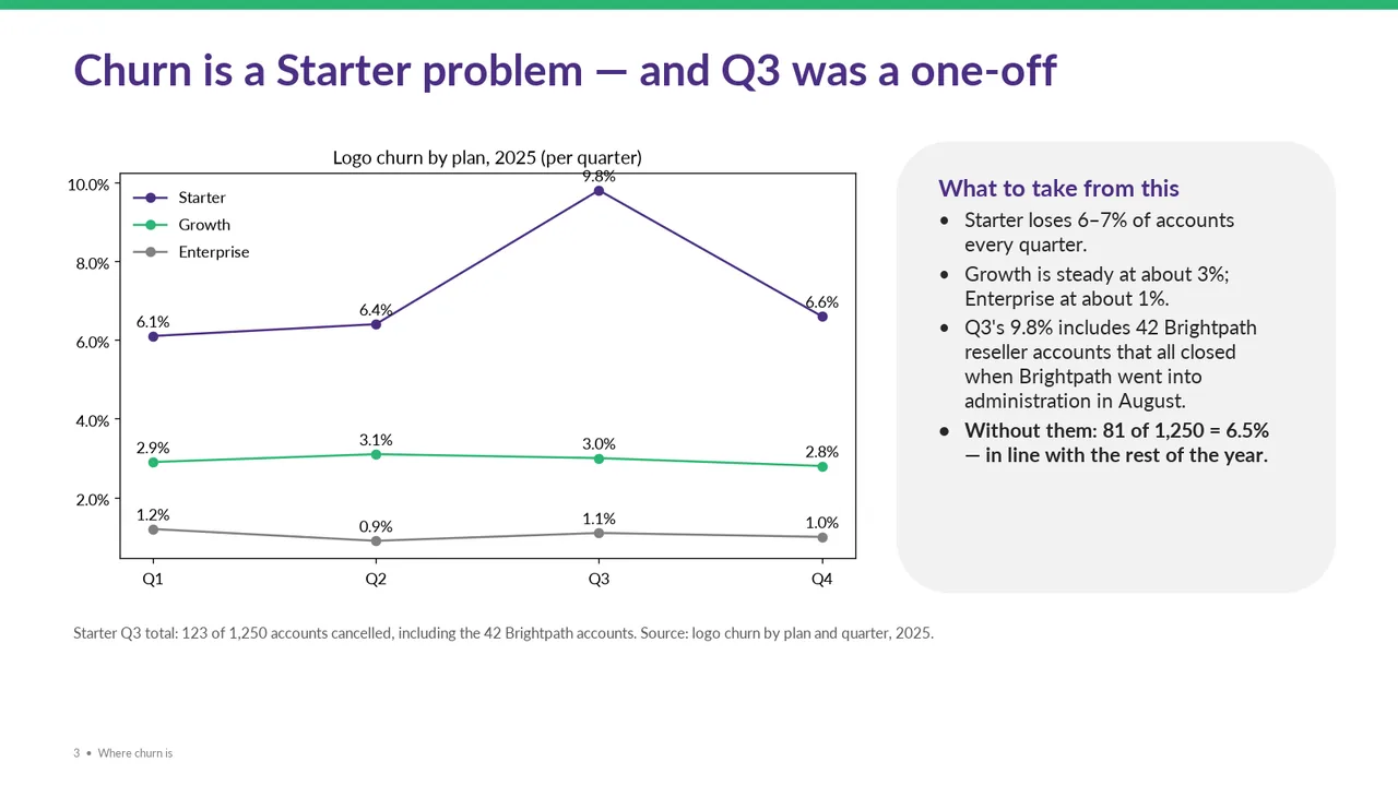
Slide 3PolishedThe '9.8%' data label collides with the top border of the plot frame
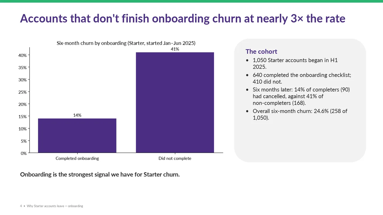
Slide 4PolishedBoth bars use the same colour, so the 'did not complete' bar gets no extra emphasis
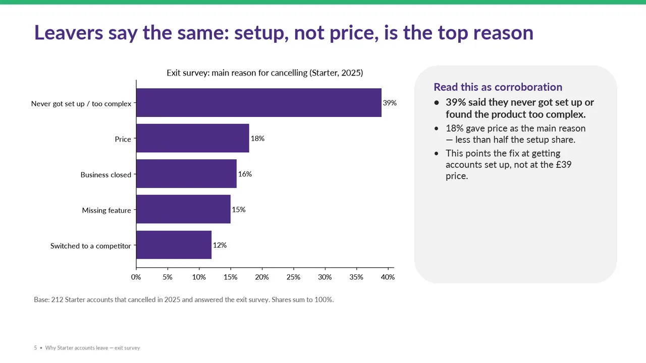
Slide 5PolishedEvery bar is the same colour; the setup bar and the price bar are not highlighted against the others
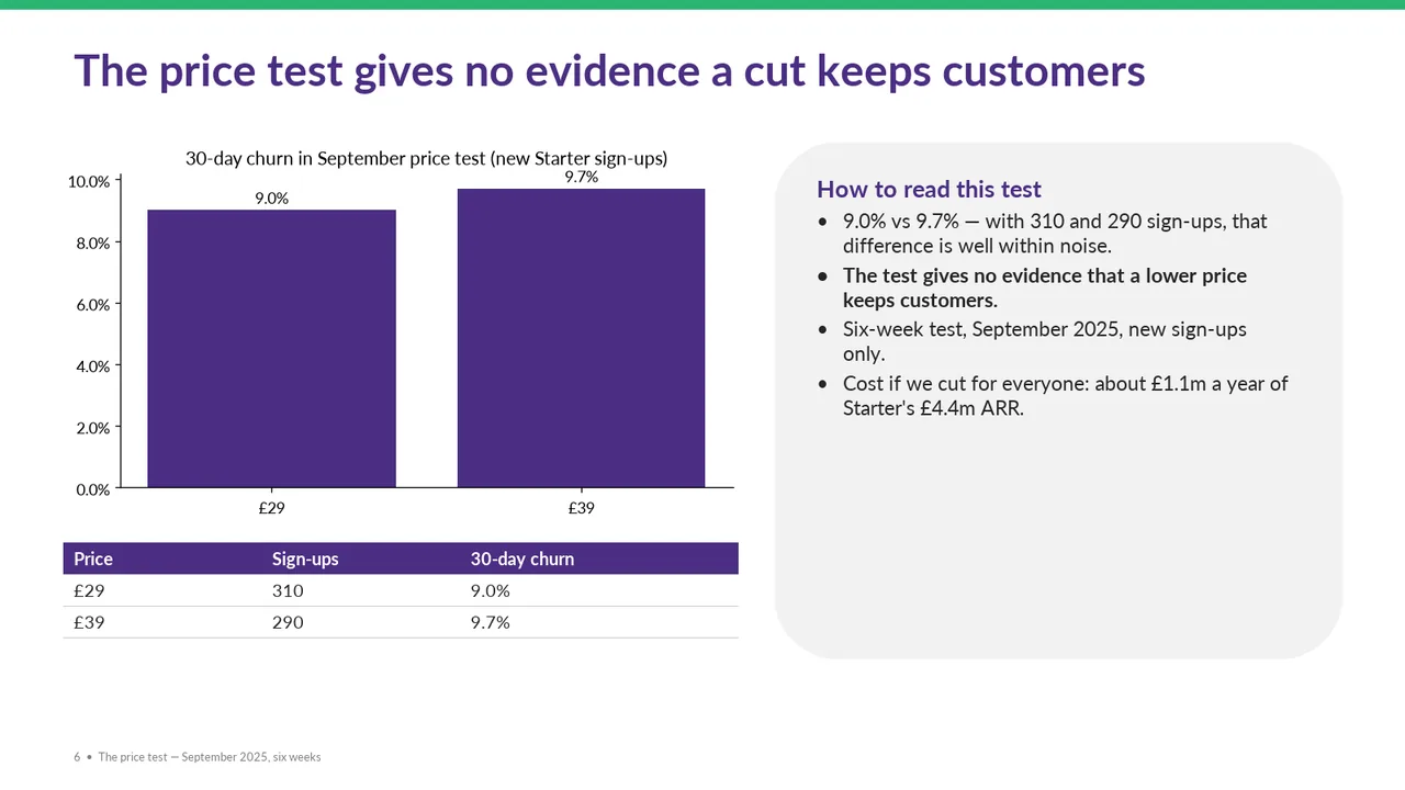
Slide 6AcceptableThe table repeats the chart's prices and churn percentages, adding visual weight mainly to communicate two sign-up counts.The '9.7%' label is crammed against the chart title and the axis top
Slide 7PolishedThe bottom third of the slide is empty, so the layout feels top-heavy
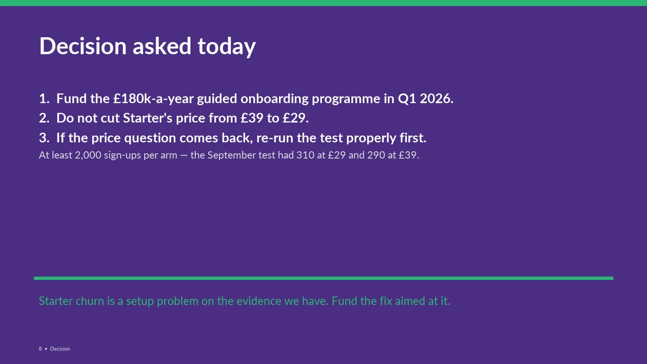
Slide 8PolishedA large empty middle separates the decision list from the closing takeaway, weakening the layout's balance.