Benchmarks / DeckBench / Kestrel Logistics
Measured by Spring Prompt
Gemini 4 Carbon: On-time delivery: what is going wrong and what to fund
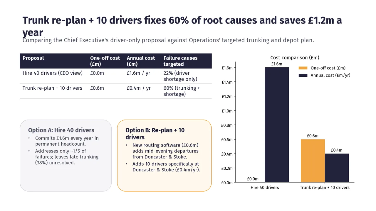
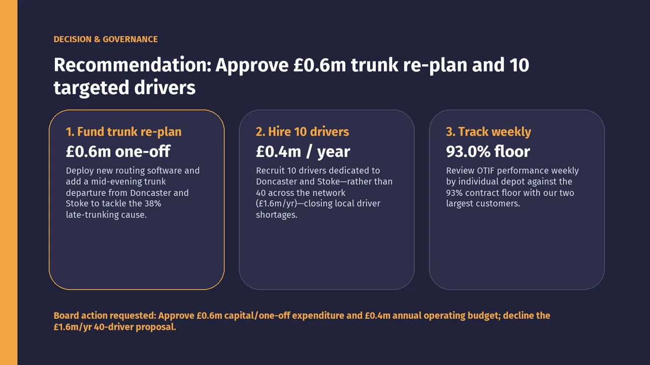
For the board and the company's three main investors. The decision it supports: whether to fund 40 more drivers or a trunk re-plan with 10 drivers.
- Verdict
- Not presentable
- Deck rating
- 1,021
- Slides
- 6 (brief: 5-8)
- Design quality
- 58%
Why it is not presentable
- Layout defect: something off the slide, colliding, too small or too faint to read
- Made a material claim the analysis does not support
- A slide the judges rated as needing work
In detail
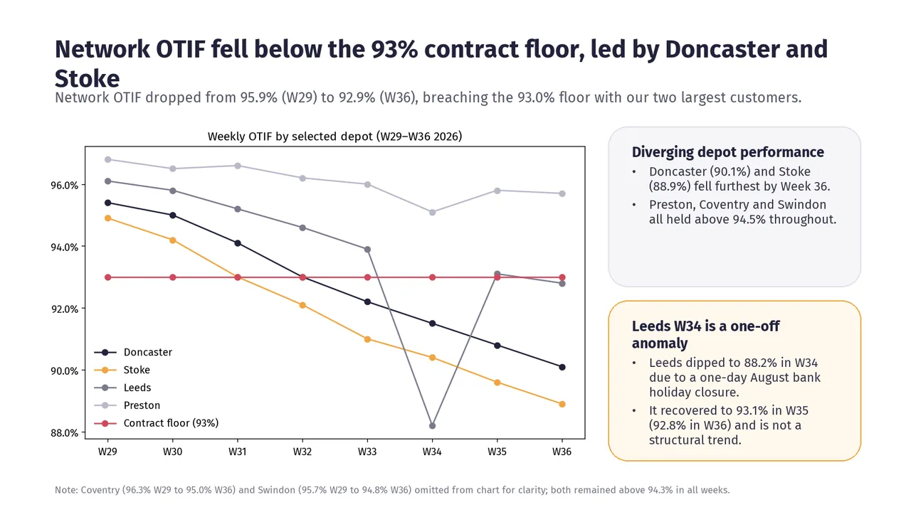
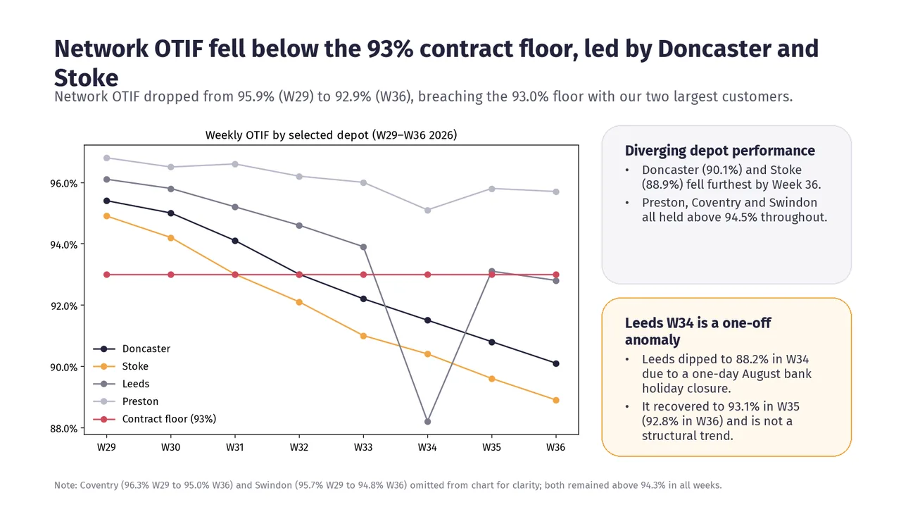
- Slide 2: “Preston, Coventry and Swindon all held above 94.5% throughout.” is not supported by the analysis.
- Slide 2: “Coventry and Swindon both remained above 94.3% in all weeks.” is not supported by the analysis.
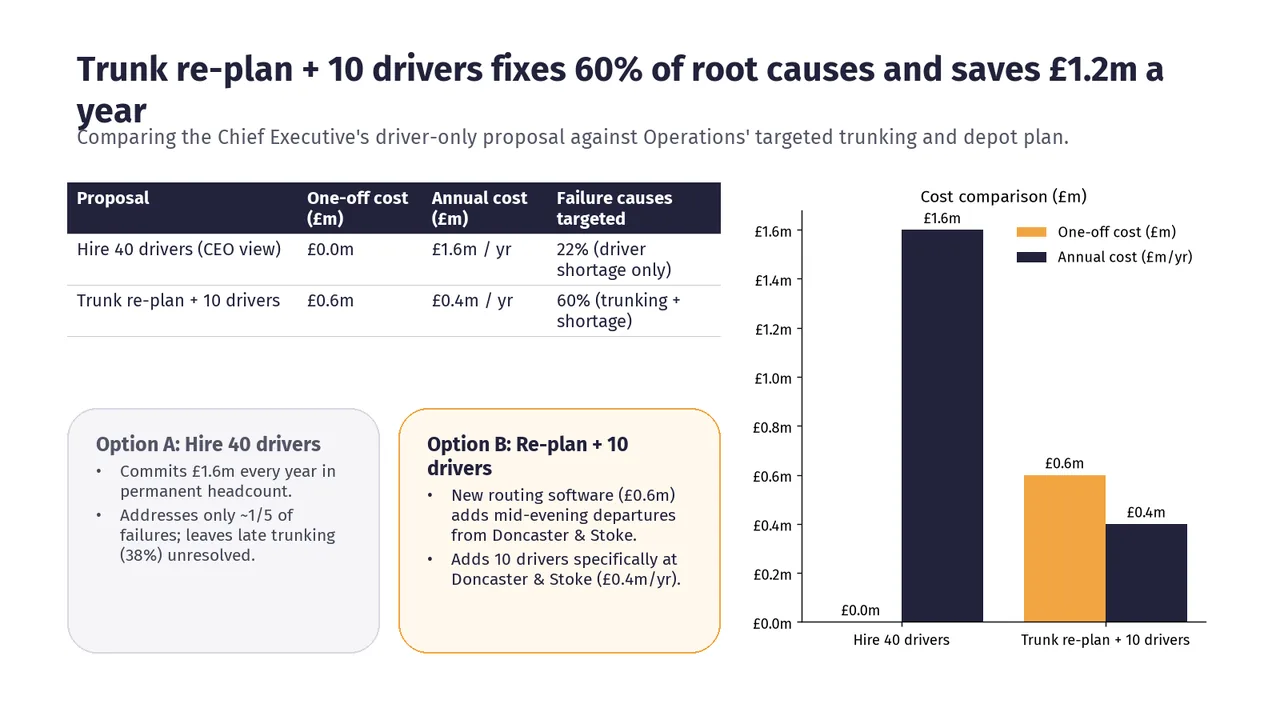
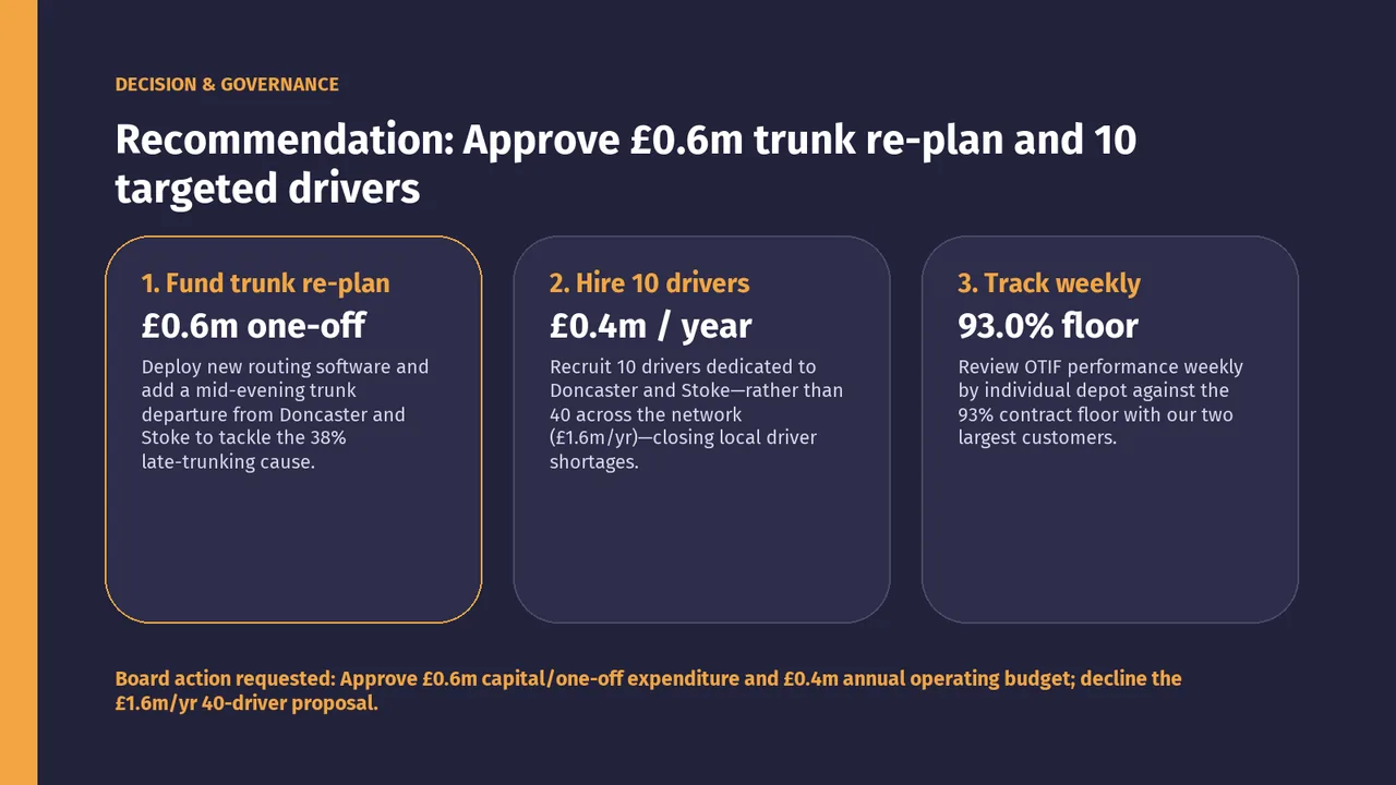
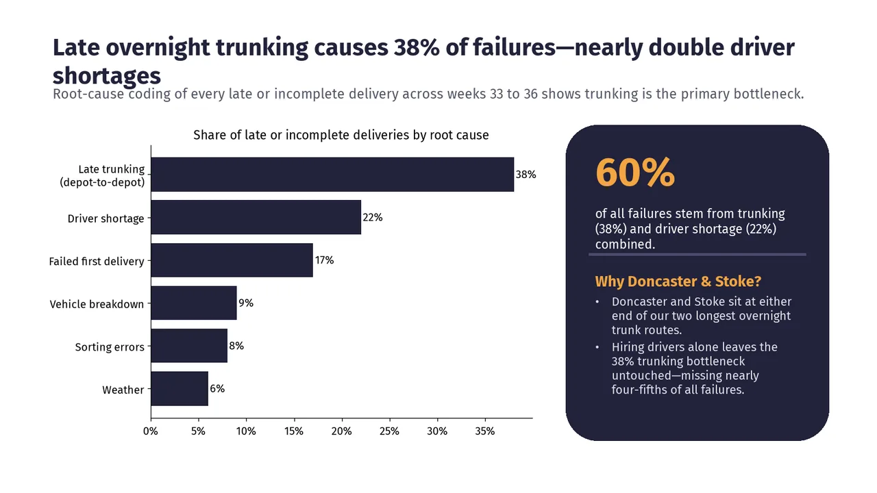
- Slide 5: “Trunk re-plan + 10 drivers fixes 60% of root causes.” is not supported by the analysis.
- Slide 6: “Recruiting 10 drivers dedicated to Doncaster and Stoke closes local driver shortages.” is not supported by the analysis.
- Slide 5: “Trunk re-plan + 10 drivers fixes 60% of root causes” is not supported by the analysis.
- Slide 2: Two text boxes overlap
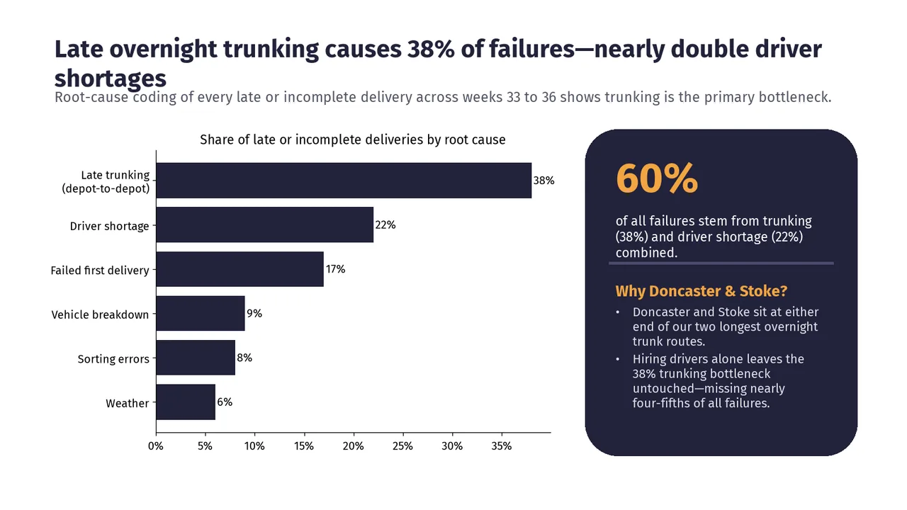
- Slide 3: Two text boxes overlap
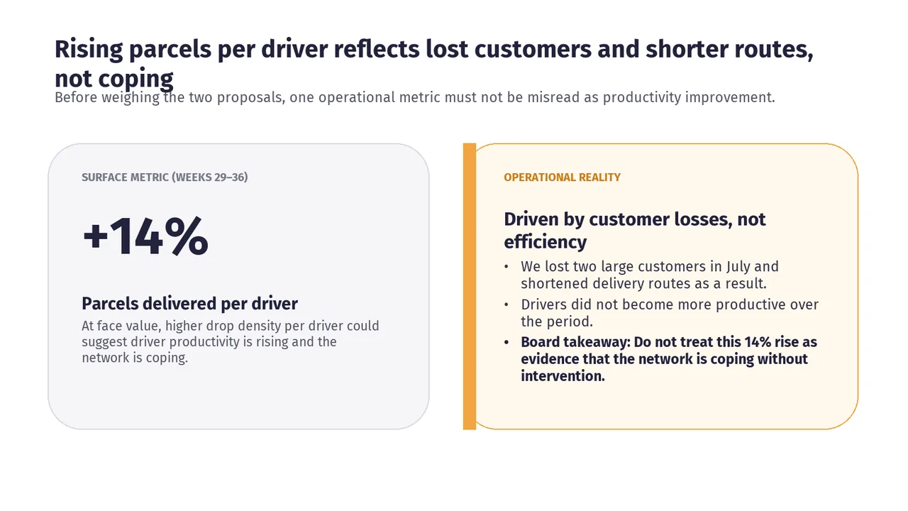
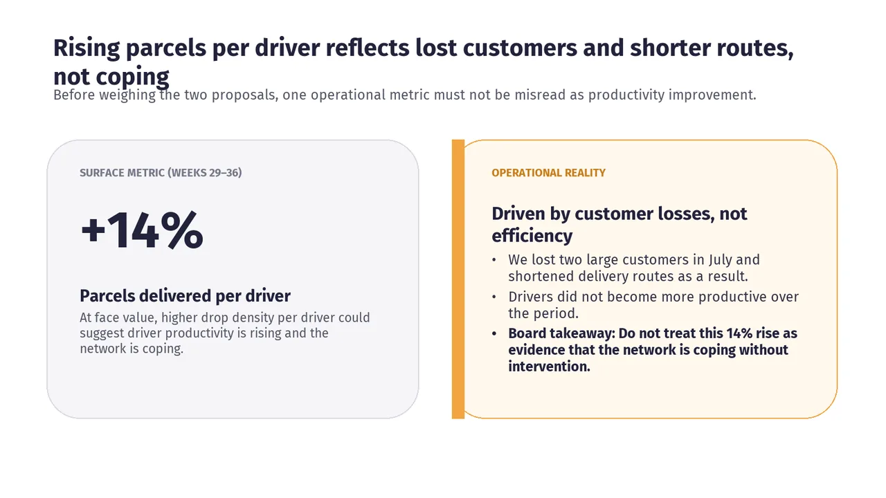
- Slide 4: Two text boxes overlap