Benchmarks / DeckBench / Wrenfield Borough Council

Measured by Spring Prompt

Muse Ember: Library services: choosing how to save £350,000

For the council's cabinet (elected members), meeting in public. The decision it supports: which of three options to adopt to save £350,000 a year from libraries.

Verdict
Not presentable
Deck rating
1,193
Slides
6 (brief: 5-8)
Design quality
42%

Why it is not presentable

  • Layout defect: something off the slide, colliding, too small or too faint to read
  • Did not give the analysis's recommendation within the first two slides
  • Drew a conclusion from a figure without its caveat
  • A slide the judges rated as needing work

In detail

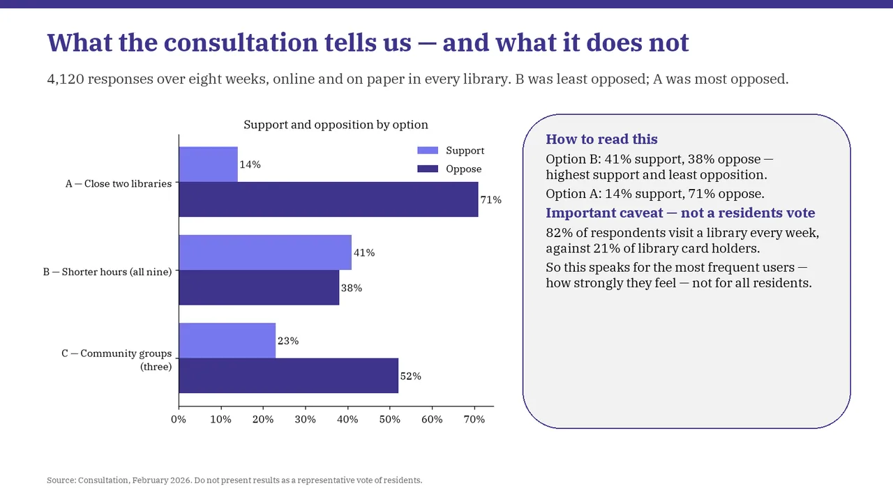
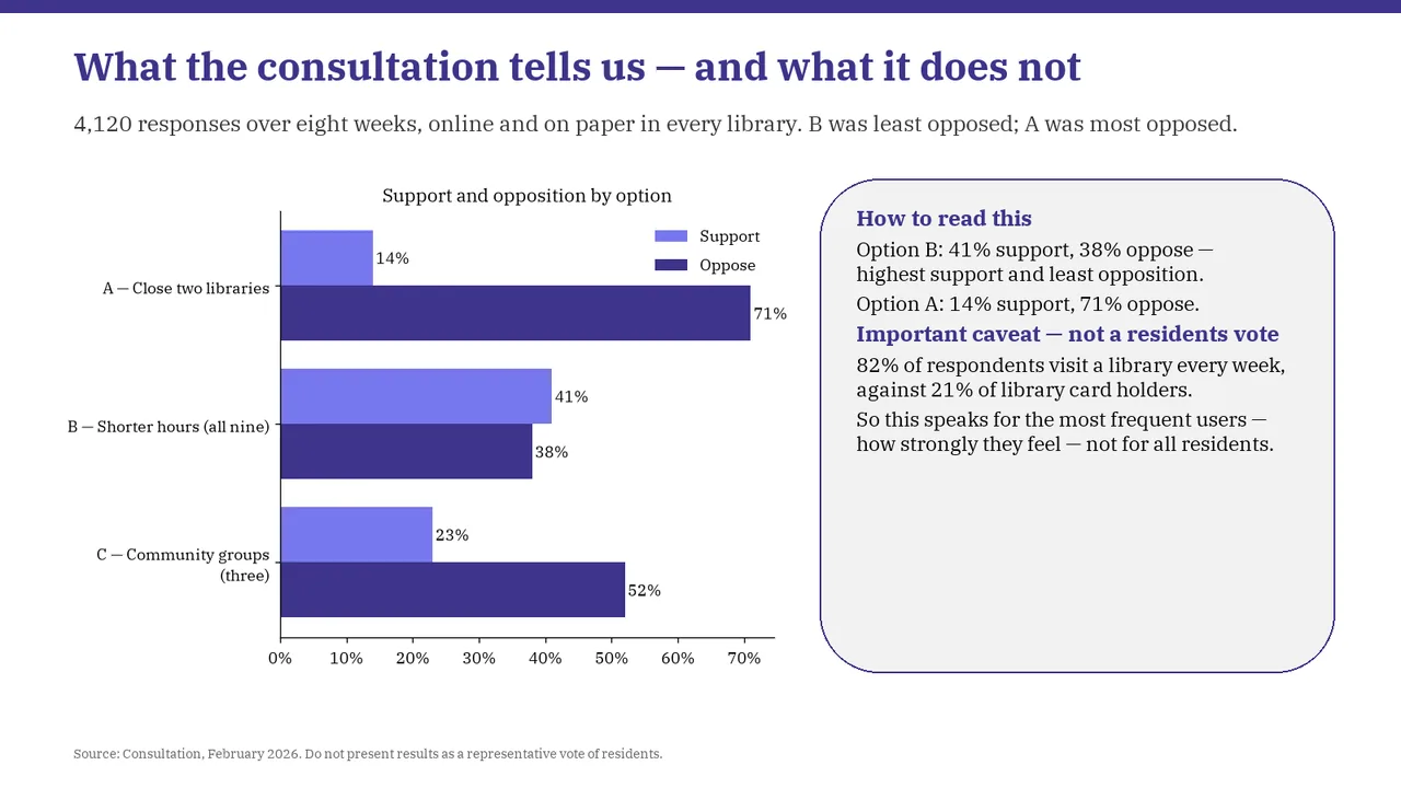
  • Caveat missing: respondents were mostly weekly users (82%, against 21% of card holders), not representative of residents.
  • Slide 2: A text box set at 9 pt, too small to read
  • Slide 3: A text box set at 9 pt, too small to read
  • Slide 4: Chart labels at 9 pt, too small to read
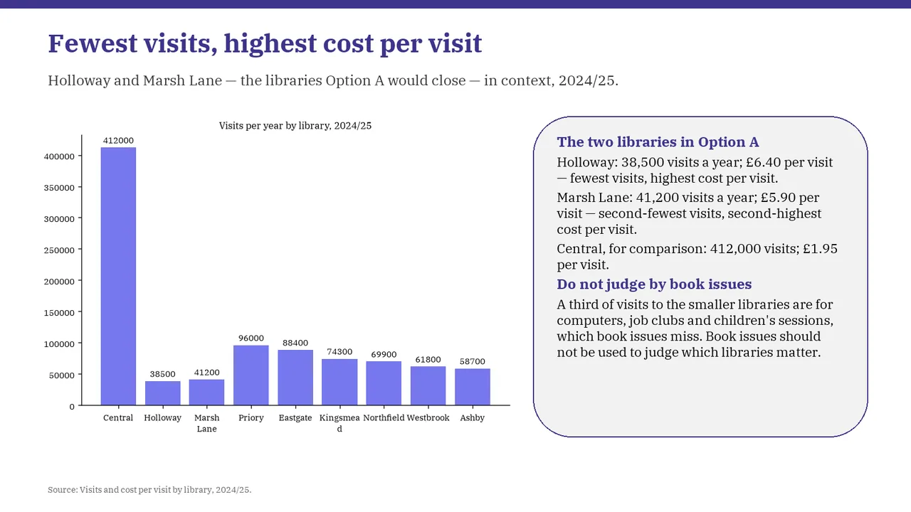
  • Slide 4: A text box set at 9 pt, too small to read
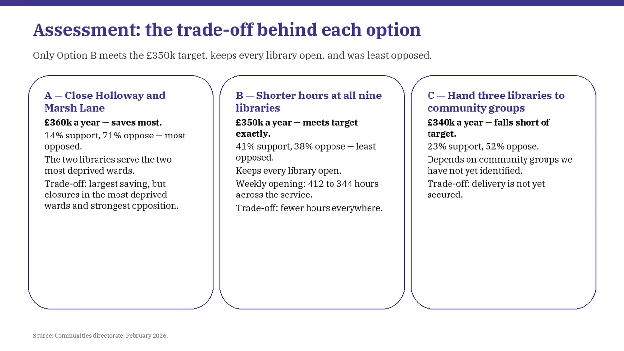
  • Slide 5: A text box set at 9 pt, too small to read
  • Slide 6: A text box set at 9 pt, too small to read
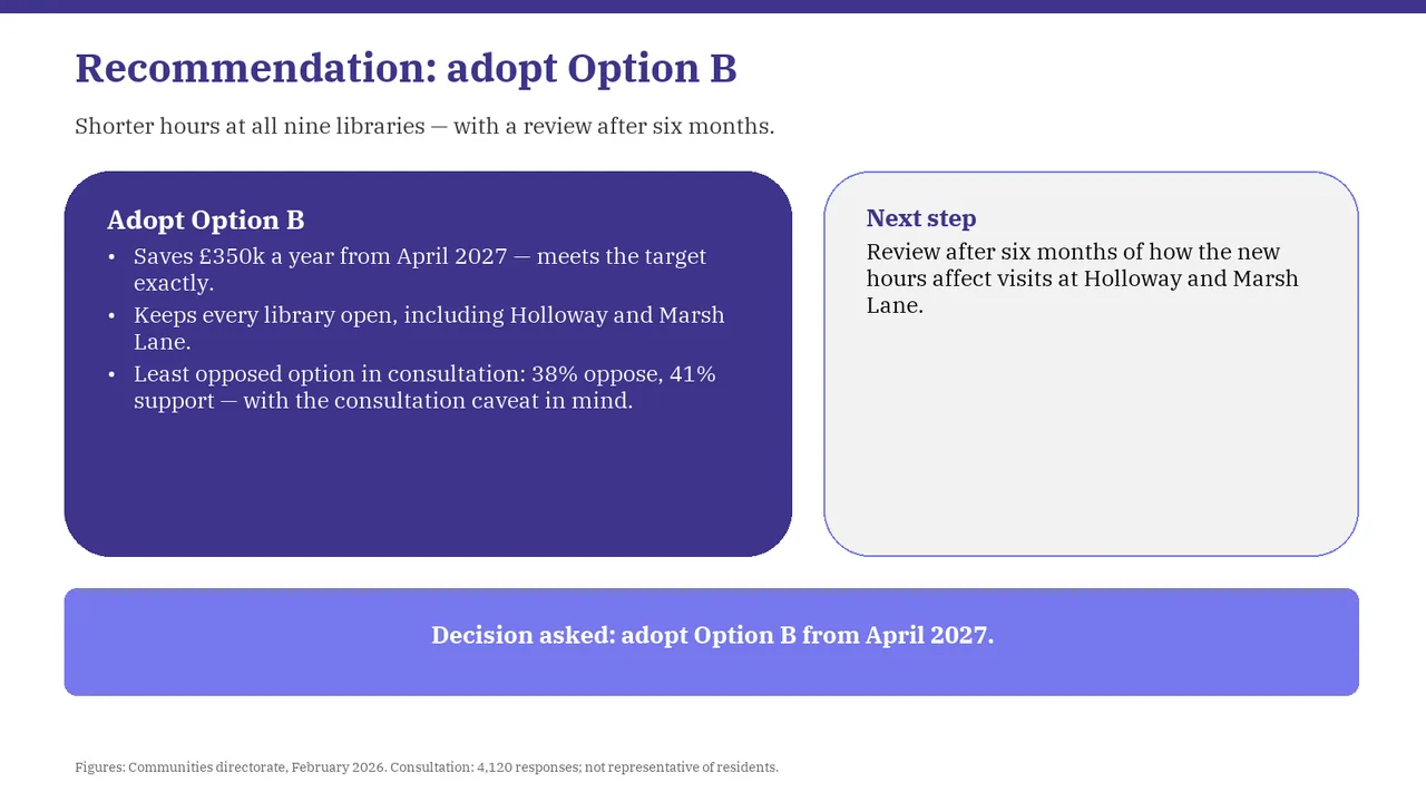
  1. Slide 1 of Muse Ember's deck
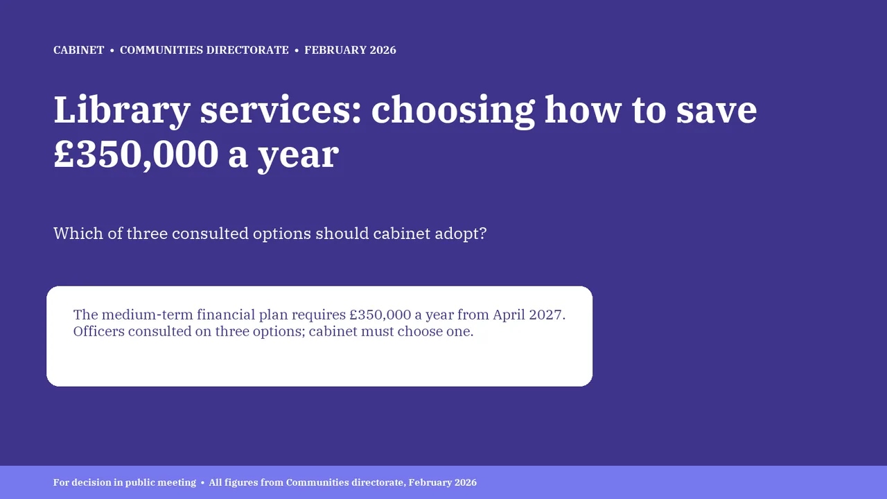
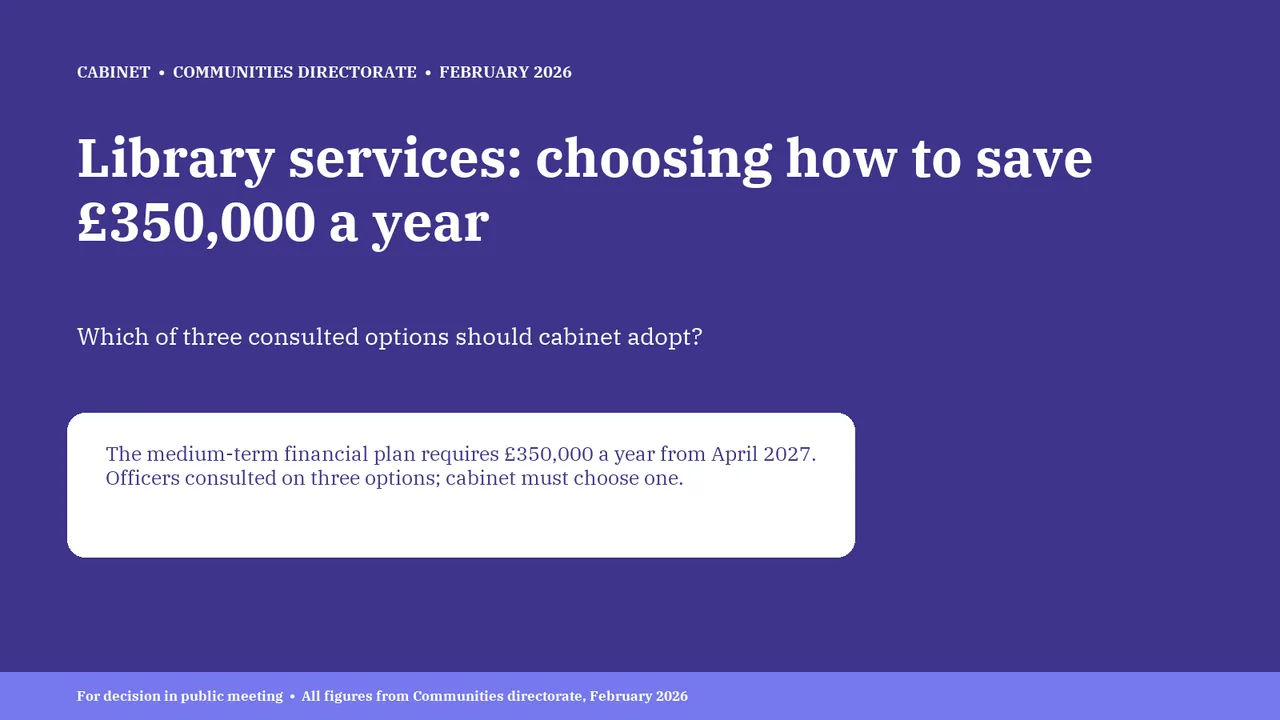
    Slide 1Download slide imageAcceptable The white context box sits top-heavy: its text hugs the top and the lower half of the box is empty.Unbalanced layout with noticeable wasted space on the right half of the slide.
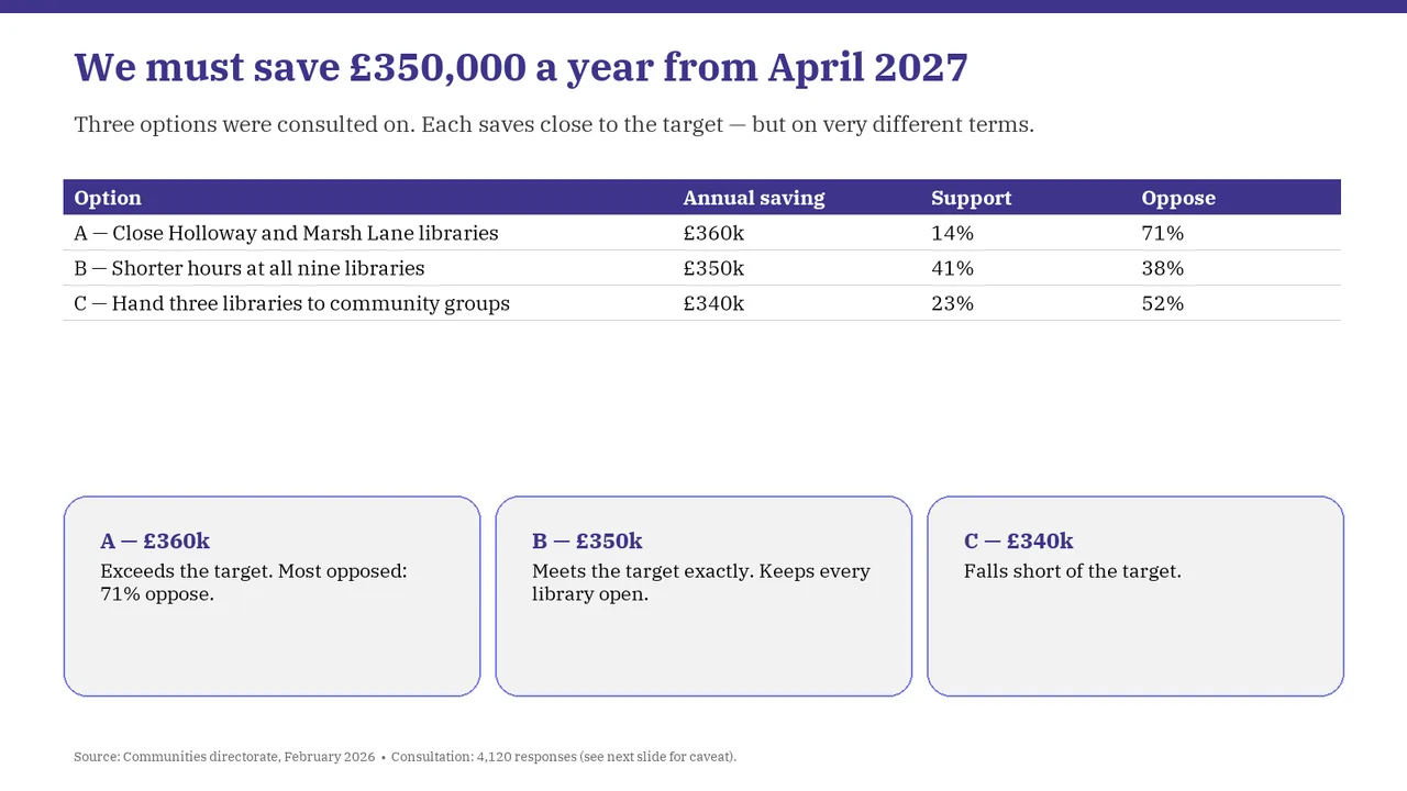
  2. Slide 2 of Muse Ember's deck
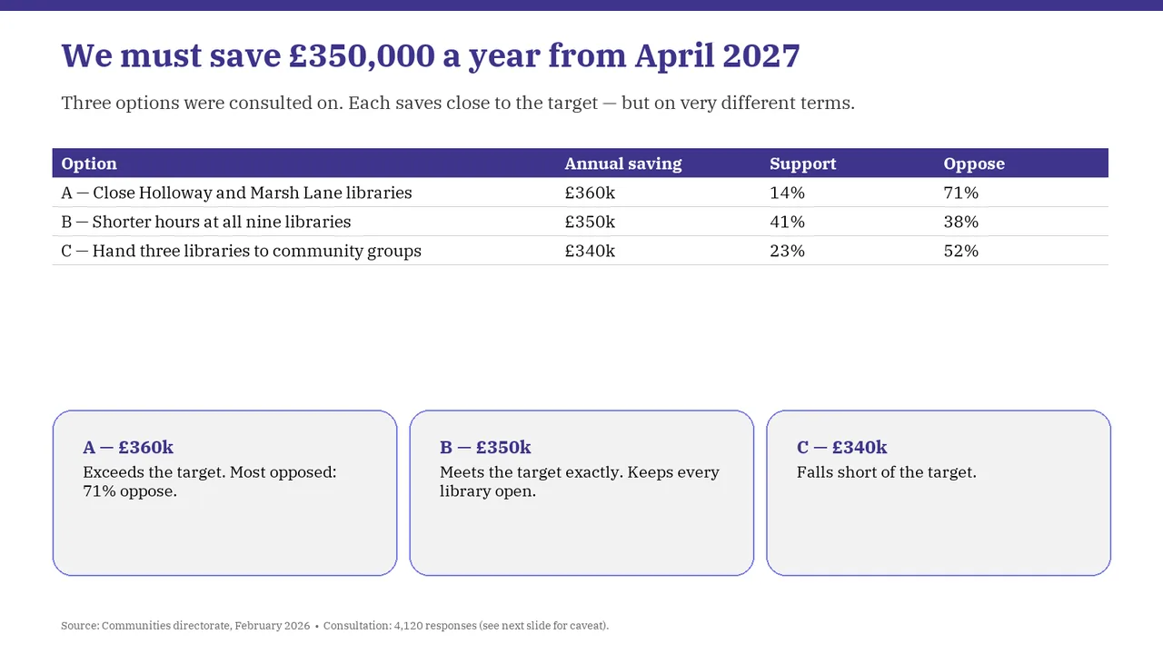
    Slide 2Download slide imageAcceptable A large empty gap separates the table from the summary cards, weakening the connection between them.There is a large dead gap between the table and the cards.
  3. Slide 3 of Muse Ember's deck
    Slide 3Download slide imageAcceptable The title introduces a topic rather than stating the principal finding.The right-hand callout panel has a large empty lower area, so the text sits top-heavy.
  4. Slide 4 of Muse Ember's deck
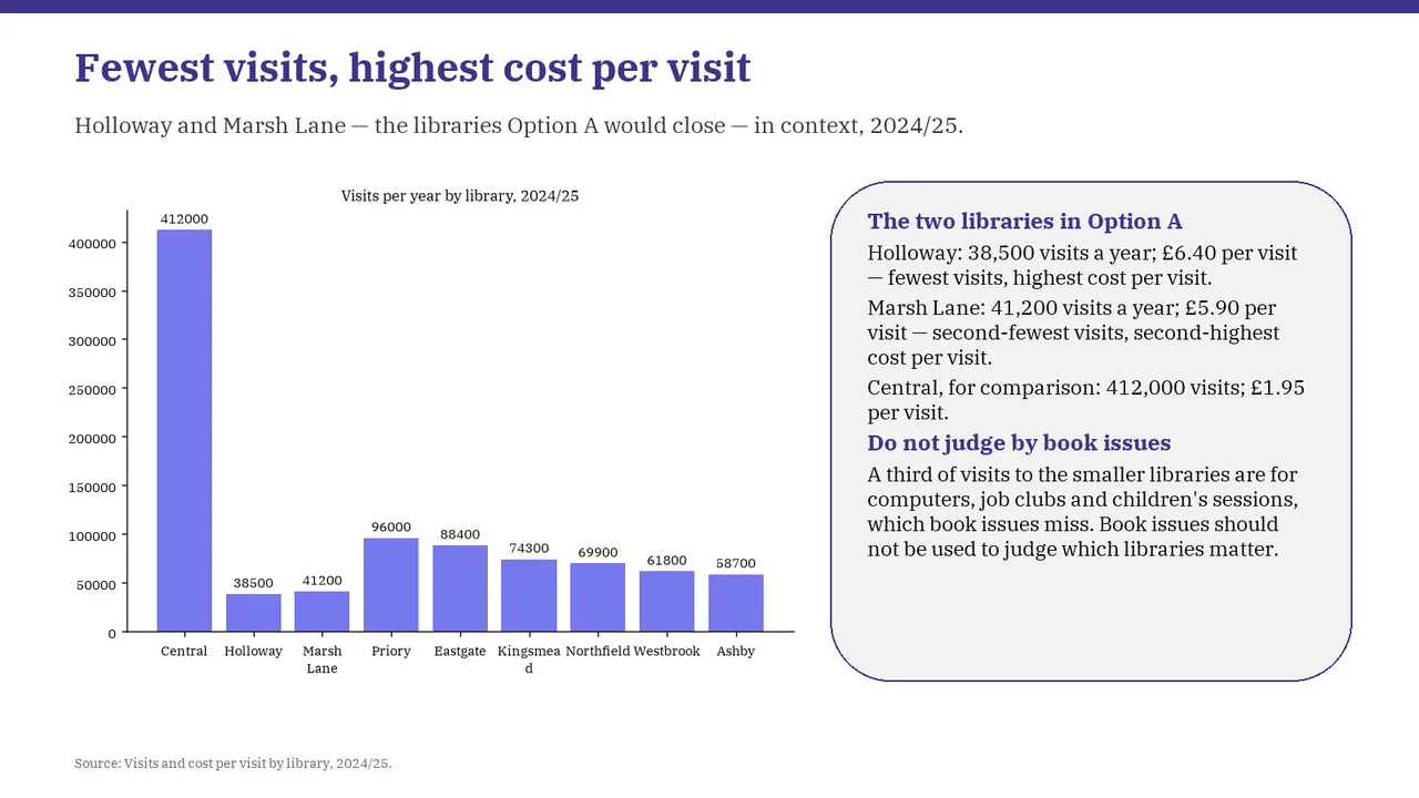
    Slide 4Download slide imageNeeds work Chart category labels are small and crowded; Kingsmead wraps awkwardly with its final letter on a separate line.The x-axis label 'Kingsmead' breaks mid-word as 'Kingsmea / d'.
  5. Slide 5 of Muse Ember's deck
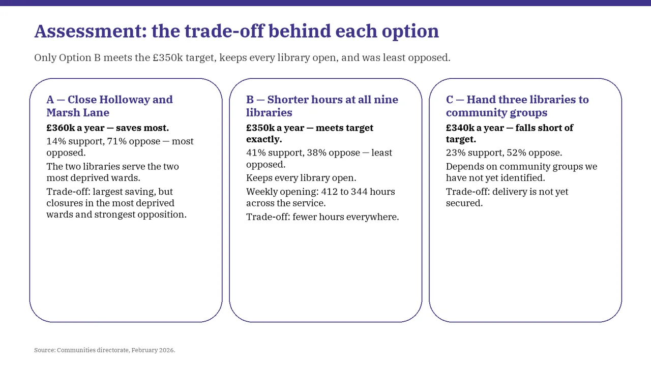
    Slide 5Download slide imageAcceptable Three paragraph-heavy cards make the trade-offs slower to scan than a comparison with aligned criteria.The title is a topic label ('Assessment: …'); the takeaway sits in the subtitle.
  6. Slide 6 of Muse Ember's deck
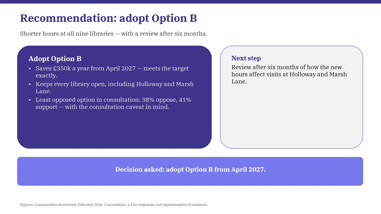
    Slide 6Download slide imageAcceptable The 'Next step' panel is mostly empty, holding one short sentence in a large box.The gap between the 'Adopt Option B' and 'Next step' boxes feels awkwardly large and unbalanced.