Benchmarks / DeckBench / Lumio

Measured by Spring Prompt

minimax-m3.1-flash:free: Starter churn: what to fund in Q1 2026

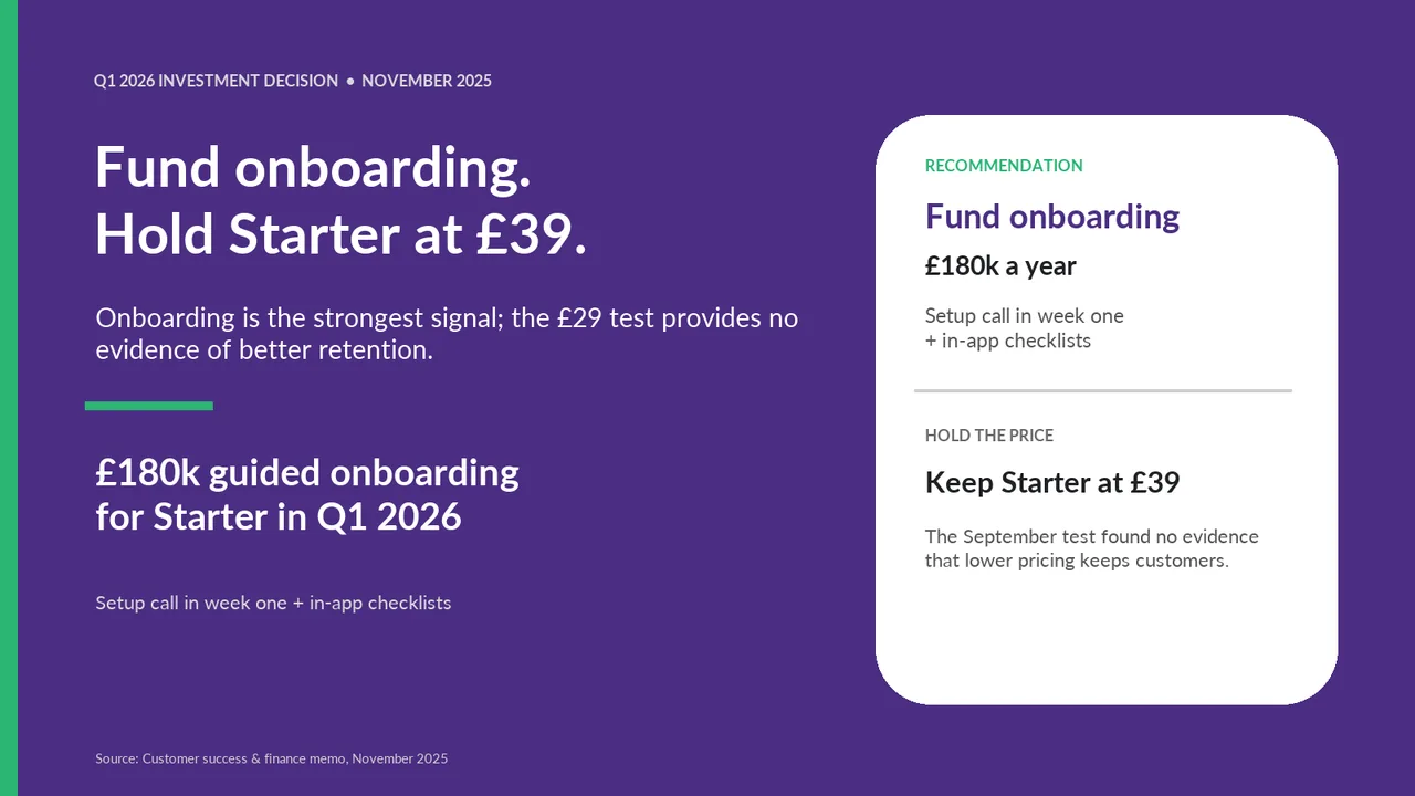
For the leadership team (chief executive, CFO, heads of product, sales and customer success). The decision it supports: whether to fund a Starter price cut or an onboarding programme in Q1 2026.

Verdict
Not presentable
Deck rating
1,090
Slides
7 (brief: 6-10)
Design quality
86%

Why it is not presentable

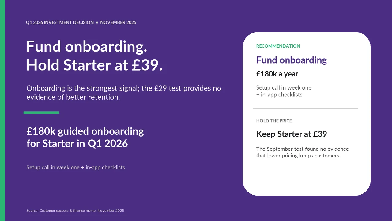
  • Layout defect: something off the slide, colliding, too small or too faint to read

In detail

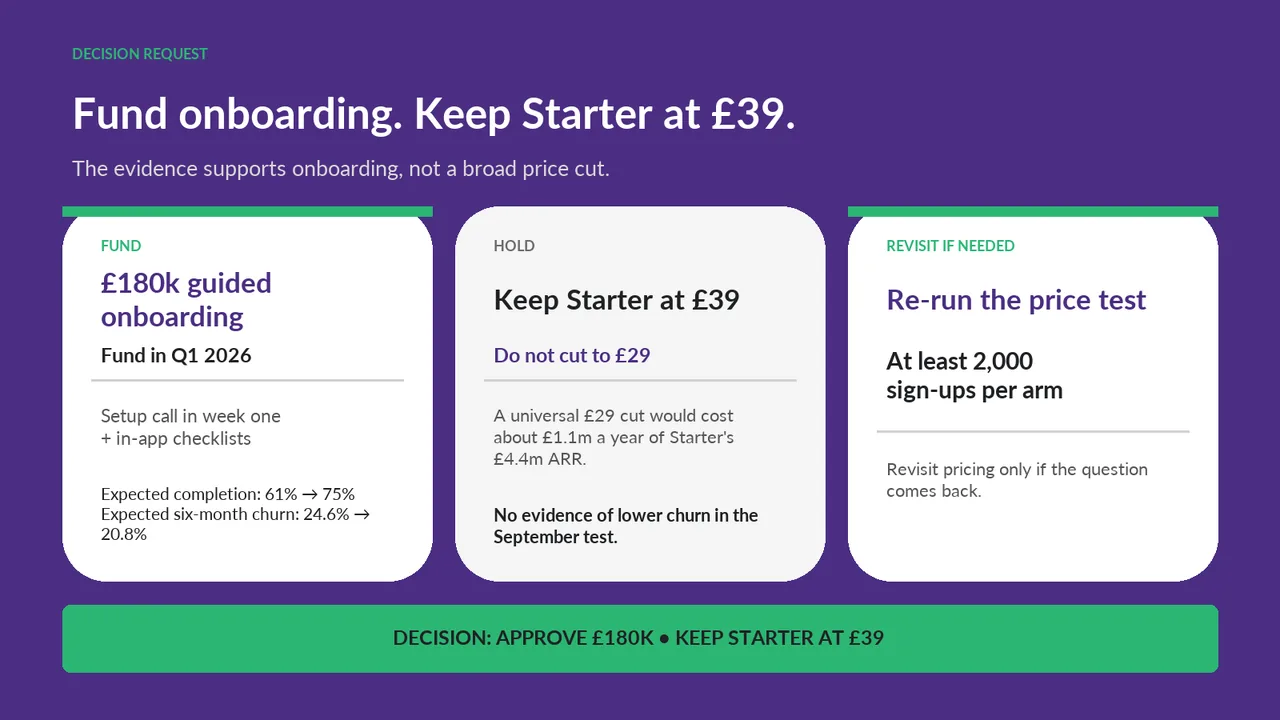
  • Slide 1: 3 body text boxes set at 11 pt, too small to read
  • Slide 1: A text box set at 9 pt, too small to read
  • Slide 2: 2 body text boxes set at 11 pt, too small to read
  • Slide 2: A body text box set at 10.5 pt, too small to read
  • Slide 2: Text too faint against its background (contrast 2.4:1)
  1. Slide 1 of minimax-m3.1-flash:free's deck
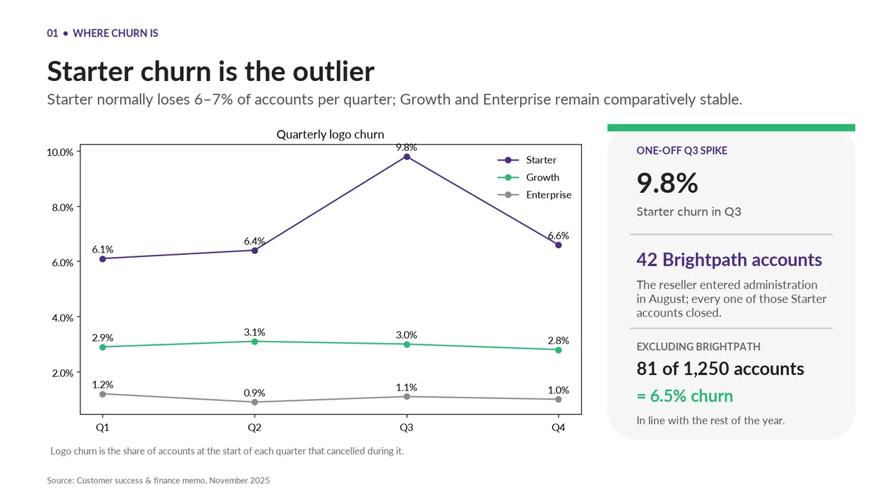
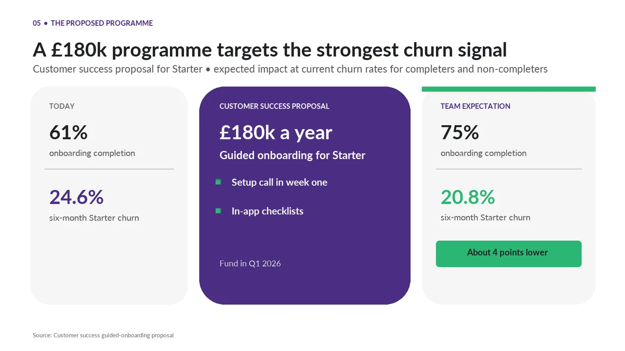
    Slide 1Download slide imagePolished The right-hand card repeats the left column: £180k onboarding and 'setup call in week one + in-app checklists' both appear twice
  2. Slide 2 of minimax-m3.1-flash:free's deck
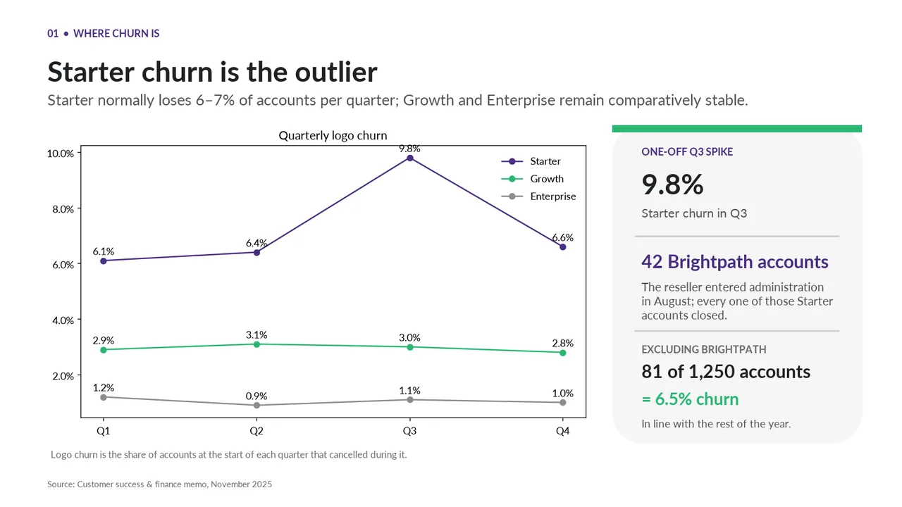
    Slide 2Download slide imagePolished The '9.8%' data label touches the top border of the chart frame
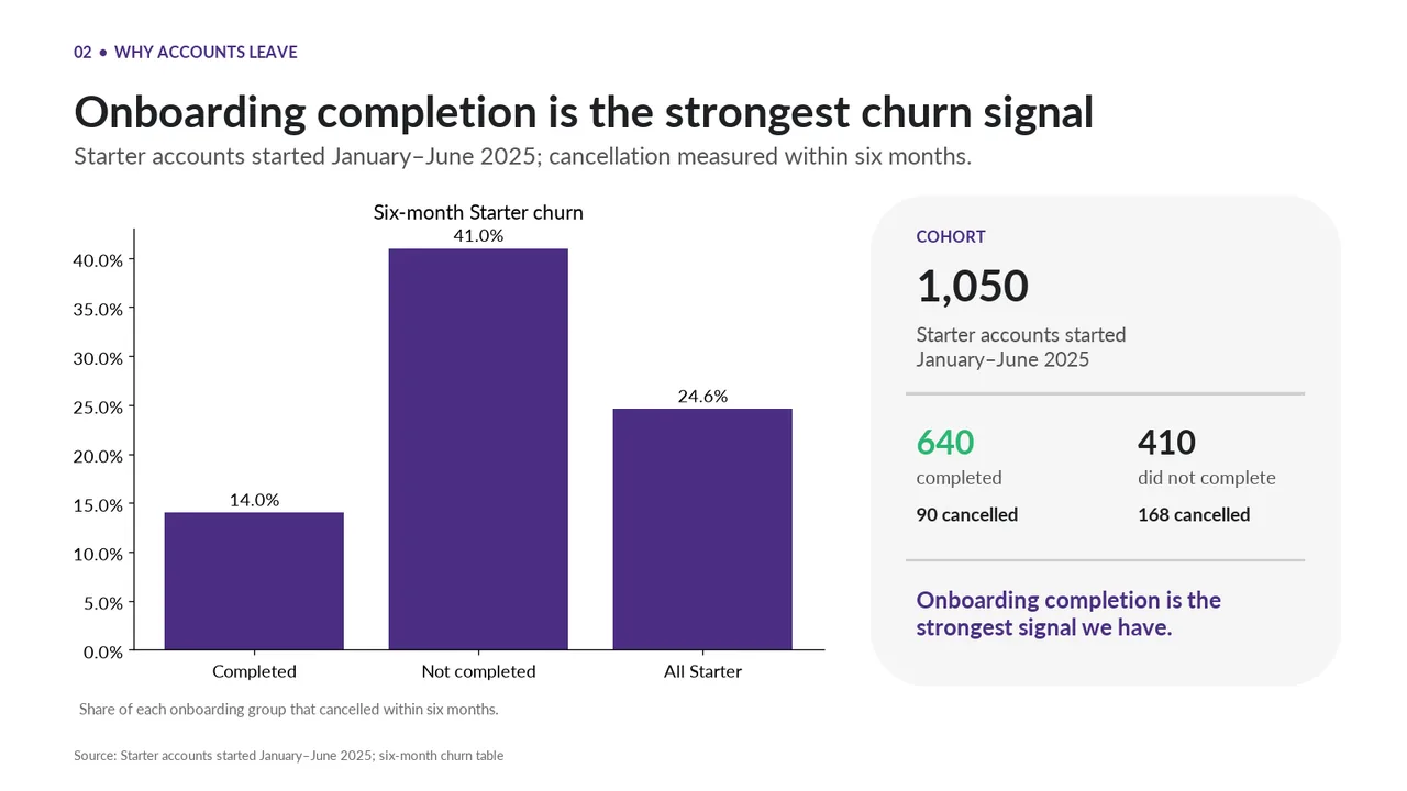
  3. Slide 3 of minimax-m3.1-flash:free's deck
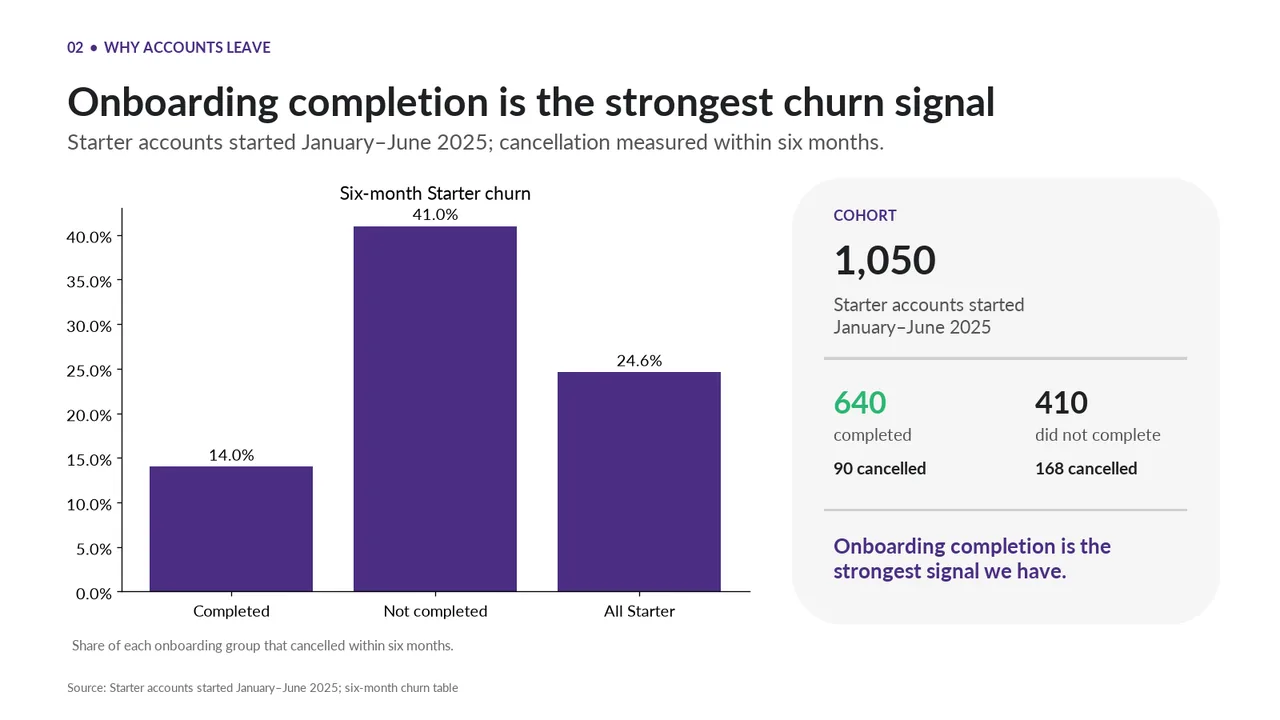
    Slide 3Download slide imagePolished All three bars share one colour, so 'Completed' vs 'Not completed' is not emphasised and 'All Starter' does not read as the baseline
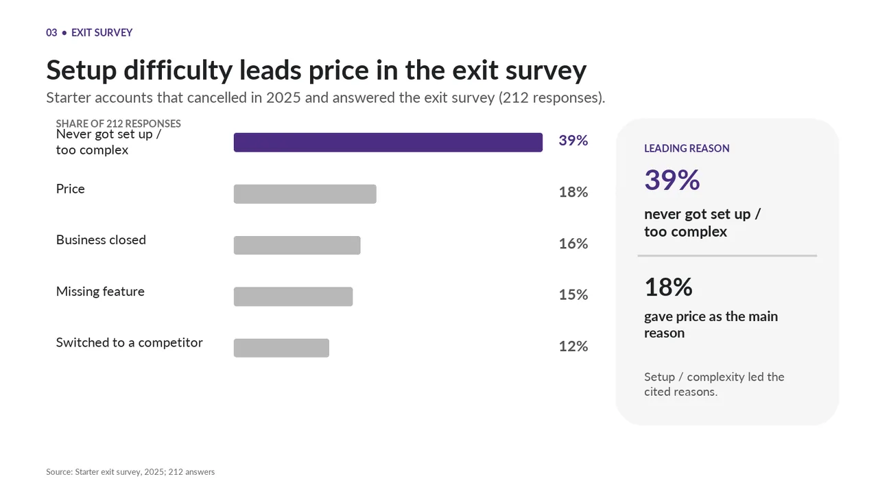
  4. Slide 4 of minimax-m3.1-flash:free's deck
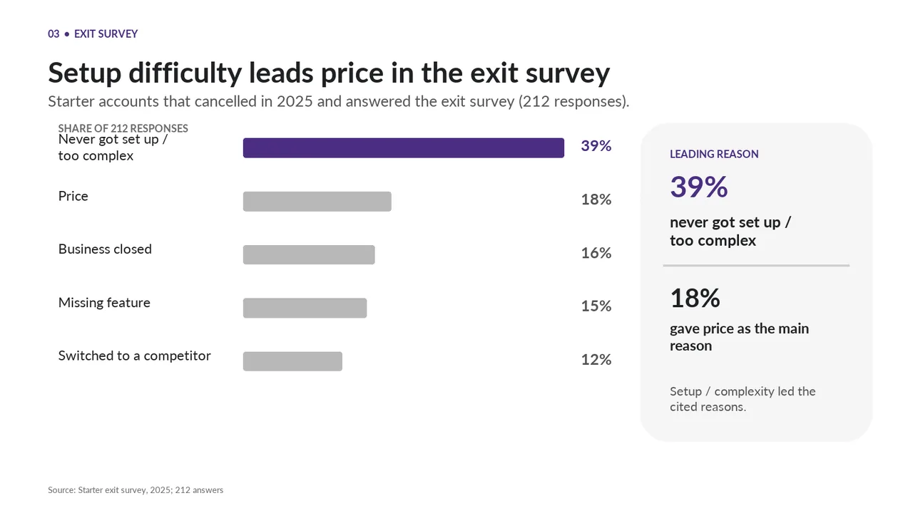
    Slide 4Download slide imageAcceptable The chart heading sits too close to the first category label, crowding the top row.The 'SHARE OF 212 RESPONSES' header collides with the first category label 'Never got set up / too complex'
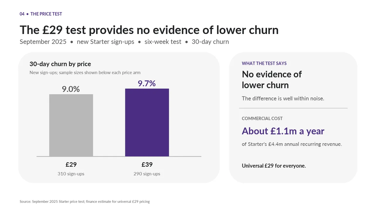
  5. Slide 5 of minimax-m3.1-flash:free's deck
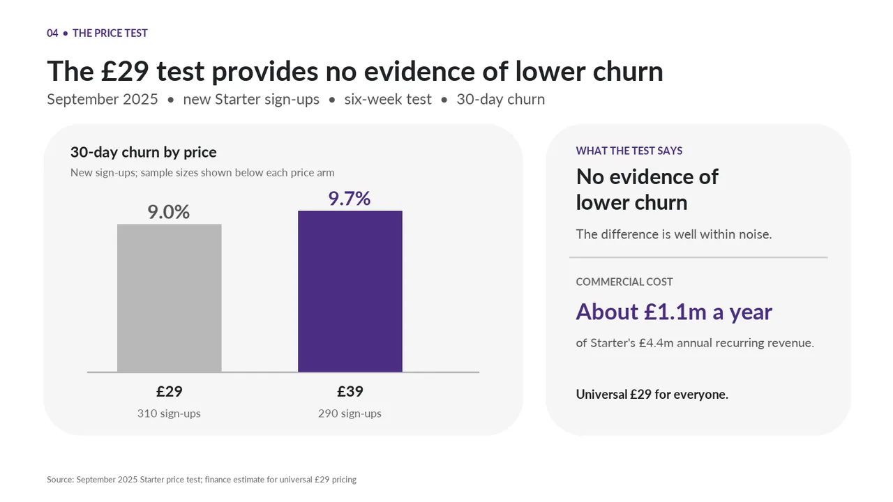
    Slide 5Download slide imagePolished The orphaned line 'Universal £29 for everyone.' at the bottom of the side panel is unclear and has no label
  6. Slide 6 of minimax-m3.1-flash:free's deck
    Slide 6Download slide imagePolished
  7. Slide 7 of minimax-m3.1-flash:free's deck
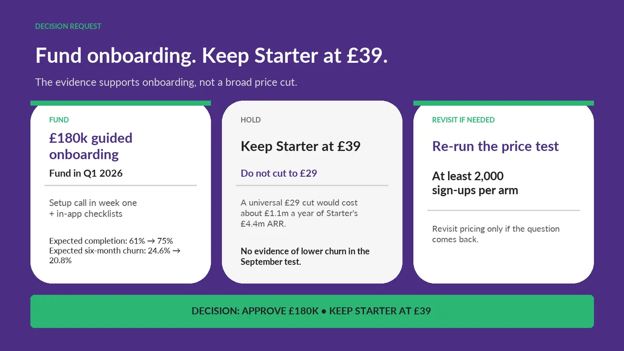
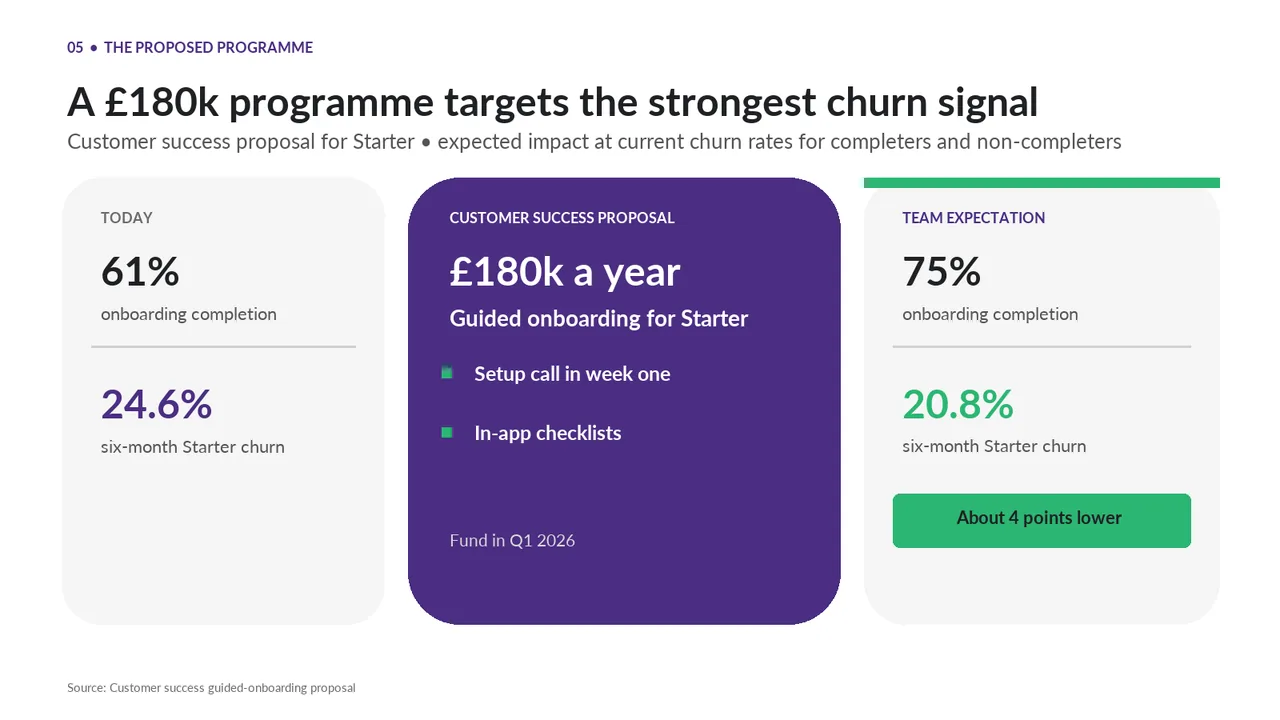
    Slide 7Download slide imageAcceptable The expected-outcomes text in the left card switches to a serif typeface, inconsistent with the rest of the deck.'Expected six-month churn: 24.6% → 20.8%' wraps awkwardly, leaving '20.8%' alone on its own line