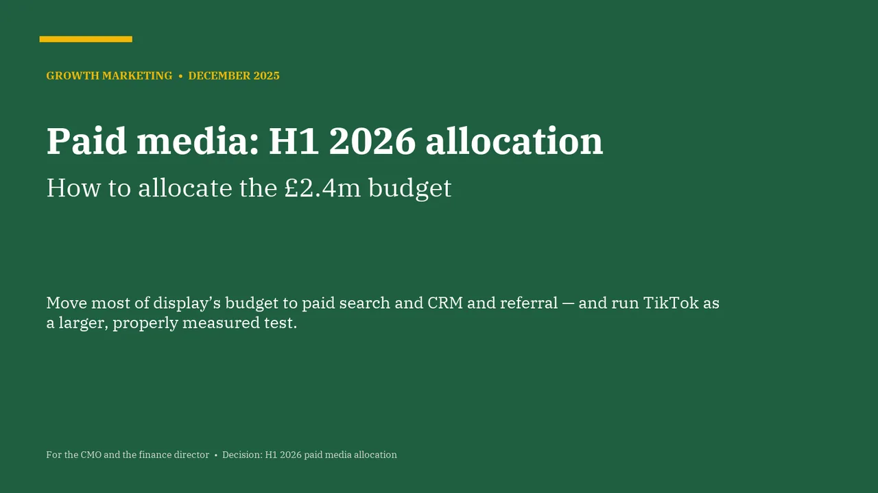
For the CMO and the finance director. The decision it supports: how to allocate the £2.4m paid media budget for H1 2026.
Verdict
Not presentable
Deck rating
1,273
Slides
7 (brief: 5-8)
Design quality
50%
Why it is not presentable
Layout defect: something off the slide, colliding, too small or too faint to read
A slide the judges rated as needing work
In detail
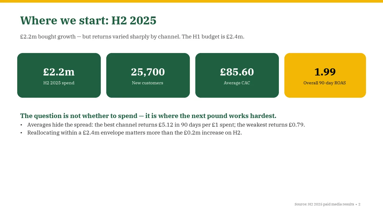
Slide 2: 4 body text boxes set at 11 pt, too small to read
Slide 2: A text box set at 9 pt, too small to read
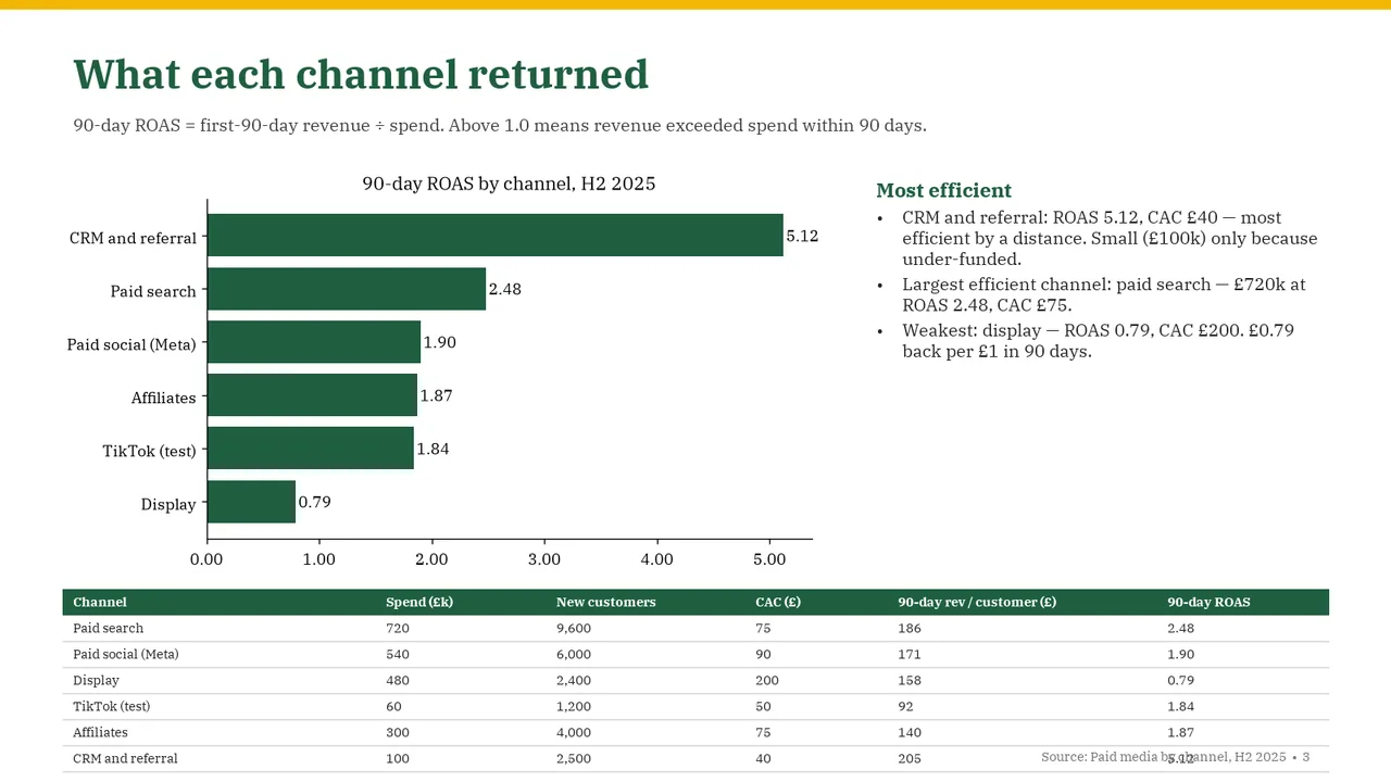
Slide 3: Table labels at 9 pt, too small to read
Slide 3: A text box set at 9 pt, too small to read
Slide 3: A table overlaps a text
Slide 1PolishedThe topic title dominates while the actual allocation recommendation is smaller and separated by a large gap; bringing them closer would strengthen the message.
Slide 2AcceptableThe title names the topic rather than stating the takeaway.Title is a topic label ('Where we start: H2 2025') rather than a takeaway; the real message sits in the green lead-in line lower down
Slide 3Needs workThe source footer overlaps the final table row and obscures its ROAS value.Source footer collides with the last table row: it overprints the CRM and referral ROAS value (5.12)
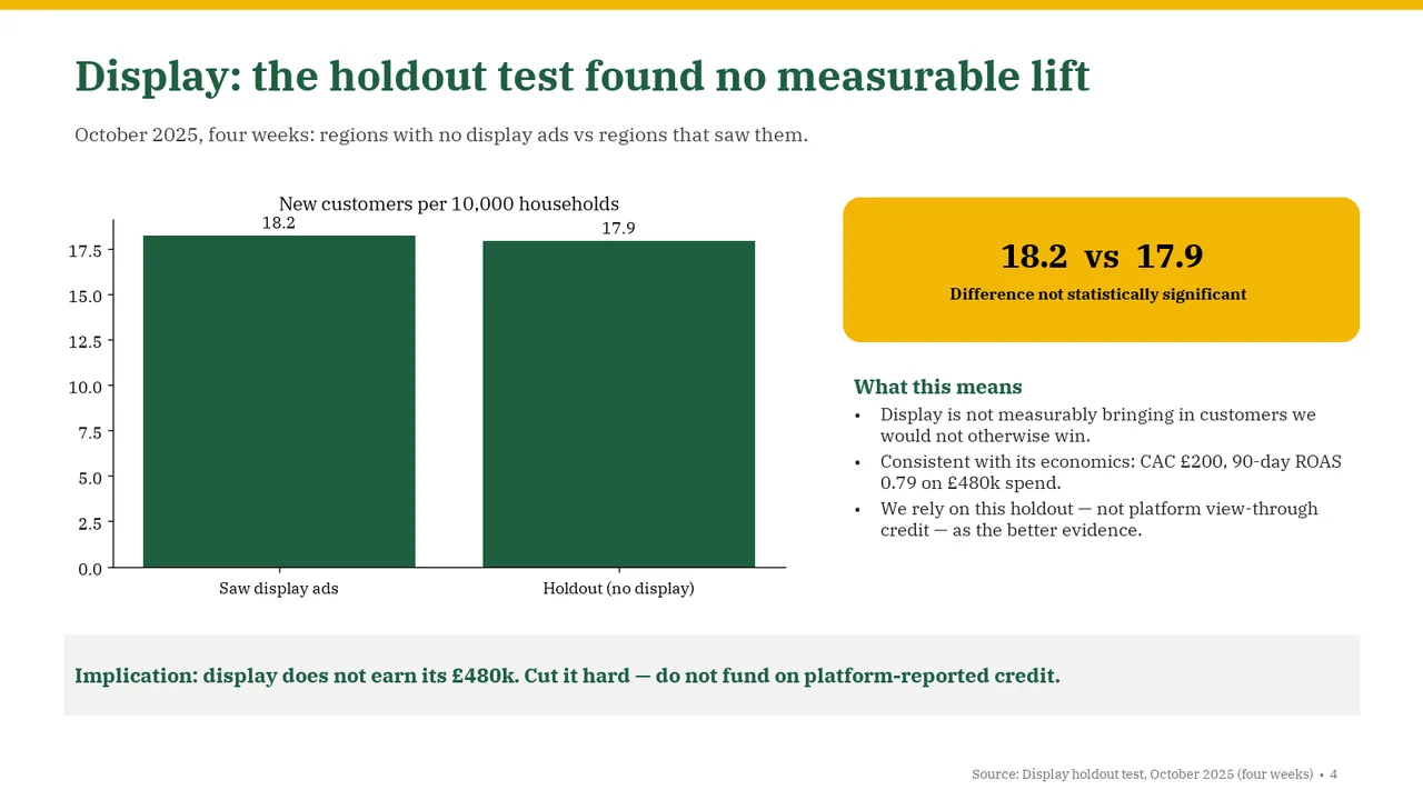
Slide 4Polished
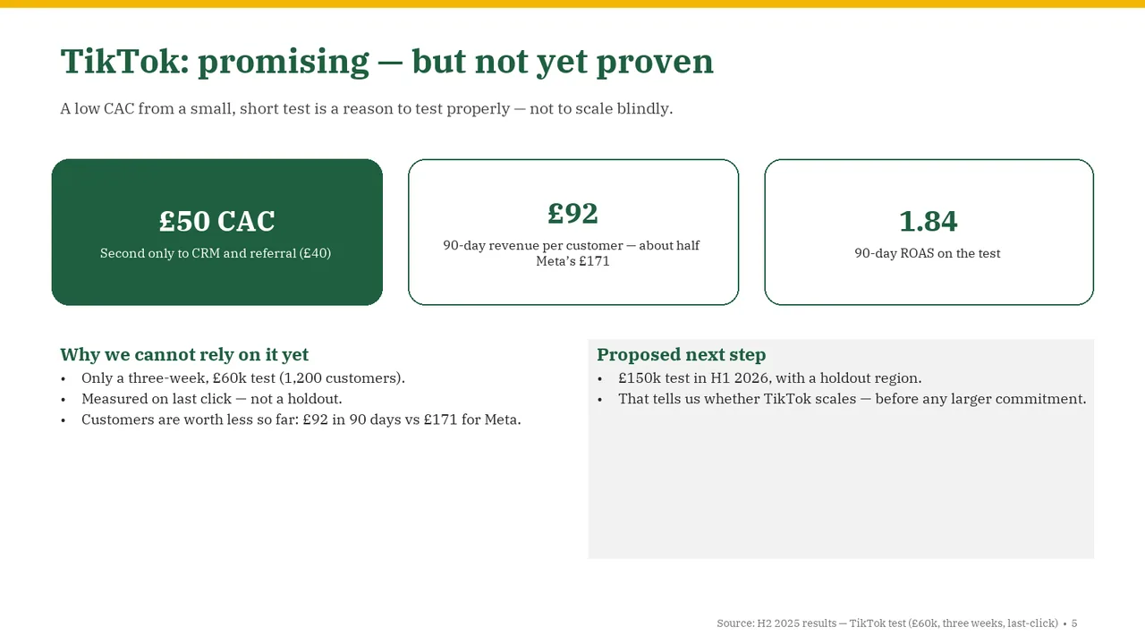
Slide 5AcceptableThe proposed-next-step panel is much taller than its content requires, creating a large empty area and an unbalanced lower half.The 'Proposed next step' grey panel is mostly empty, which leaves the bottom half unbalanced
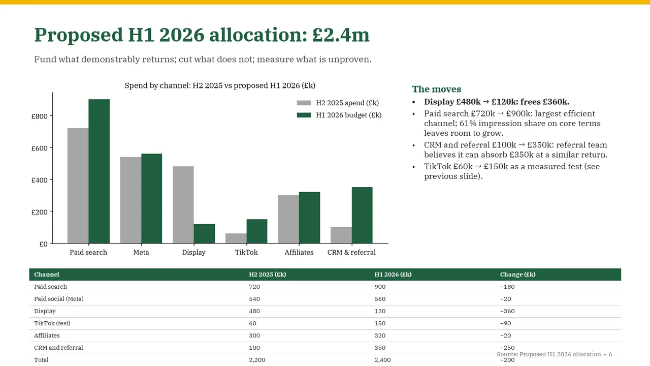
Slide 6Needs workThe source footer intrudes into the table's final rows.Source footer overlaps the table's last rows, colliding with the +250 and +200 values
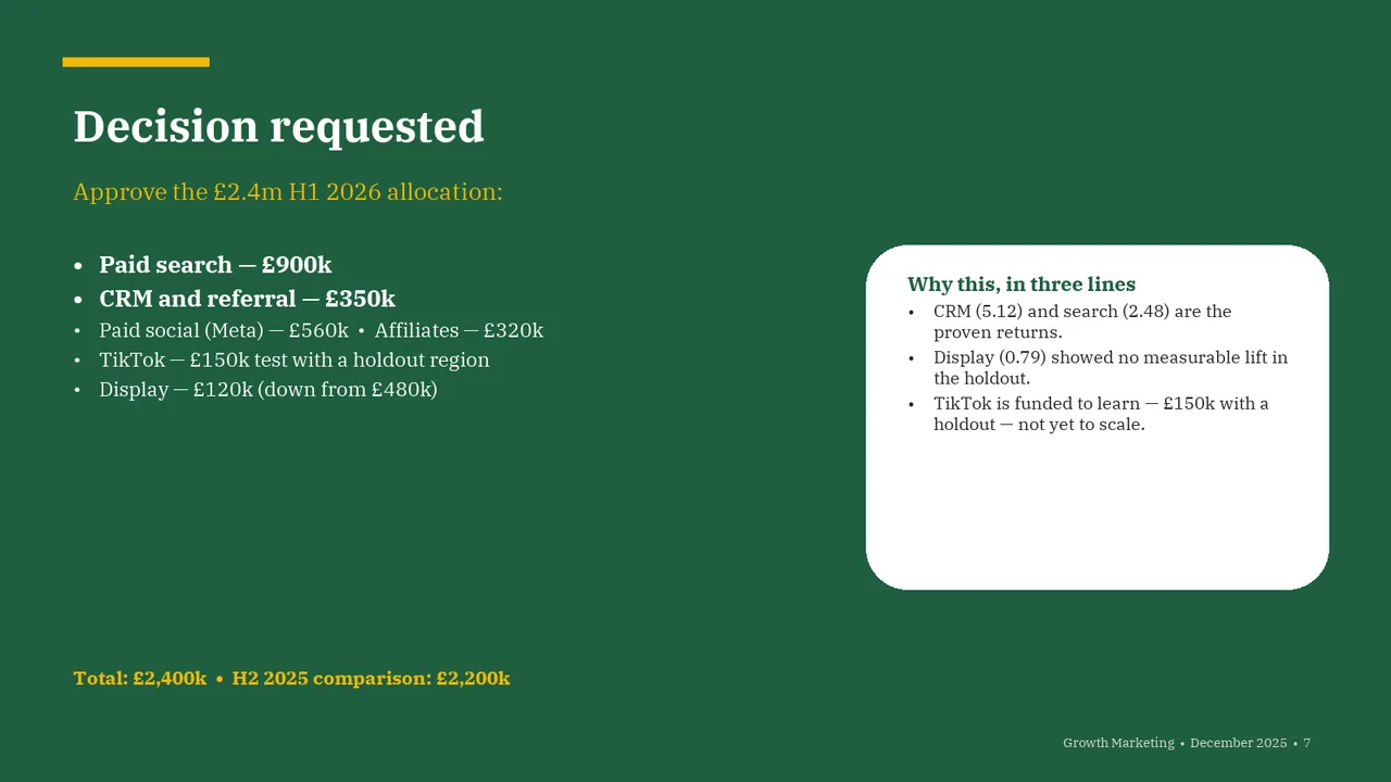
Slide 7AcceptableThe rationale panel has substantial empty space beneath its text and feels oversized.White 'Why this' box has a large empty lower half and is vertically offset from the left column