Claude Haiku 5.5: Manchester store investment review
For the board of directors (non-executives and the chief executive). The decision it supports: whether to approve £480k of capital for a Manchester store.
Verdict
Not presentable
Deck rating
1,130
Slides
7 (brief: 5-8)
Design quality
57%
Why it is not presentable
Layout defect: something off the slide, colliding, too small or too faint to read
Quoted a figure the analysis says not to quote
In detail
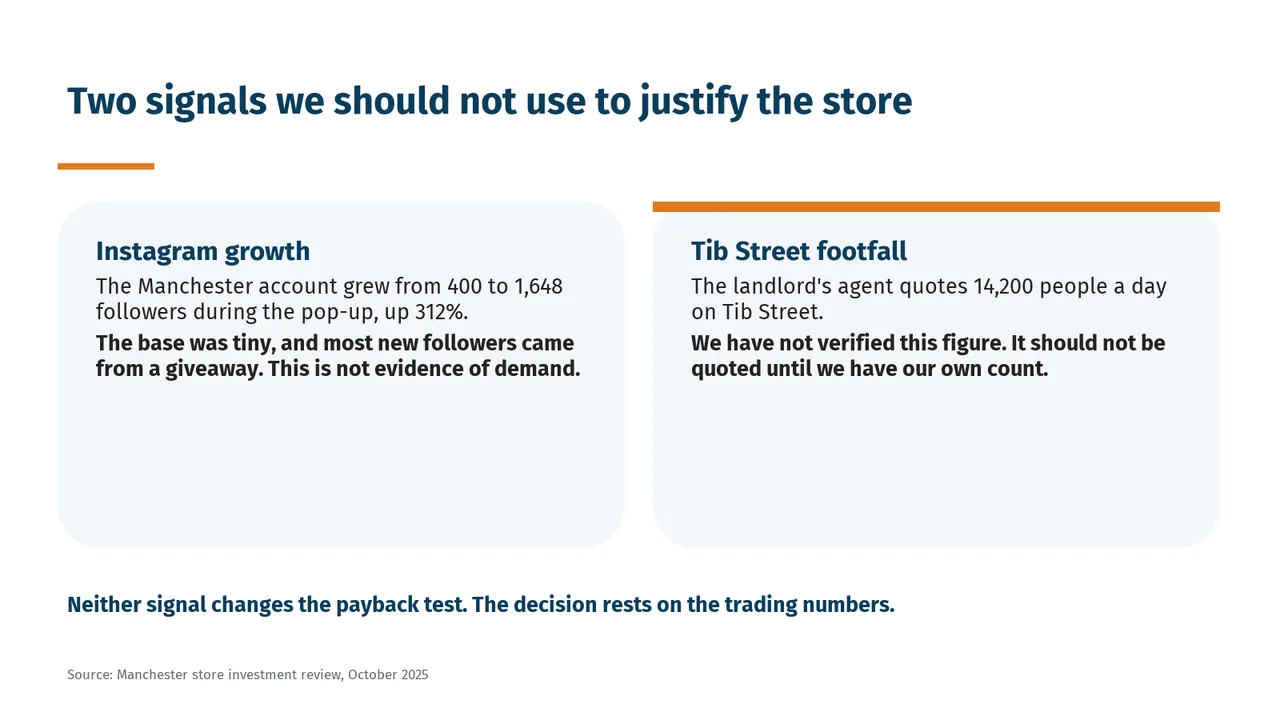
Slide 6 quotes 14,200: the landlord's unverified footfall figure of 14,200 people a day.
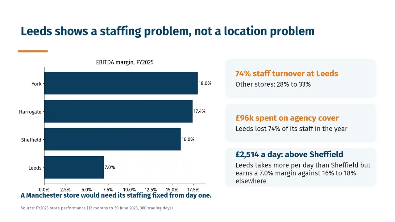
Slide 5: A chart overlaps a text
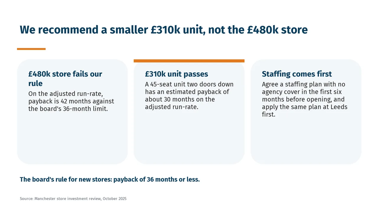
Slide 1Polished
Slide 2AcceptableCards are much taller than their text, leaving the lower half of each card emptyBoxes are heavily text-based with little visual emphasis on key numbers or outcomes.
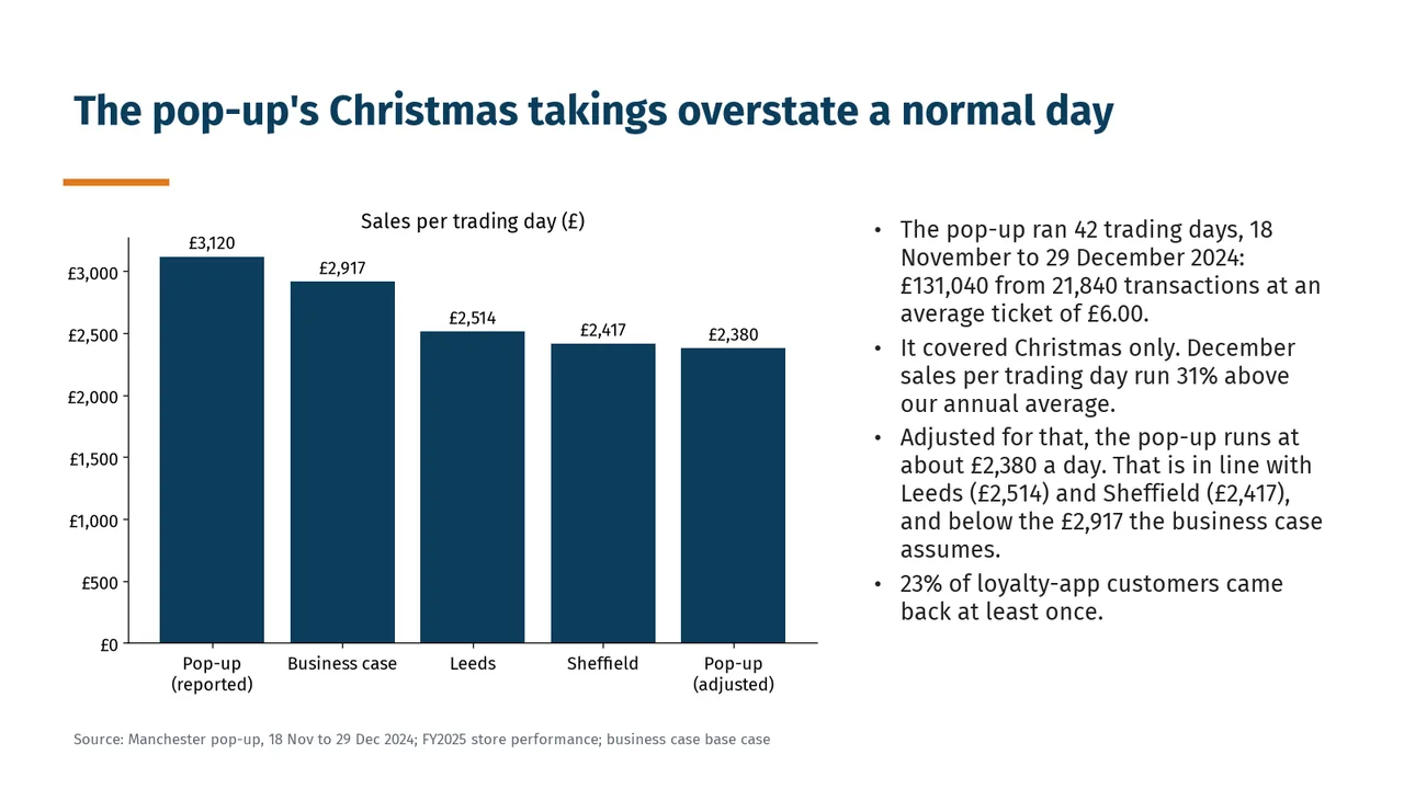
Slide 3AcceptableThe right-hand bullet column is text-heavy, slowing scanning.All bars share one colour, so the key comparison (adjusted pop-up against the business case) is not emphasised
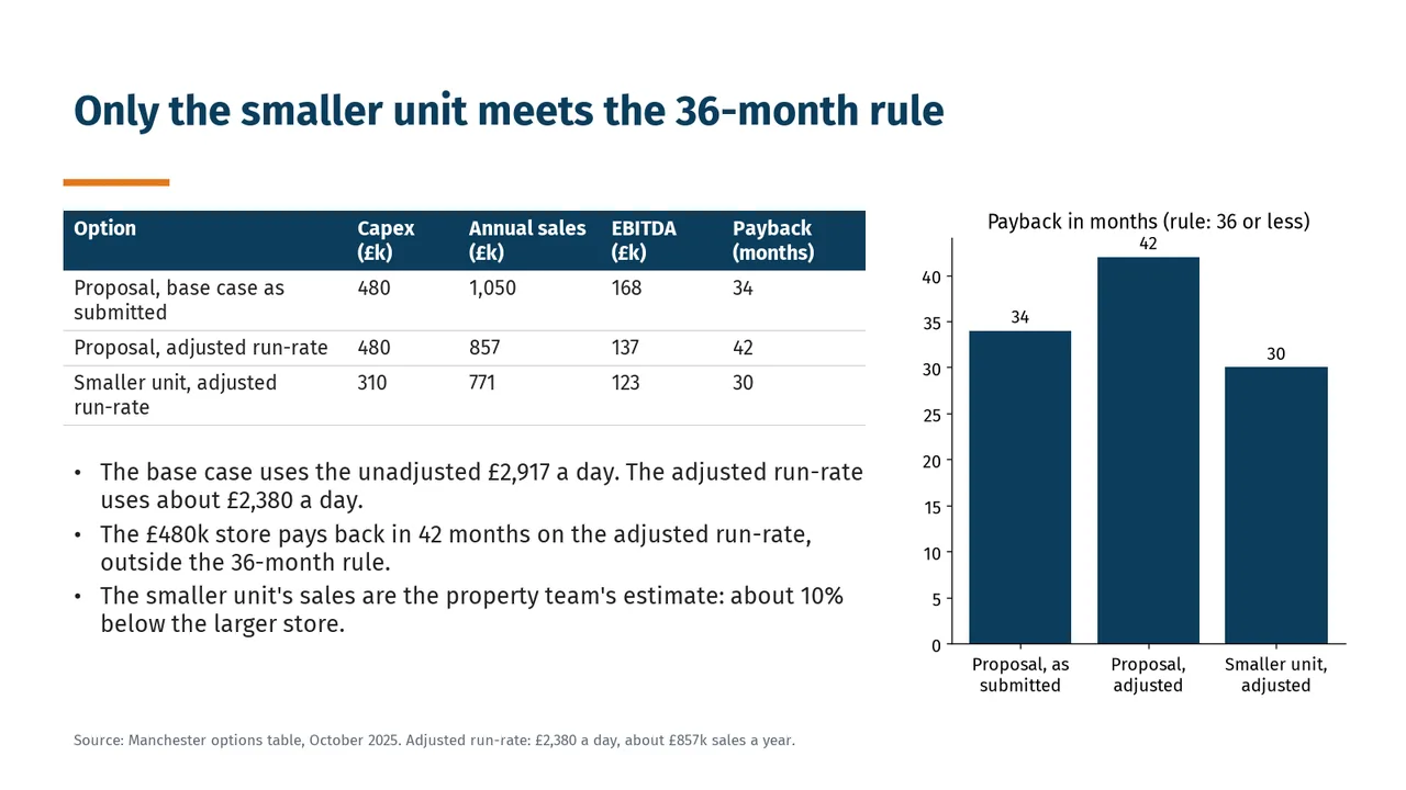
Slide 4AcceptableThe table, chart and explanatory bullets repeat information, making the slide denser than necessary.The chart has no reference line at 36 months, so the rule must be read from the subtitle
Slide 5AcceptableThe bottom takeaway sits too close to the chart's tick labels, crowding the lower-left area.The takeaway line 'A Manchester store would need its staffing fixed from day one.' collides with the chart's x-axis tick labels
Slide 6AcceptableThe panels are substantially taller than their content, leaving large unused areas.Both cards are roughly half empty below their text
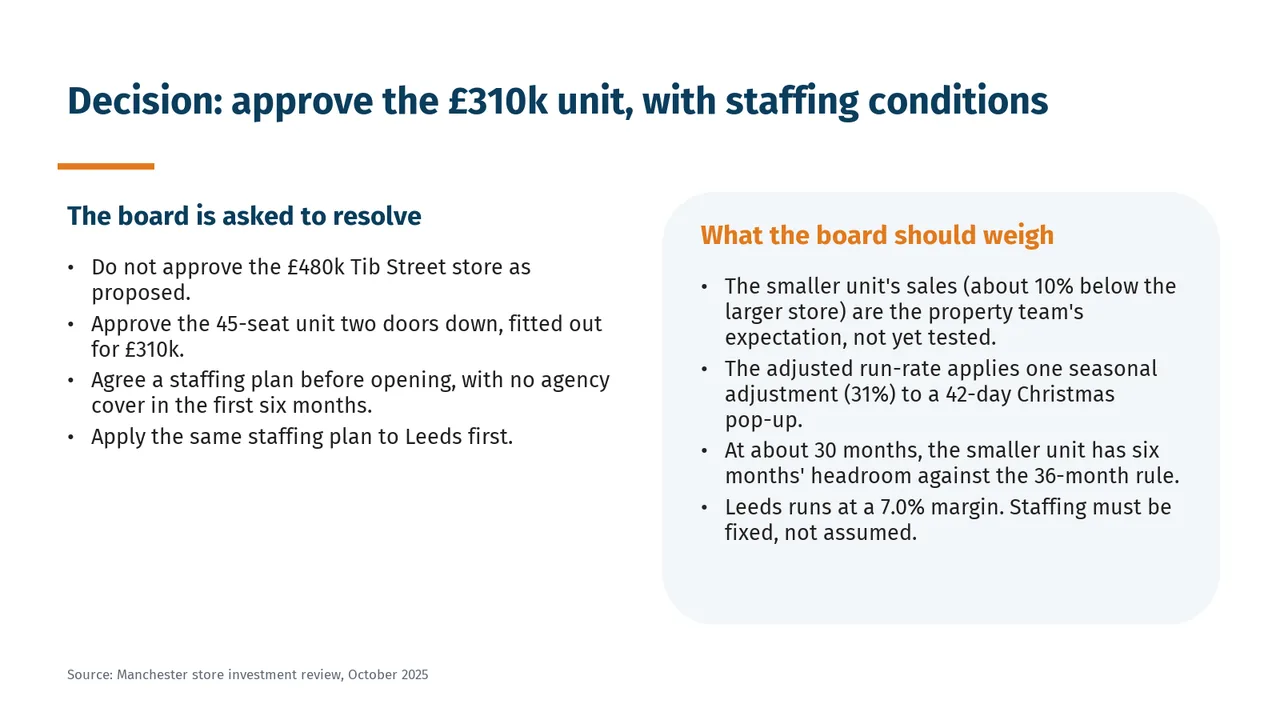
Slide 7AcceptableBoth columns rely on lengthy bullets, making the closing decision slide text-heavy.The left and right column headings sit at different heights