Benchmarks / DeckBench / Lumio

Measured by Spring Prompt

Kimi K3.1 Pro: Starter churn: what to fund in Q1 2026

For the leadership team (chief executive, CFO, heads of product, sales and customer success). The decision it supports: whether to fund a Starter price cut or an onboarding programme in Q1 2026.

Verdict
Not presentable
Deck rating
1,247
Slides
8 (brief: 6-10)
Design quality
88%

Why it is not presentable

  • Layout defect: something off the slide, colliding, too small or too faint to read

In detail

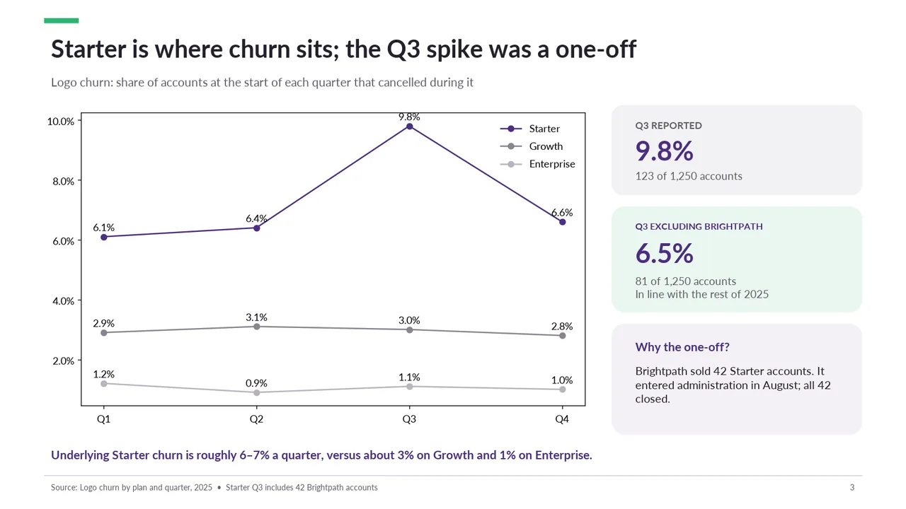
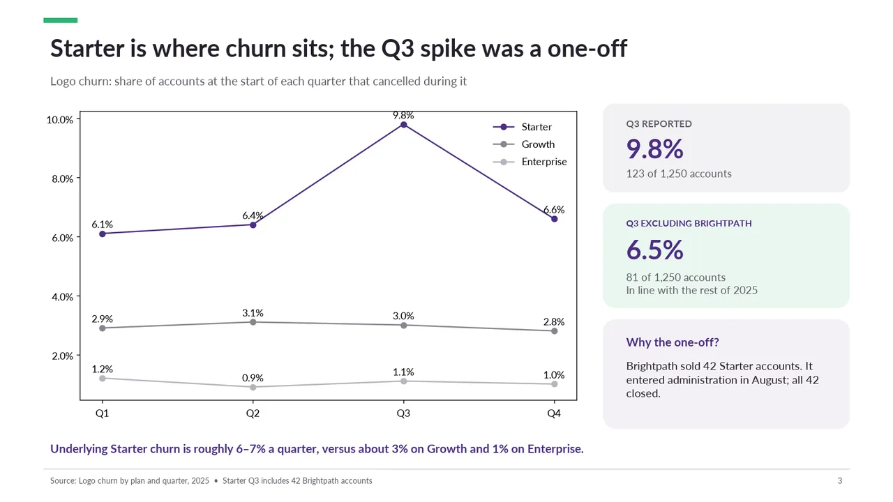
  • Slide 1: 3 text boxes set at 9.5 pt, too small to read
  • Slide 2: 2 text boxes set at 8.5 pt, too small to read
  • Slide 3: A text box set at 9.7 pt, too small to read
  • Slide 3: 2 text boxes set at 8.5 pt, too small to read
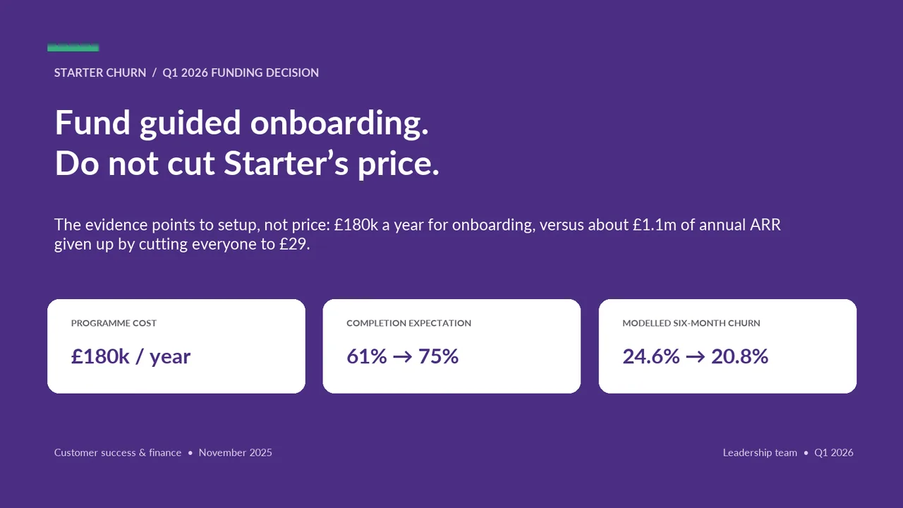
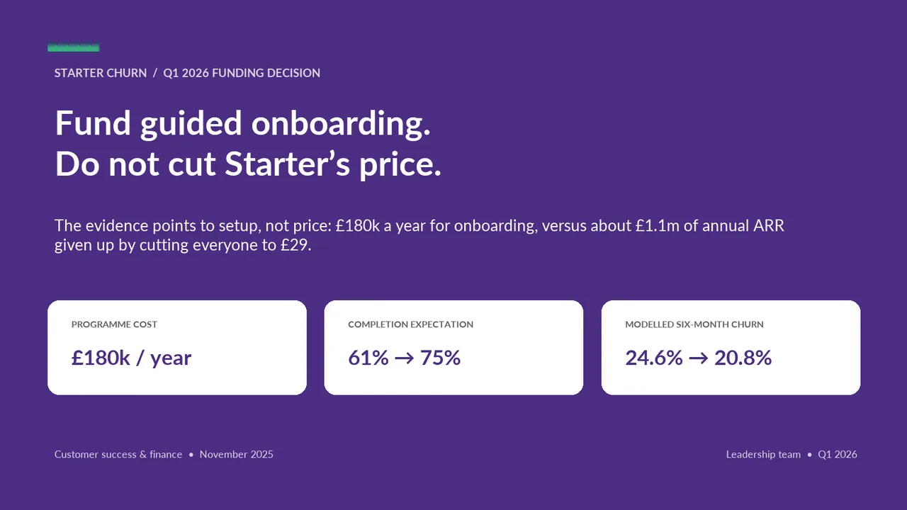
  1. Slide 1 of Kimi K3.1 Pro's deck
    Slide 1Download slide imagePolished
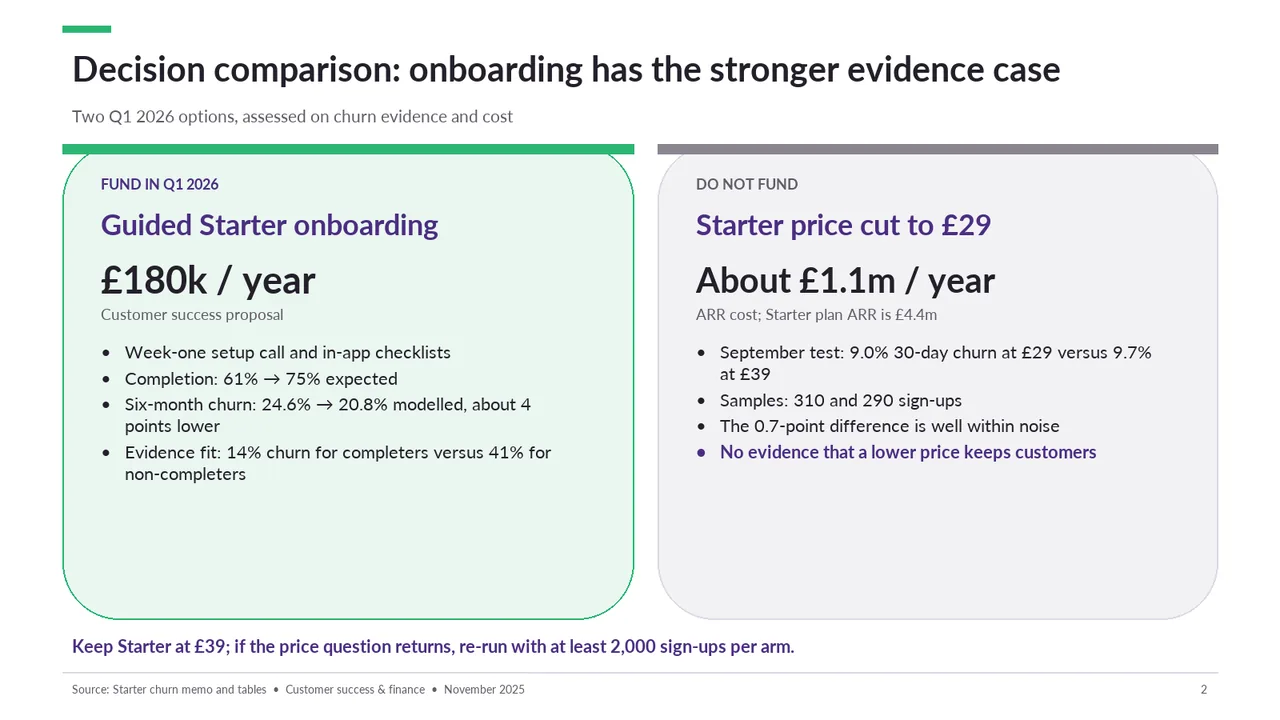
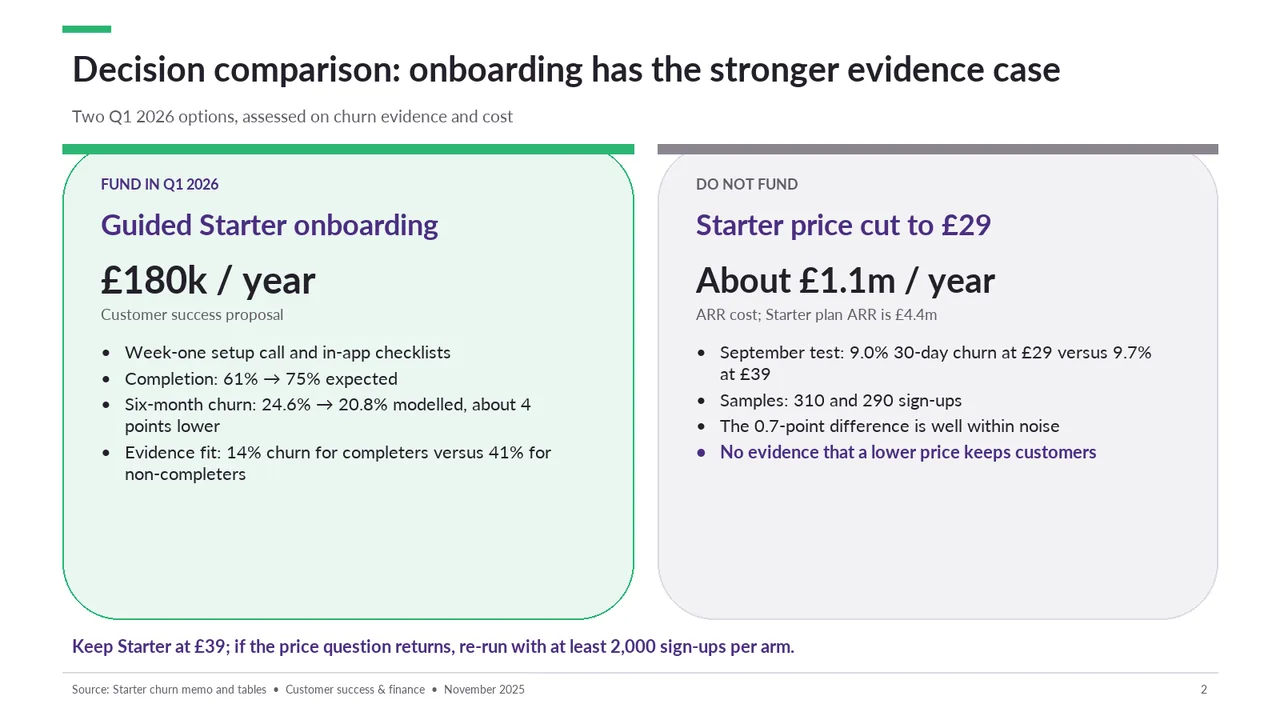
  2. Slide 2 of Kimi K3.1 Pro's deck
    Slide 2Download slide imageAcceptable The comparison cards are text-heavy, with several wrapped bullets that slow scanning.The square coloured header bars sit on top of rounded cards, so the card corners curve away beneath the bars and the join looks unfinished
  3. Slide 3 of Kimi K3.1 Pro's deck
    Slide 3Download slide imagePolished Data labels collide with the lines and markers (6.4% and 6.6% sit on the Starter line)
  4. Slide 4 of Kimi K3.1 Pro's deck
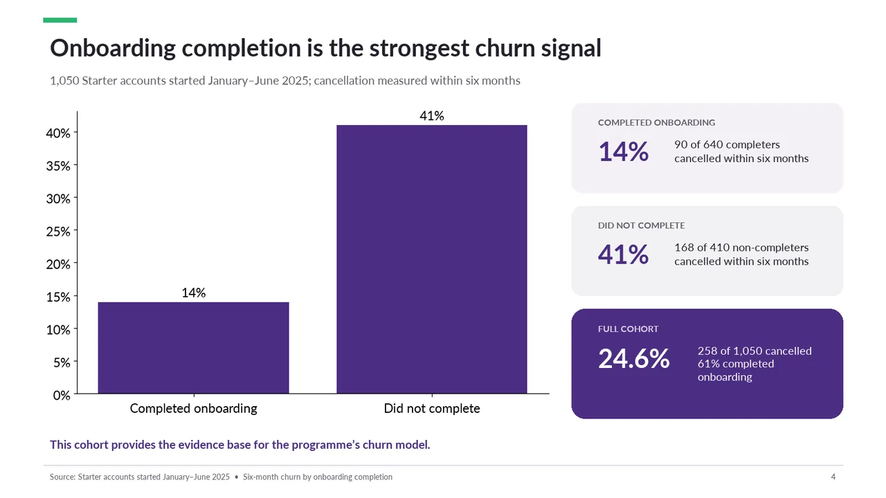
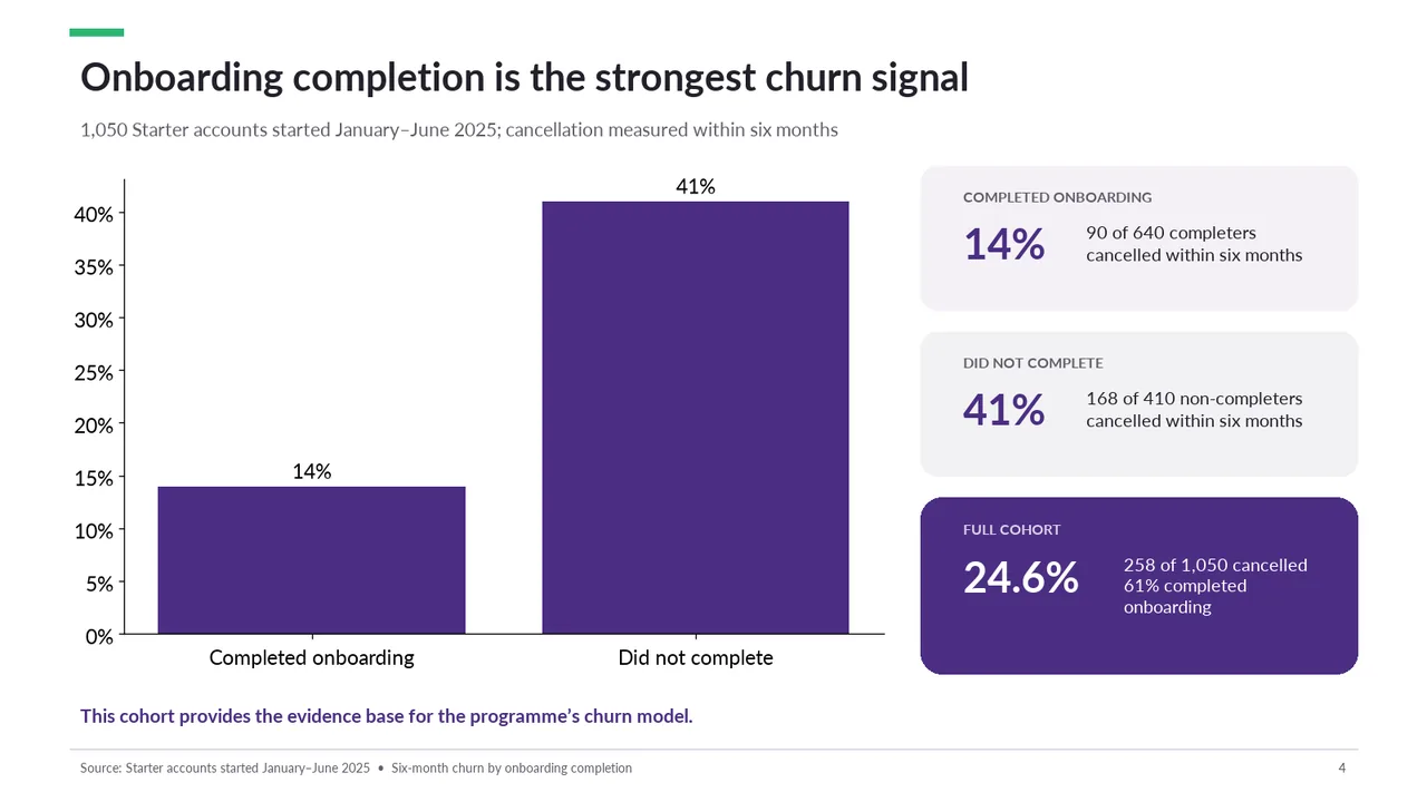
    Slide 4Download slide imagePolished The 41% bar extends beyond the maximum y-axis value of 40% and spills out of the chart area.
  5. Slide 5 of Kimi K3.1 Pro's deck
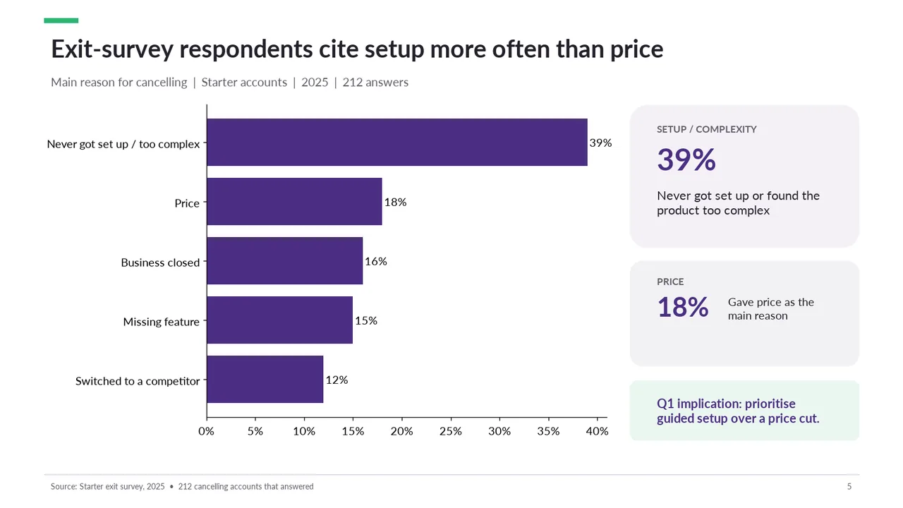
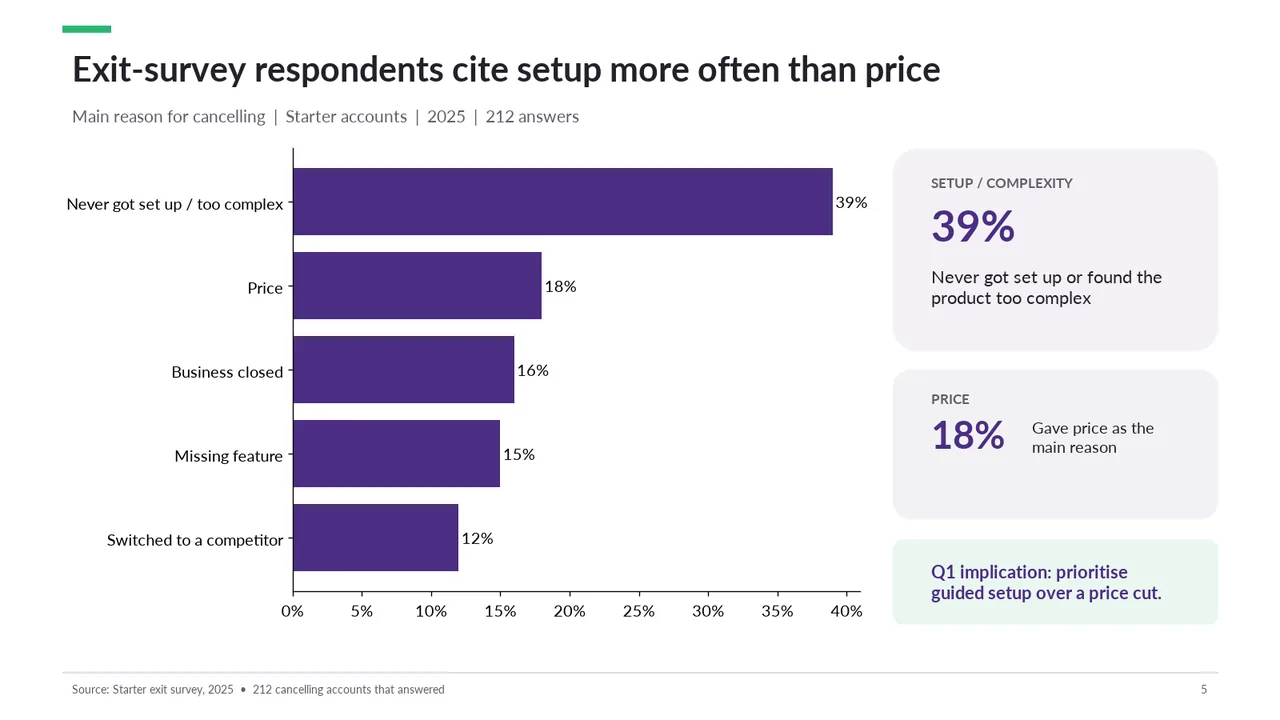
    Slide 5Download slide imagePolished
  6. Slide 6 of Kimi K3.1 Pro's deck
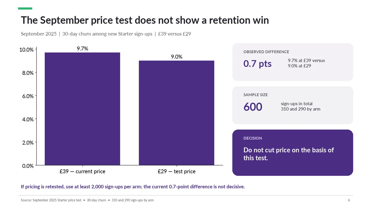
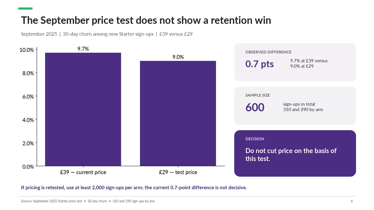
    Slide 6Download slide imagePolished
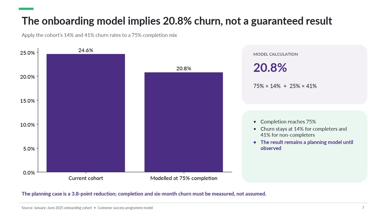
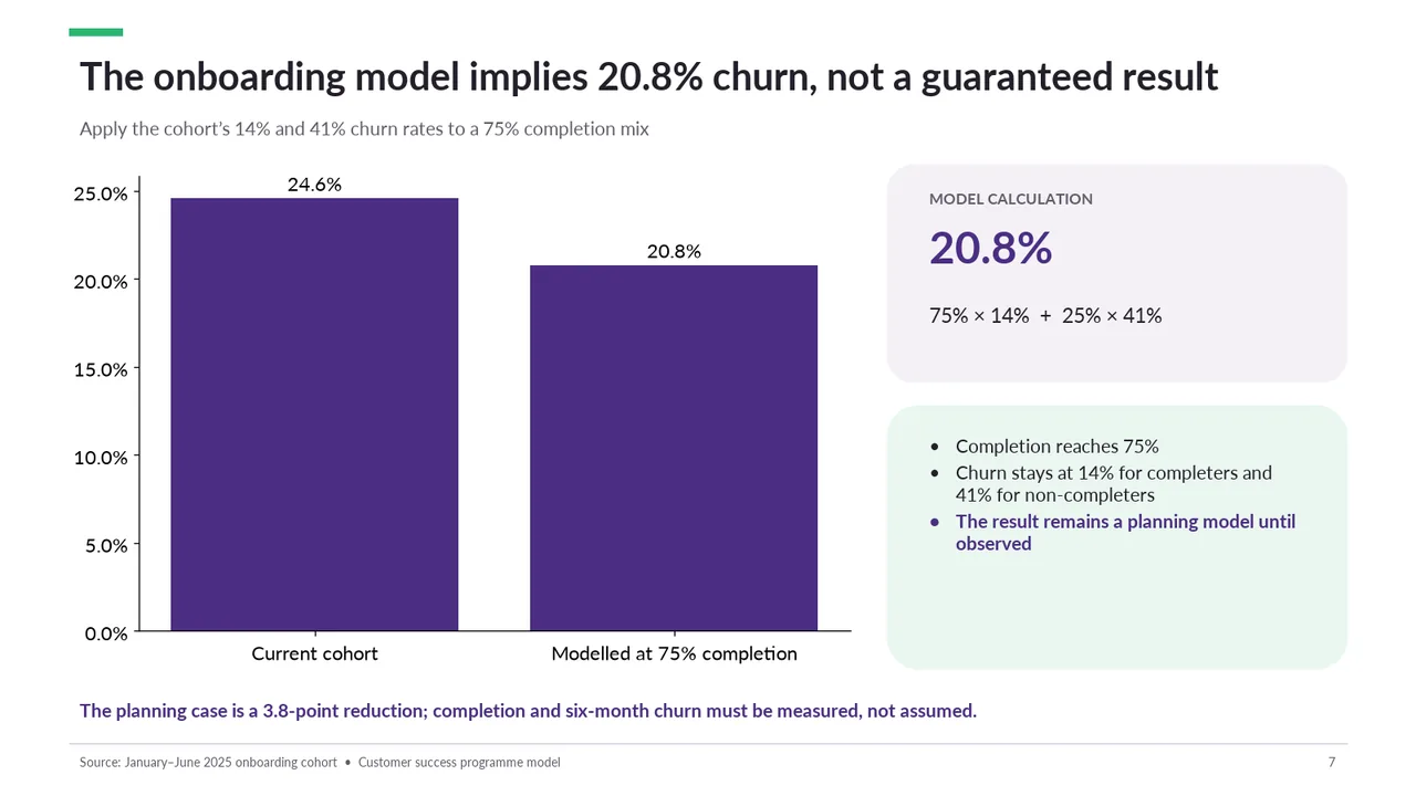
  7. Slide 7 of Kimi K3.1 Pro's deck
    Slide 7Download slide imagePolished
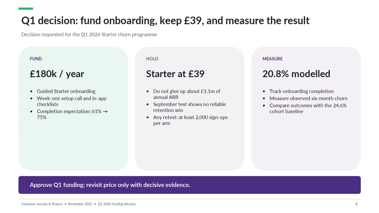
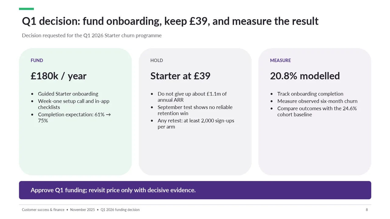
  8. Slide 8 of Kimi K3.1 Pro's deck
    Slide 8Download slide imageAcceptable The three tall cards leave substantial empty space beneath their bullet lists, making the content feel top-heavy.The bottom half of all three cards is empty, which wastes space