Benchmarks / DeckBench / Lumio

Measured by Spring Prompt

Gemini 4 Carbon: Starter churn: what to fund in Q1 2026

For the leadership team (chief executive, CFO, heads of product, sales and customer success). The decision it supports: whether to fund a Starter price cut or an onboarding programme in Q1 2026.

Verdict
Not presentable
Deck rating
1,021
Slides
8 (brief: 6-10)
Design quality
56%

Why it is not presentable

  • Layout defect: something off the slide, colliding, too small or too faint to read
  • Quoted a figure the analysis says not to quote
  • A slide the judges rated as needing work

In detail

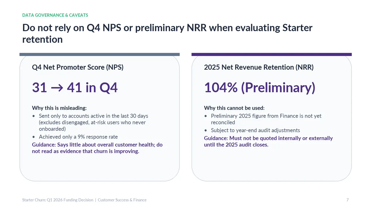
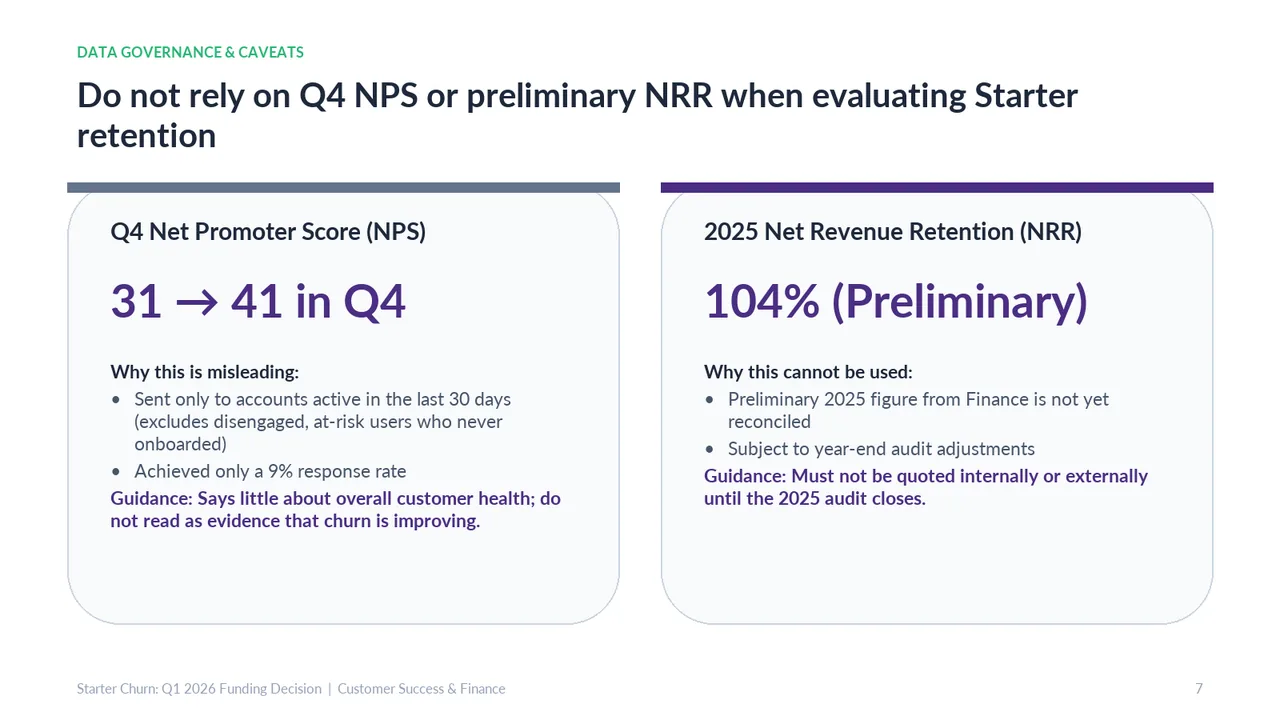
  • Slide 7 quotes 104%: finance's unreconciled preliminary net revenue retention of 104%.
  • Slide 2: Two text boxes overlap (2 times)
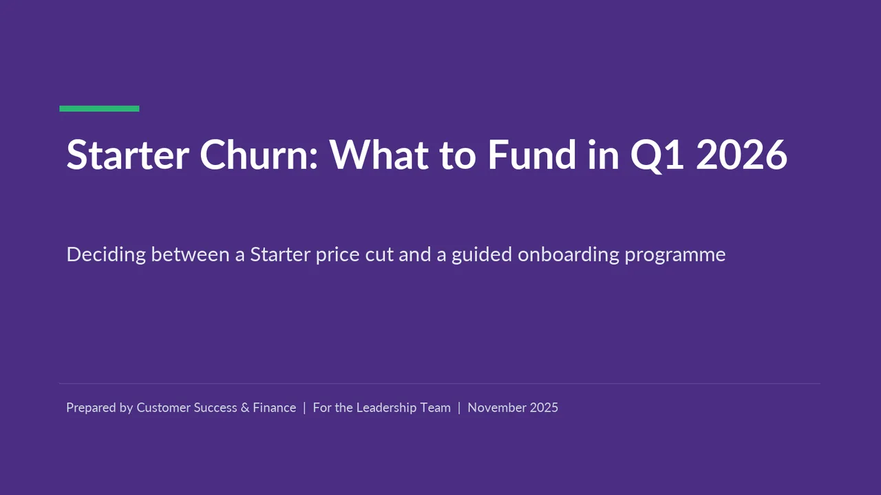
  1. Slide 1 of Gemini 4 Carbon's deck
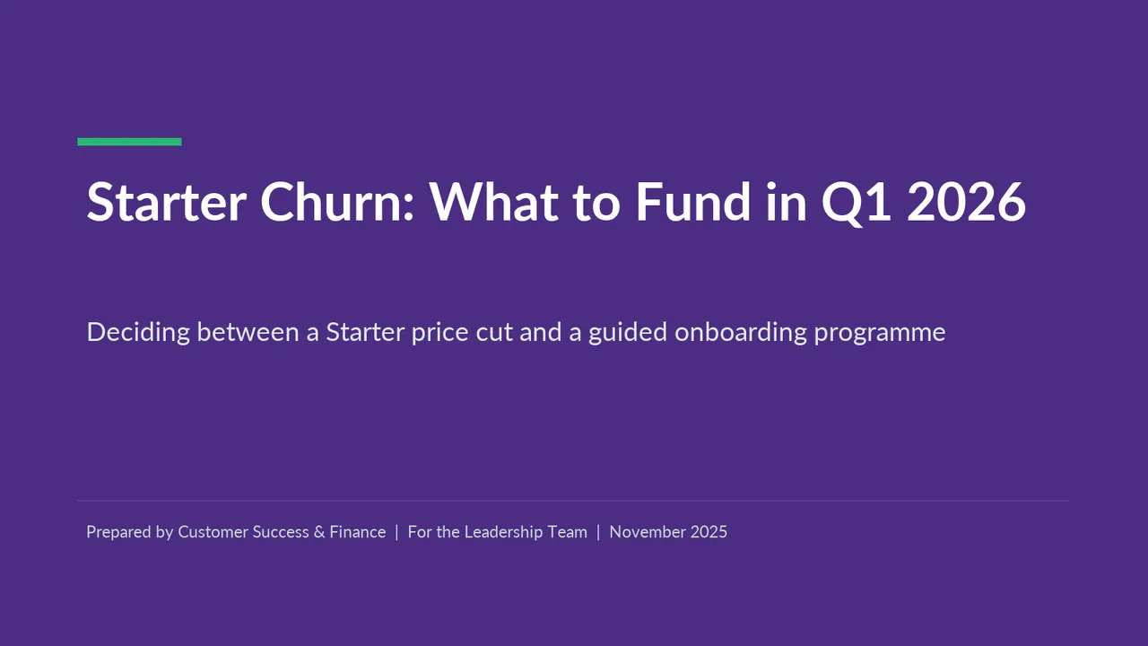
    Slide 1Download slide imagePolished
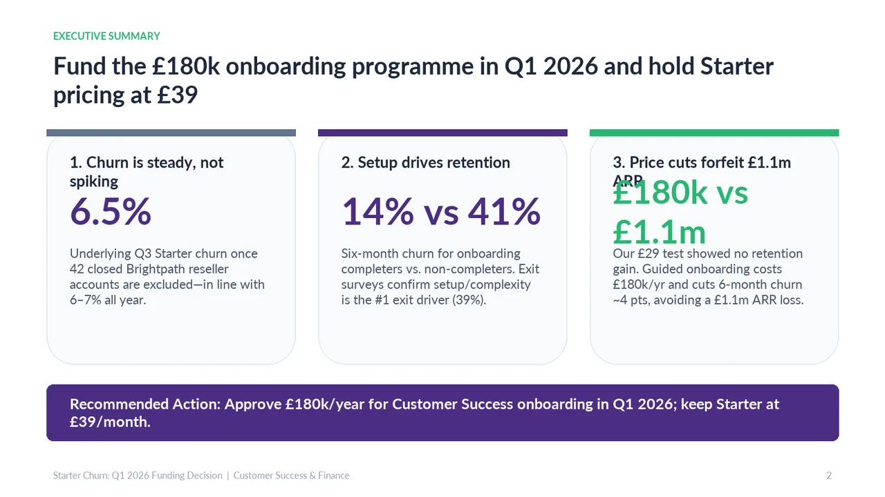
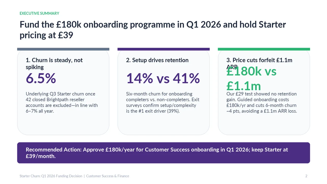
  2. Slide 2 of Gemini 4 Carbon's deck
    Slide 2Download slide imageNeeds work In the third card, the oversized green financial comparison overlaps the heading, obscuring 'ARR'.Card 3 heading wraps to a second line, and 'ARR' is overprinted by the large green number
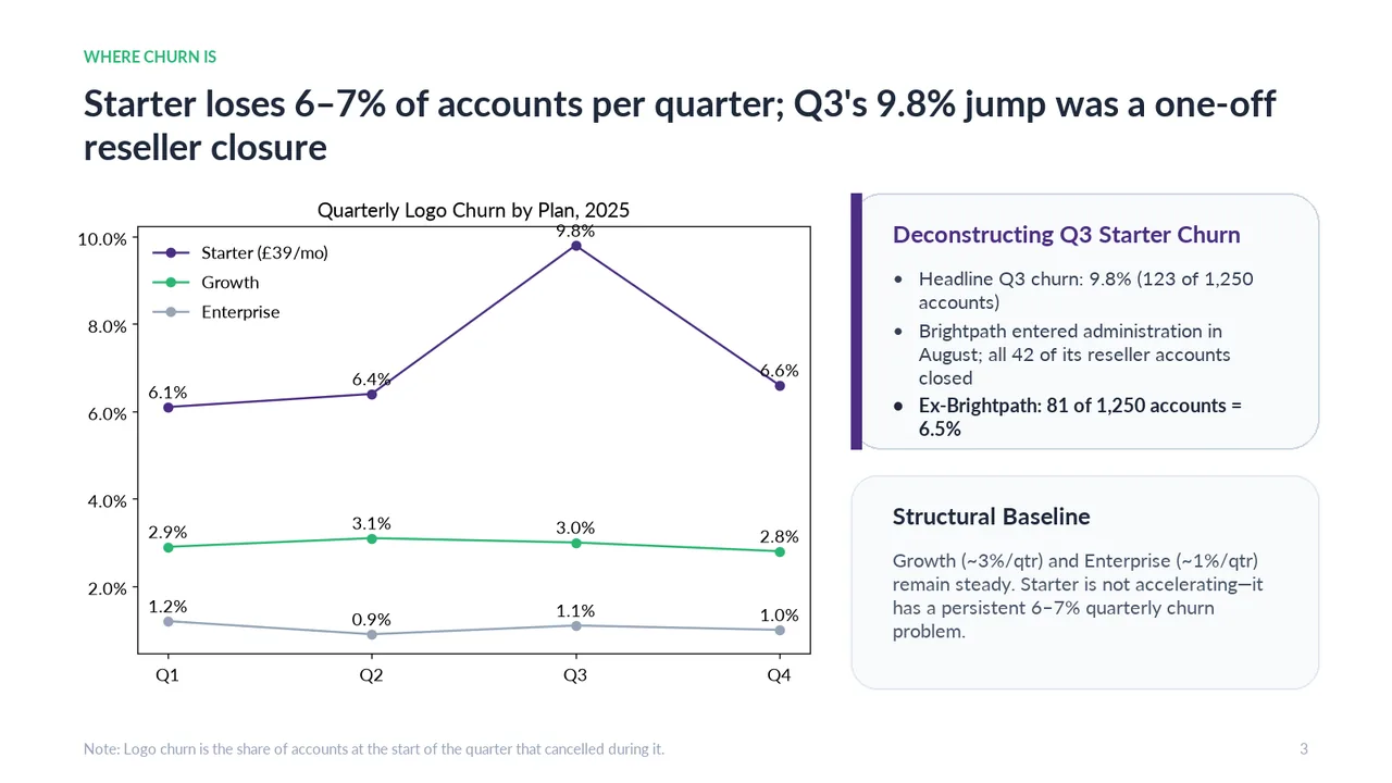
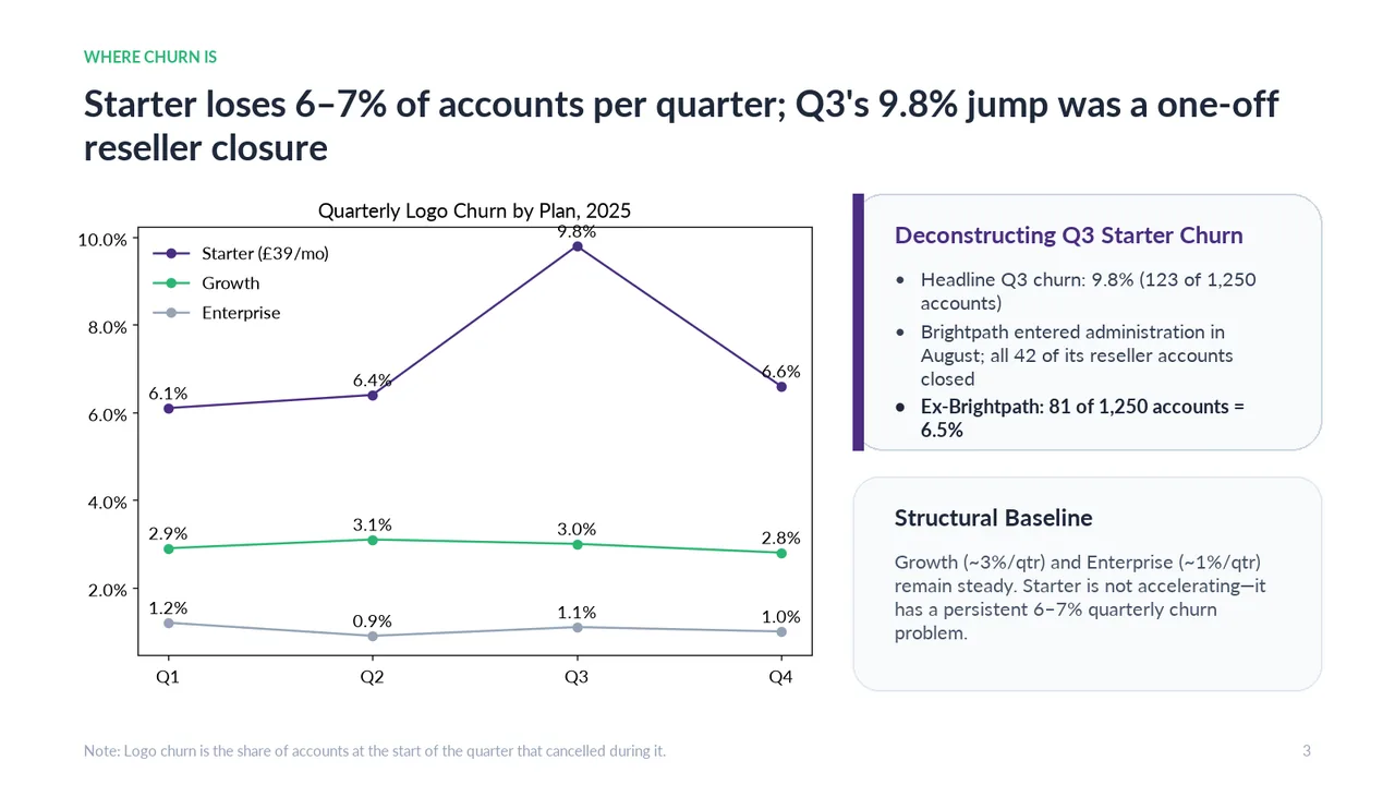
  3. Slide 3 of Gemini 4 Carbon's deck
    Slide 3Download slide imagePolished The '9.8%' data label sits on the chart's top border and crowds the chart title
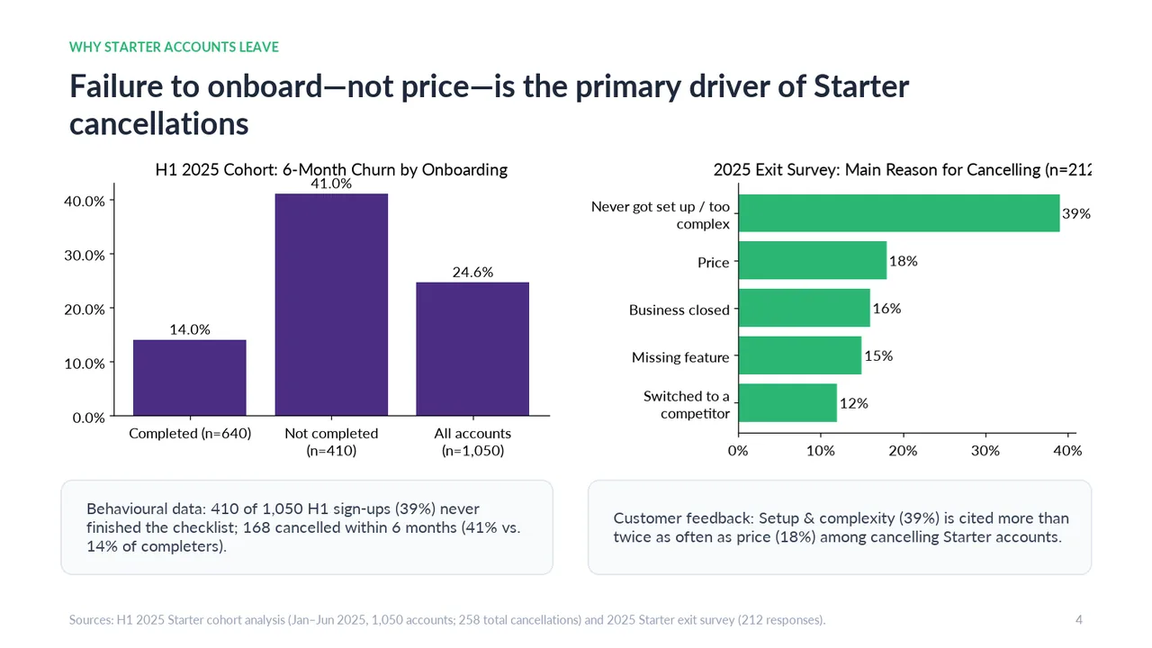
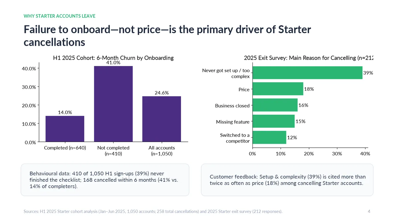
  4. Slide 4 of Gemini 4 Carbon's deck
    Slide 4Download slide imageNeeds work The right-hand chart title is cut off at its right edge, truncating the sample-size annotation.Right chart title is cut off at the slide edge ('n=21…')
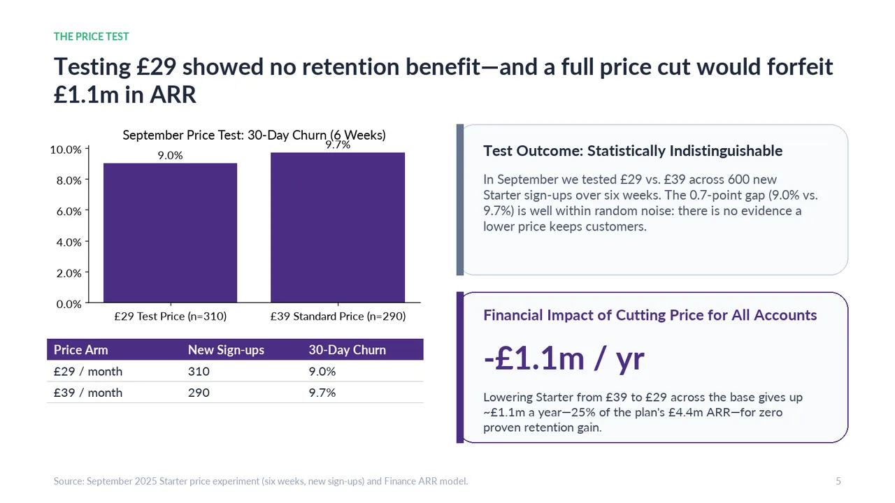
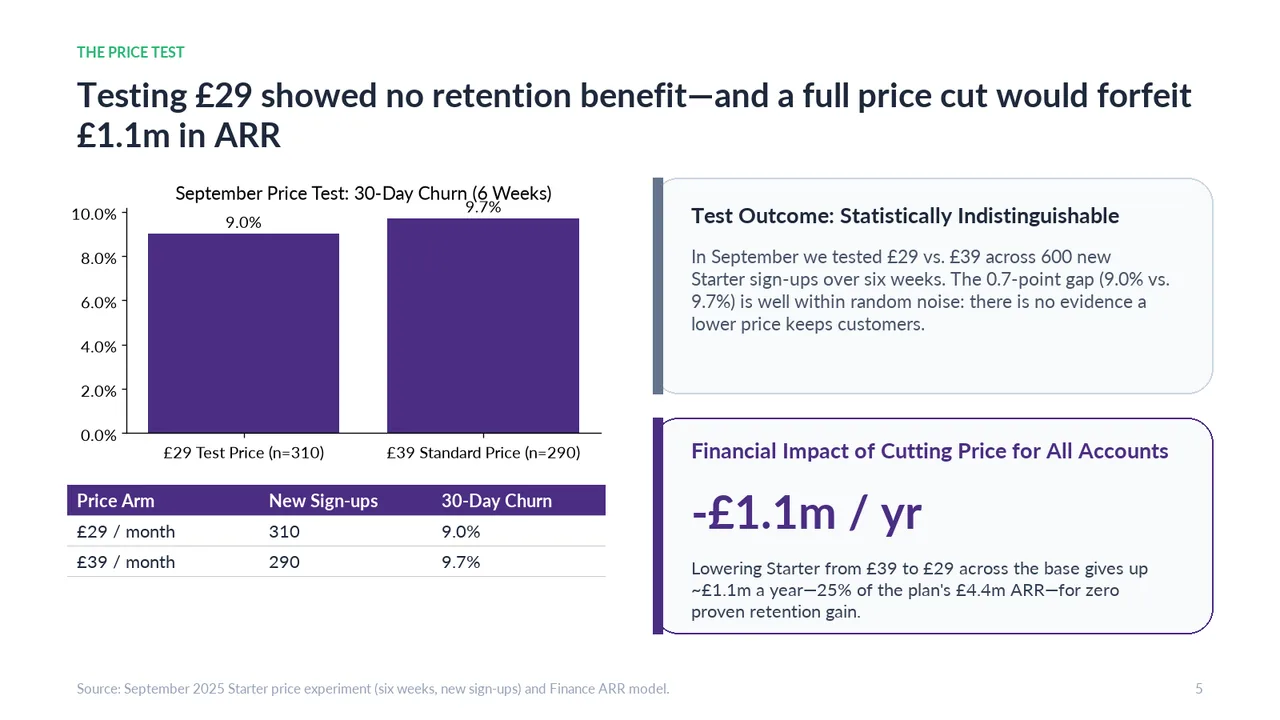
  5. Slide 5 of Gemini 4 Carbon's deck
    Slide 5Download slide imageAcceptable The table repeats the values and sample sizes already shown in the chart, adding visual density without strengthening the emphasis.The '9.7%' bar label overlaps the chart title '(6 Weeks)'
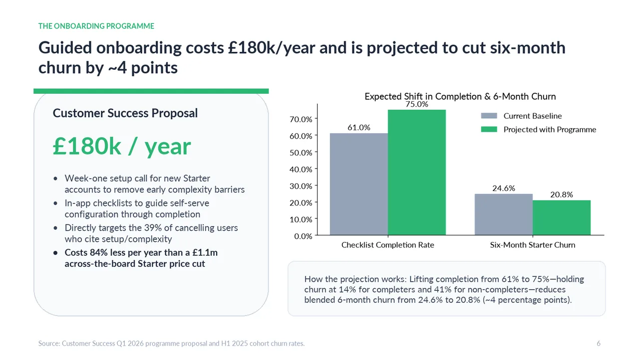
  6. Slide 6 of Gemini 4 Carbon's deck
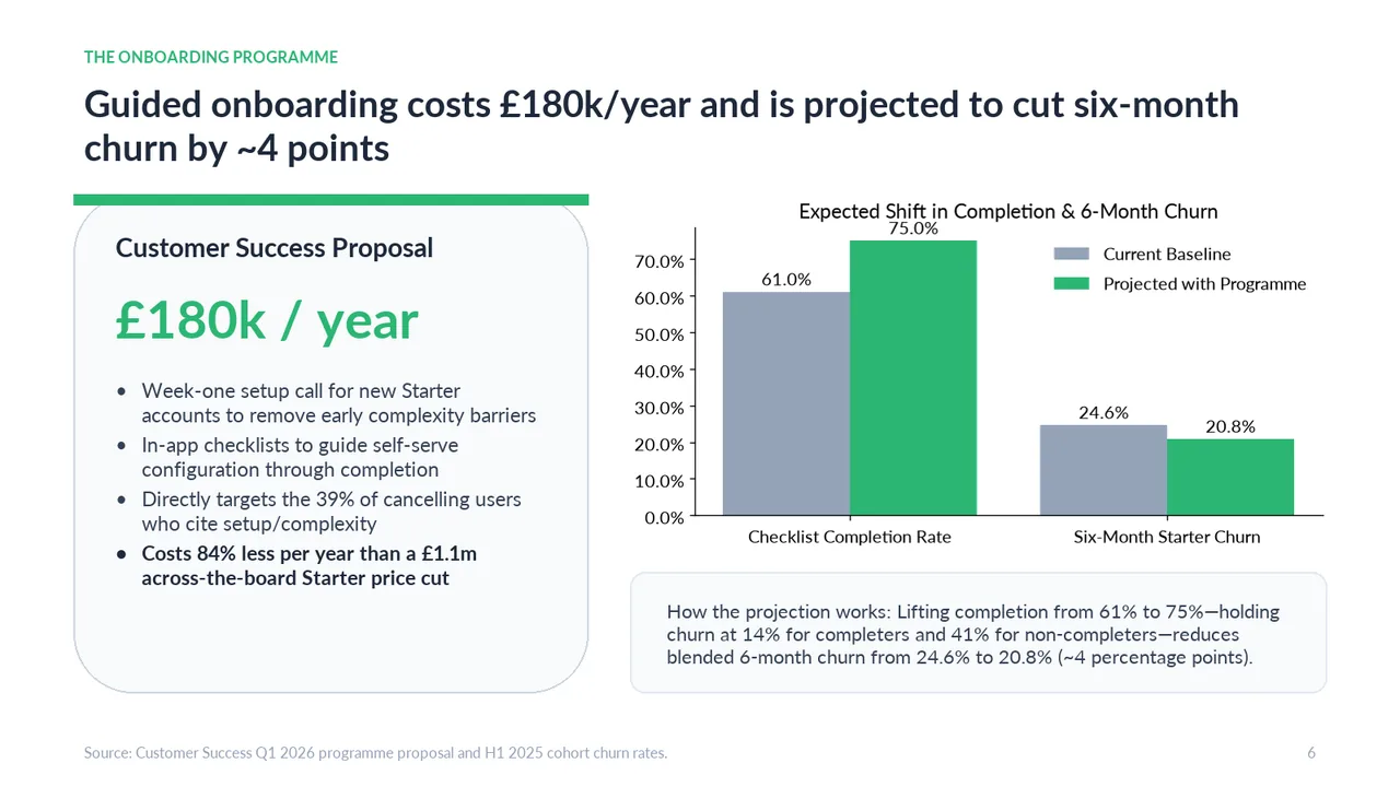
    Slide 6Download slide imagePolished The '75.0%' bar label is crammed directly under the chart title
  7. Slide 7 of Gemini 4 Carbon's deck
    Slide 7Download slide imageAcceptable Both cards are text-heavy, with the caveats and guidance requiring sustained reading.The headline numbers are the largest elements on the slide, yet they are the figures the audience is told not to rely on, so emphasis works against the message
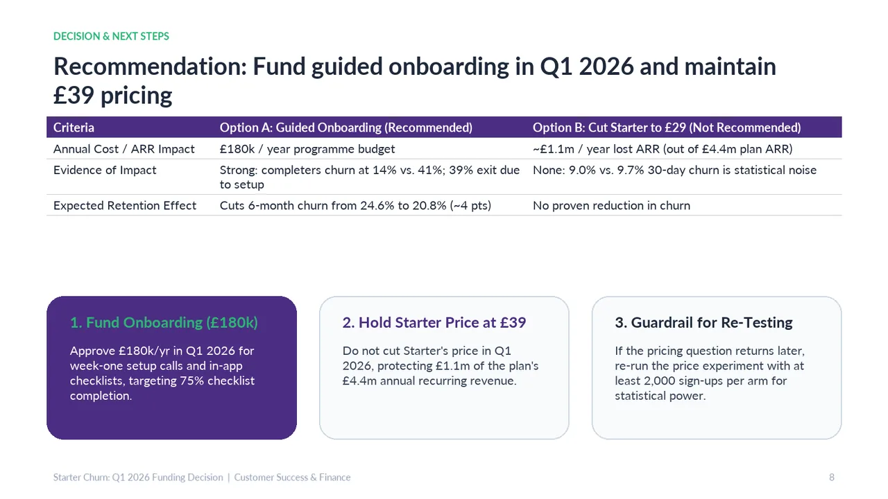
  8. Slide 8 of Gemini 4 Carbon's deck
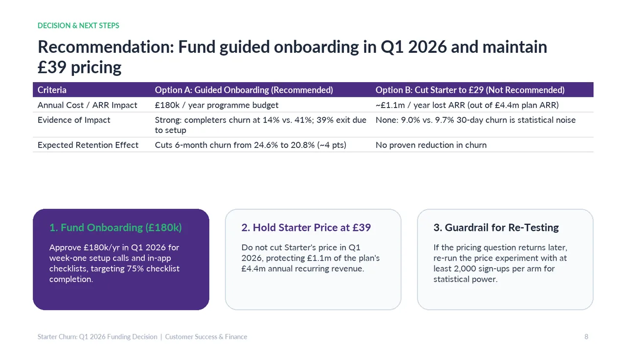
    Slide 8Download slide imageAcceptable A large empty band separates the comparison table from the action cards, weakening the connection between evidence and next steps.Large empty gap between the table and the action cards leaves the layout unbalanced