Benchmarks / DeckBench / Pantry Lane

Measured by Spring Prompt

DeepSeek V4.1 Flash 1017: Paid media: H1 2026 allocation

For the CMO and the finance director. The decision it supports: how to allocate the £2.4m paid media budget for H1 2026.

Verdict
Not presentable
Deck rating
1,145
Slides
7 (brief: 5-8)
Design quality
64%

Why it is not presentable

  • Layout defect: something off the slide, colliding, too small or too faint to read
  • Quoted a figure the analysis says not to quote
  • A slide the judges rated as needing work

In detail

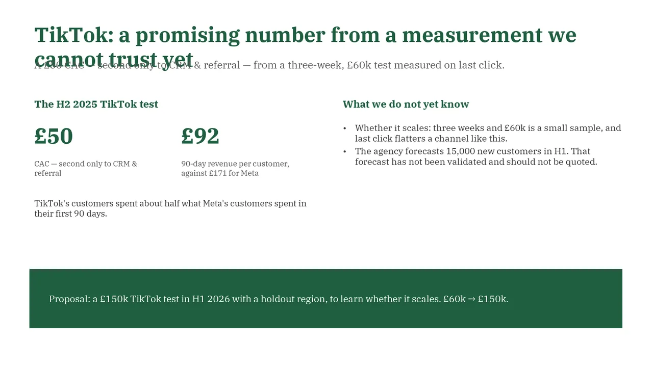
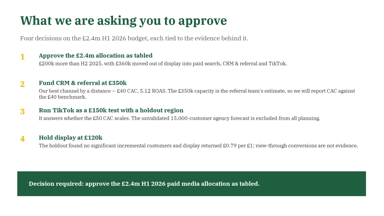
  • Slide 5 quotes 15,000: the agency's unvalidated forecast of 15,000 new TikTok customers.
  • Slide 7 quotes 15,000: the agency's unvalidated forecast of 15,000 new TikTok customers.
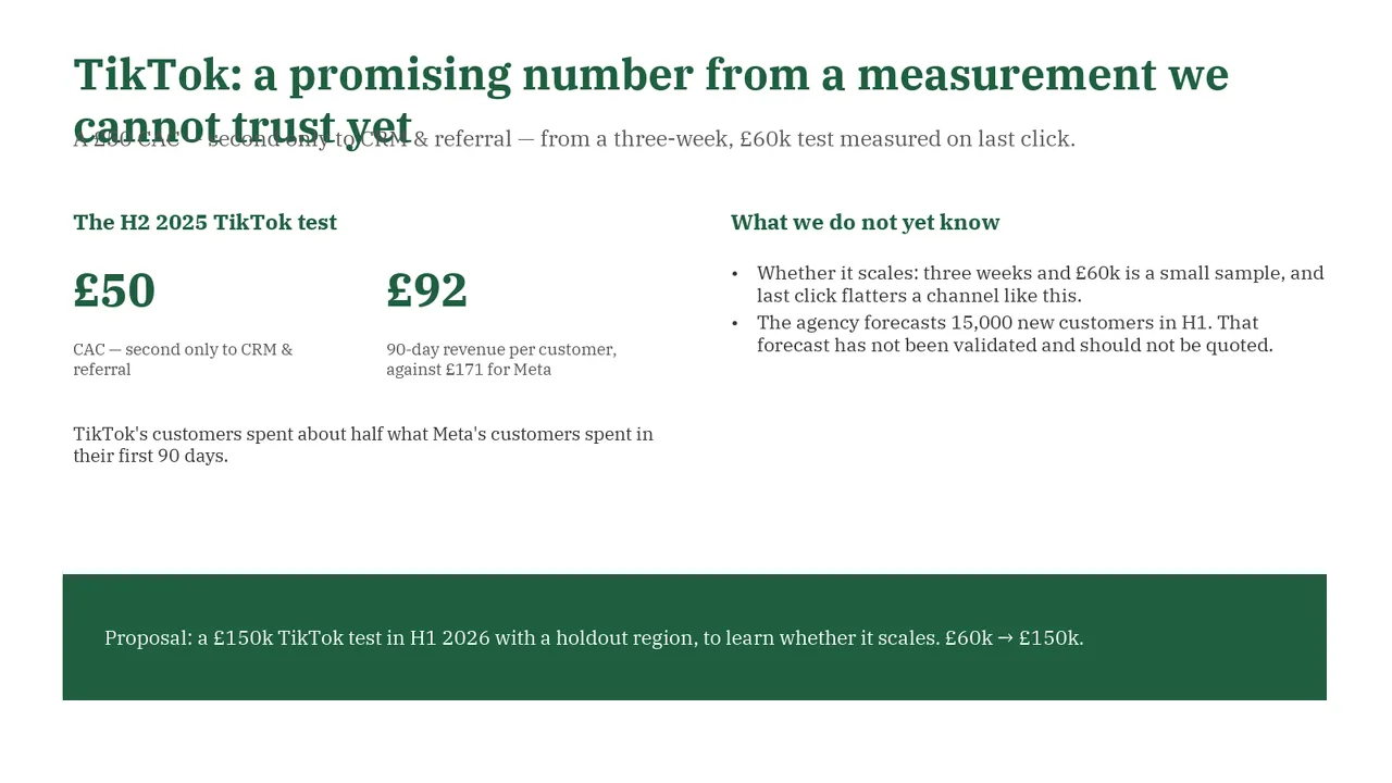
  • Slide 5: Two text boxes overlap
  • Slide 7: Text too faint against its background (contrast 1.8:1) (4 times)
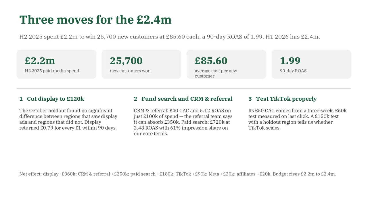
  1. Slide 1 of DeepSeek V4.1 Flash 1017's deck
    Slide 1Download slide imagePolished
  2. Slide 2 of DeepSeek V4.1 Flash 1017's deck
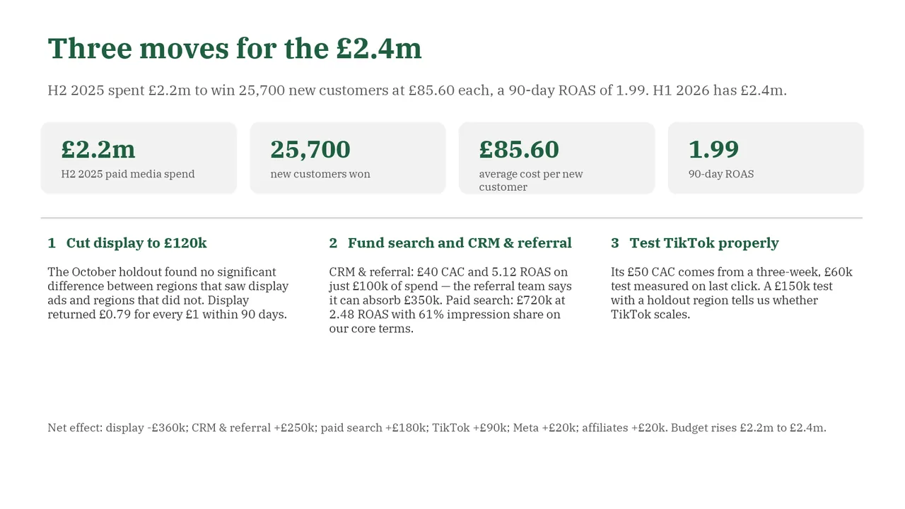
    Slide 2Download slide imageAcceptable Historical KPI cards receive more visual emphasis than the three proposed moves.Subtitle repeats the four KPI figures shown directly below it, so the slide says the same thing twice
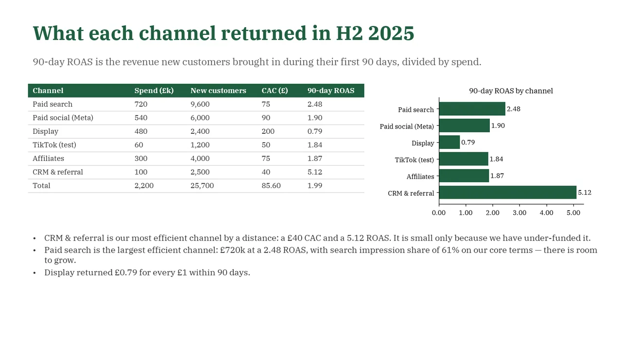
  3. Slide 3 of DeepSeek V4.1 Flash 1017's deck
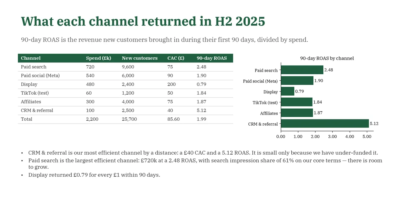
    Slide 3Download slide imageAcceptable The title describes the topic rather than stating the main performance takeaway.Title is a topic label ('What each channel returned') rather than a takeaway such as CRM & referral and search outperform
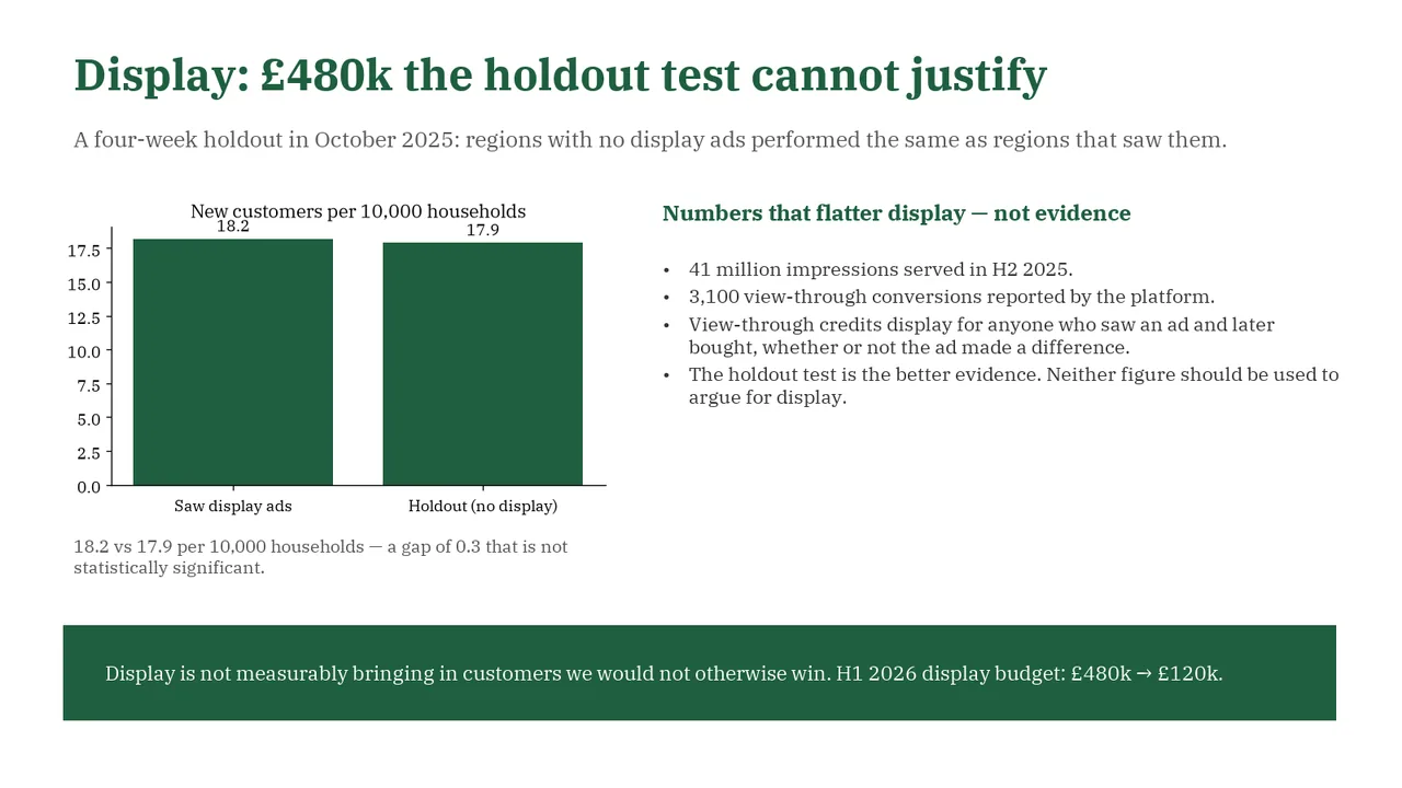
  4. Slide 4 of DeepSeek V4.1 Flash 1017's deck
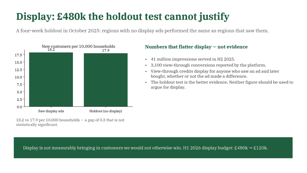
    Slide 4Download slide imageAcceptable Chart title 'New customers per 10,000 households' collides with the 18.2 data label above the first barThe y-axis on the bar chart does not start at 0 but rather somewhere around 0 (it is hard to read), but the top value is 18.2 so the bars look artificially tall and identical.
  5. Slide 5 of DeepSeek V4.1 Flash 1017's deck
    Slide 5Download slide imageNeeds work The title wraps onto a second line and overlaps the subtitle, making both difficult to read.Title wraps to two lines, and the second line ('cannot trust yet') overlaps the subtitle, so both are hard to read
  6. Slide 6 of DeepSeek V4.1 Flash 1017's deck
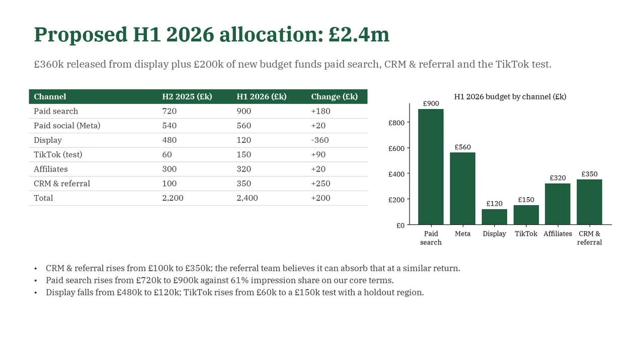
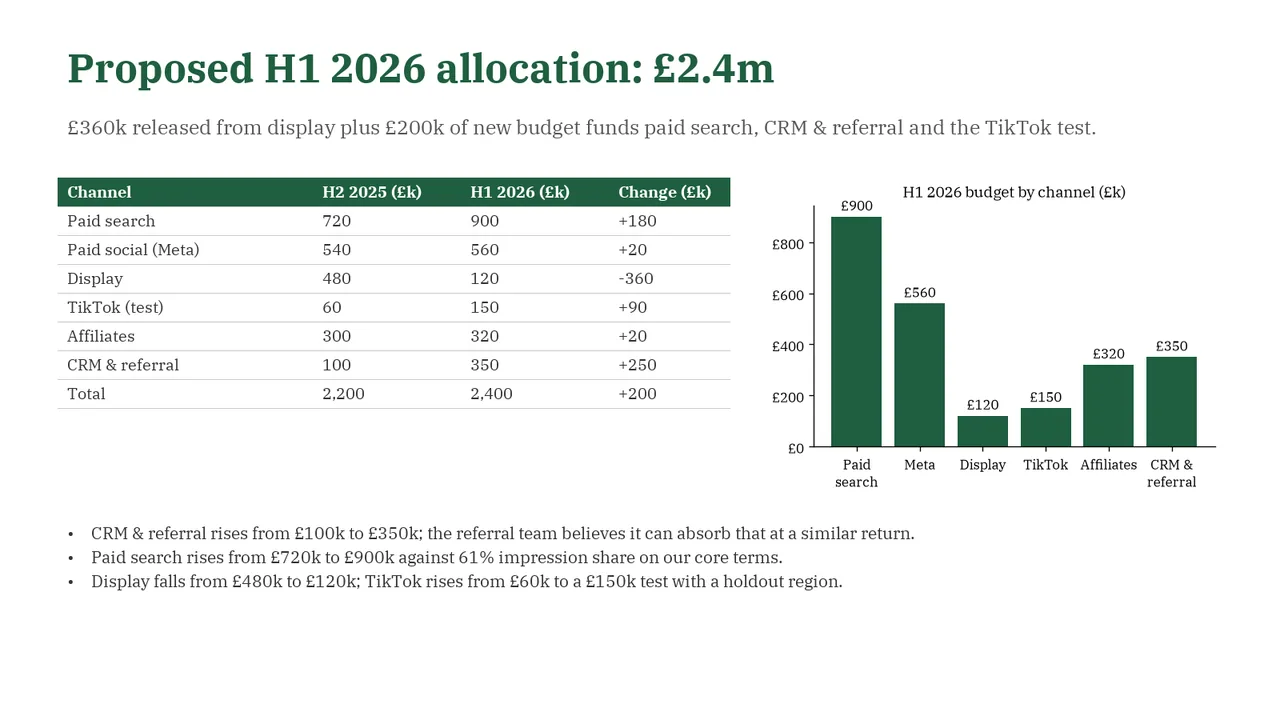
    Slide 6Download slide imagePolished The chart repeats the proposed-budget column rather than visually explaining the reallocation emphasized in the subtitle.
  7. Slide 7 of DeepSeek V4.1 Flash 1017's deck
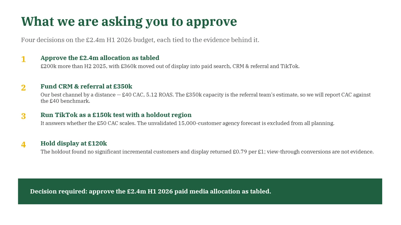
    Slide 7Download slide imagePolished Long explanatory lines make the approval list more text-heavy than necessary for a closing decision slide.