Benchmarks / DeckBench / Pantry Lane

Measured by Spring Prompt

Gemini 4 Argon: Paid media: H1 2026 allocation

For the CMO and the finance director. The decision it supports: how to allocate the £2.4m paid media budget for H1 2026.

Verdict
Not presentable
Deck rating
1,026
Slides
5 (brief: 5-8)
Design quality
60%

Why it is not presentable

  • Layout defect: something off the slide, colliding, too small or too faint to read

In detail

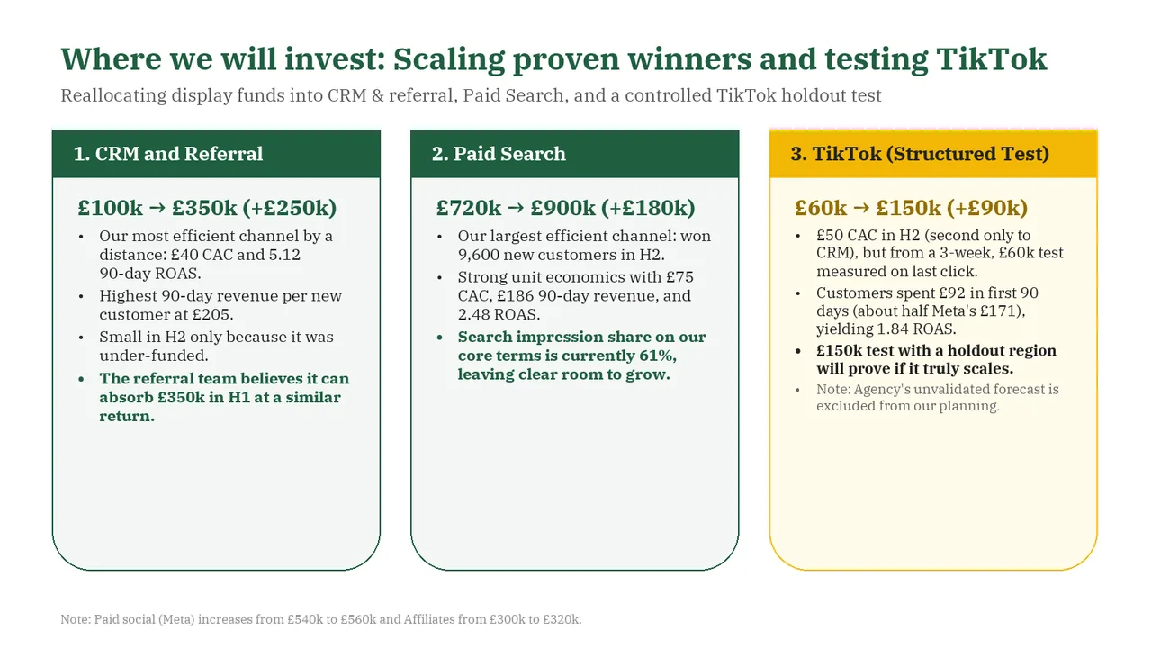
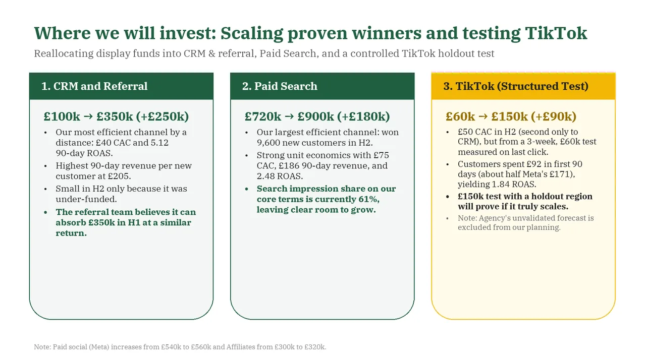
  • Slide 4: A body text box set at 11.5 pt, too small to read
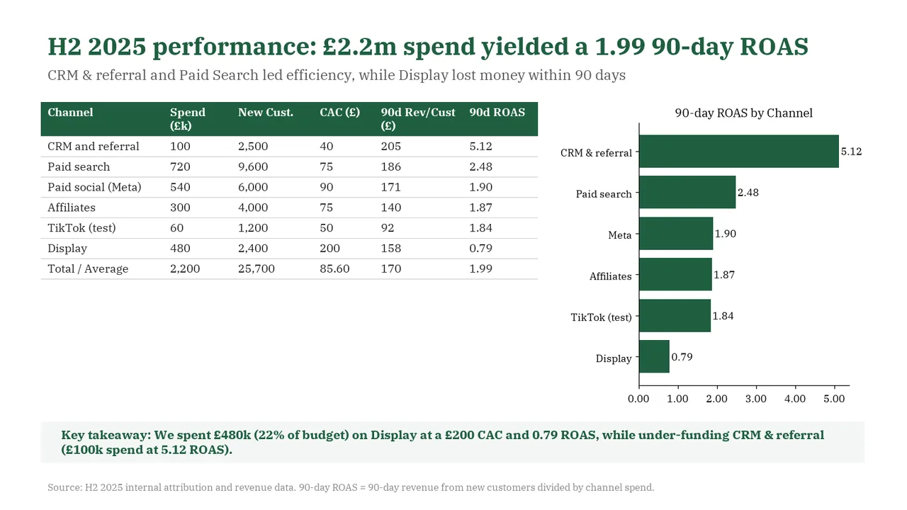
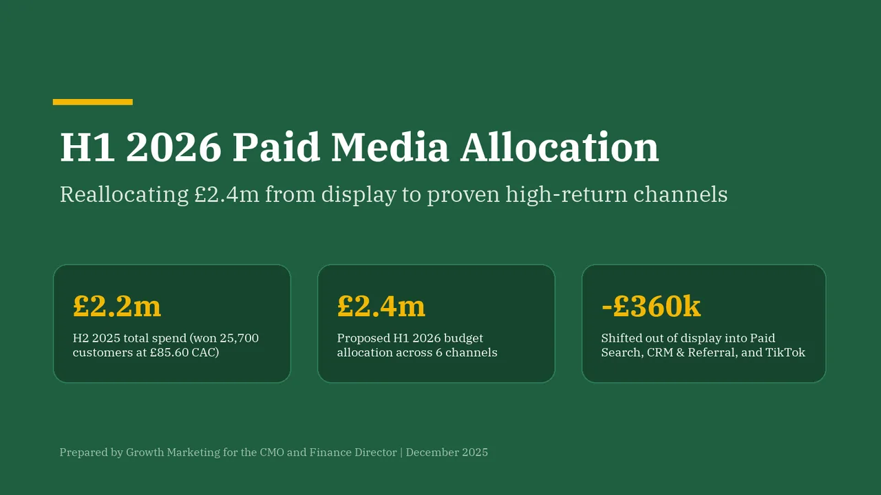
  1. Slide 1 of Gemini 4 Argon's deck
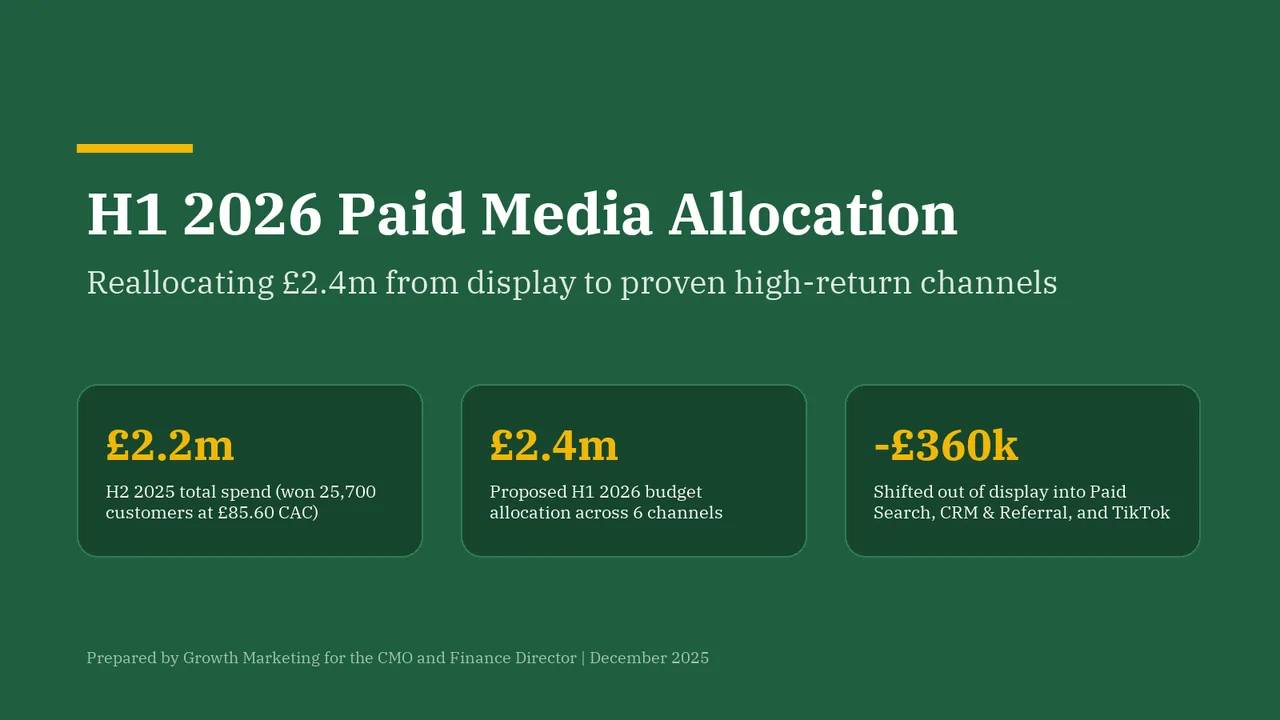
    Slide 1Download slide imagePolished
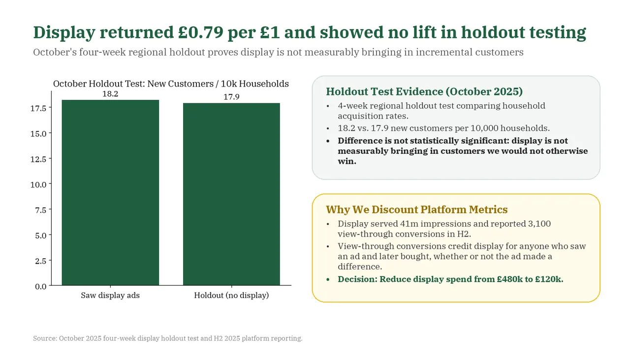
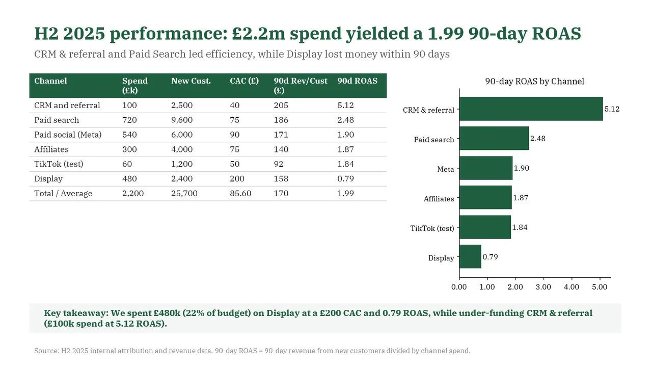
  2. Slide 2 of Gemini 4 Argon's deck
    Slide 2Download slide imageAcceptable The short table beside the much taller chart leaves a large unused area beneath the table, making the body layout uneven.Large empty white area below the table on the left leaves the layout unbalanced
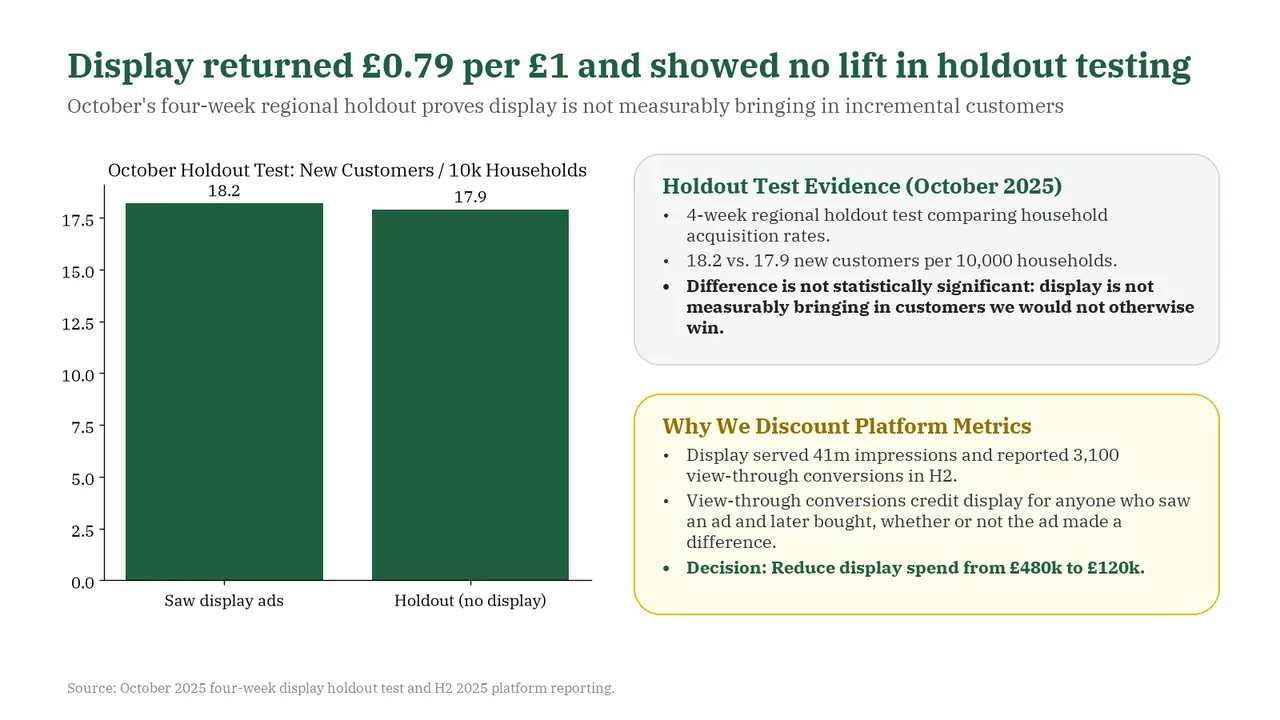
  3. Slide 3 of Gemini 4 Argon's deck
    Slide 3Download slide imageAcceptable The two explanatory panels are text-heavy, with several multiline bullets that require sustained reading.The '18.2' data label sits very close to the chart title, which feels cramped
  4. Slide 4 of Gemini 4 Argon's deck
    Slide 4Download slide imageAcceptable The cards contain substantial bullet text; shorter supporting points would make the allocation rationale easier to scan.The three cards are much taller than their content, leaving large empty lower halves
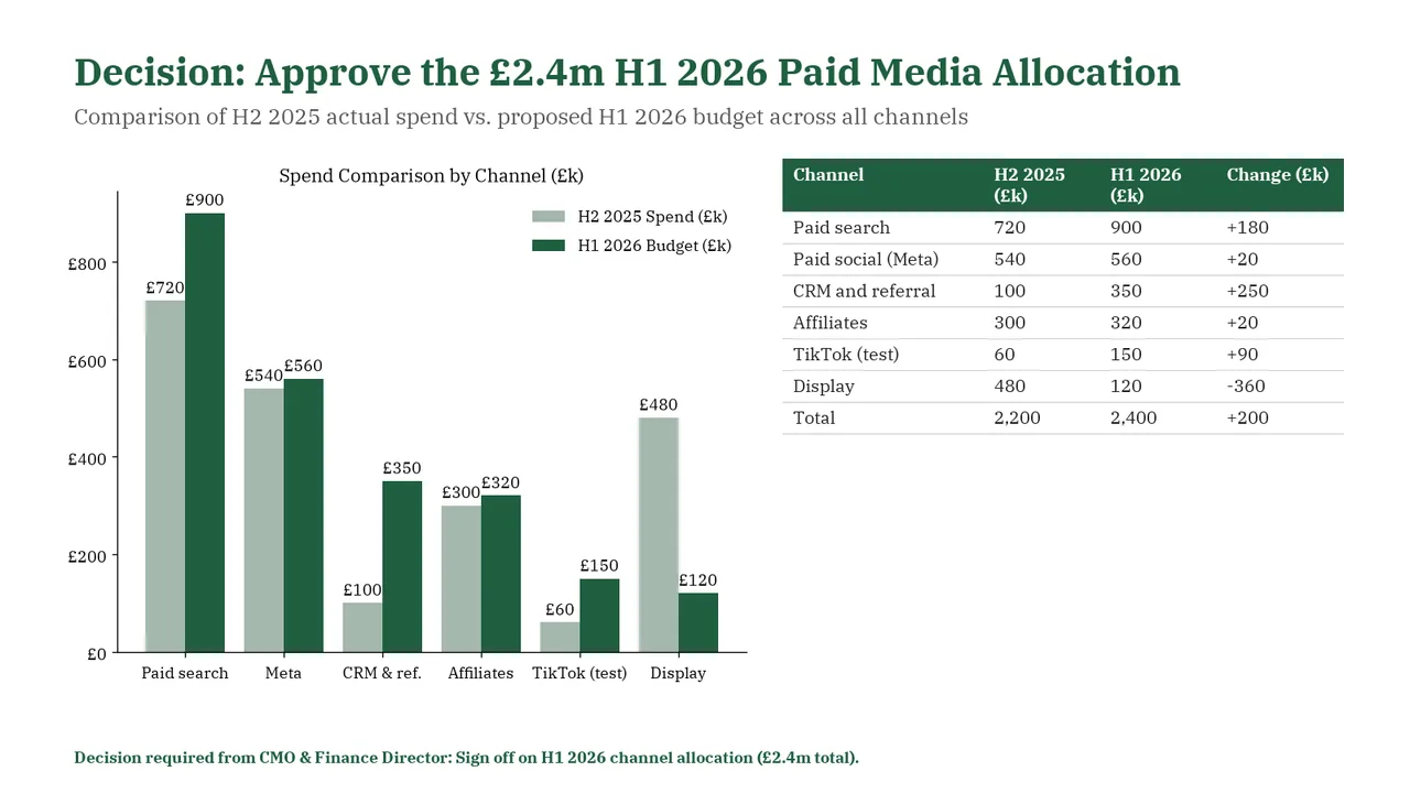
  5. Slide 5 of Gemini 4 Argon's deck
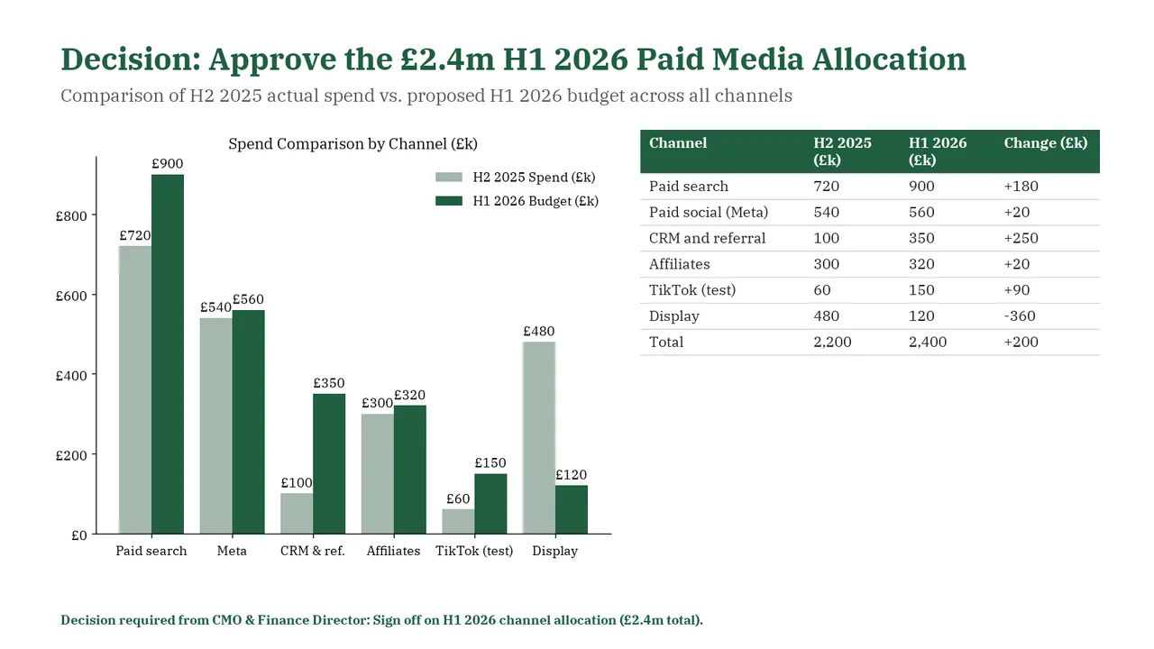
    Slide 5Download slide imageAcceptable The value labels above the Meta bars run together as '£540£560'; the Affiliates labels similarly run together as '£300£320'. Reposition or stagger these labels.Large empty space below the table on the right leaves the layout unbalanced