Benchmarks / DeckBench / Pantry Lane

Measured by Spring Prompt

Kimi K3.1 Pro: Paid media: H1 2026 allocation

For the CMO and the finance director. The decision it supports: how to allocate the £2.4m paid media budget for H1 2026.

Verdict
Not presentable
Deck rating
1,247
Slides
6 (brief: 5-8)
Design quality
75%

Why it is not presentable

  • Layout defect: something off the slide, colliding, too small or too faint to read
  • Left out a key finding

In detail

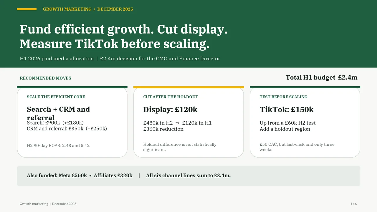
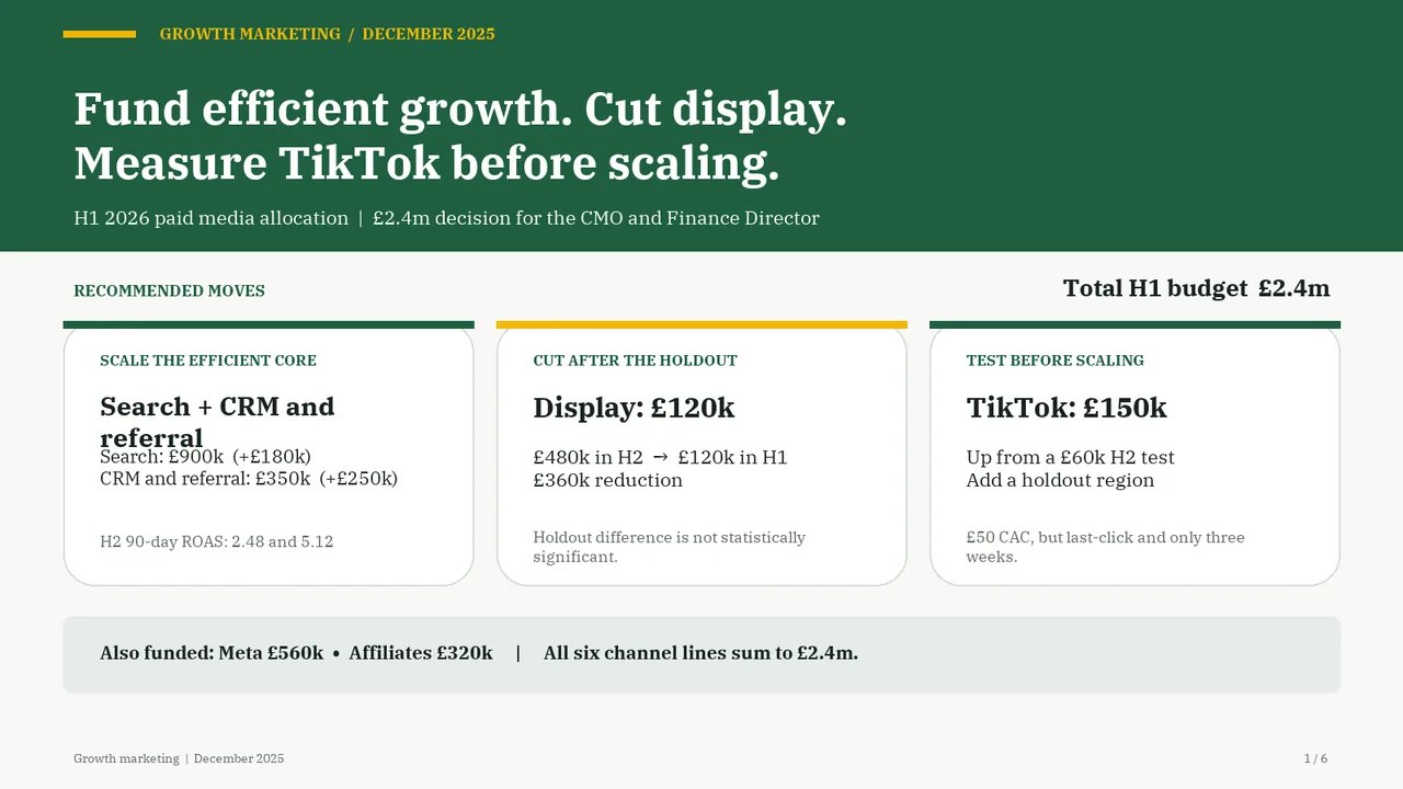
  • Slide 1: 2 text boxes set at 8.5 pt, too small to read
  • Slide 1: Two text boxes overlap
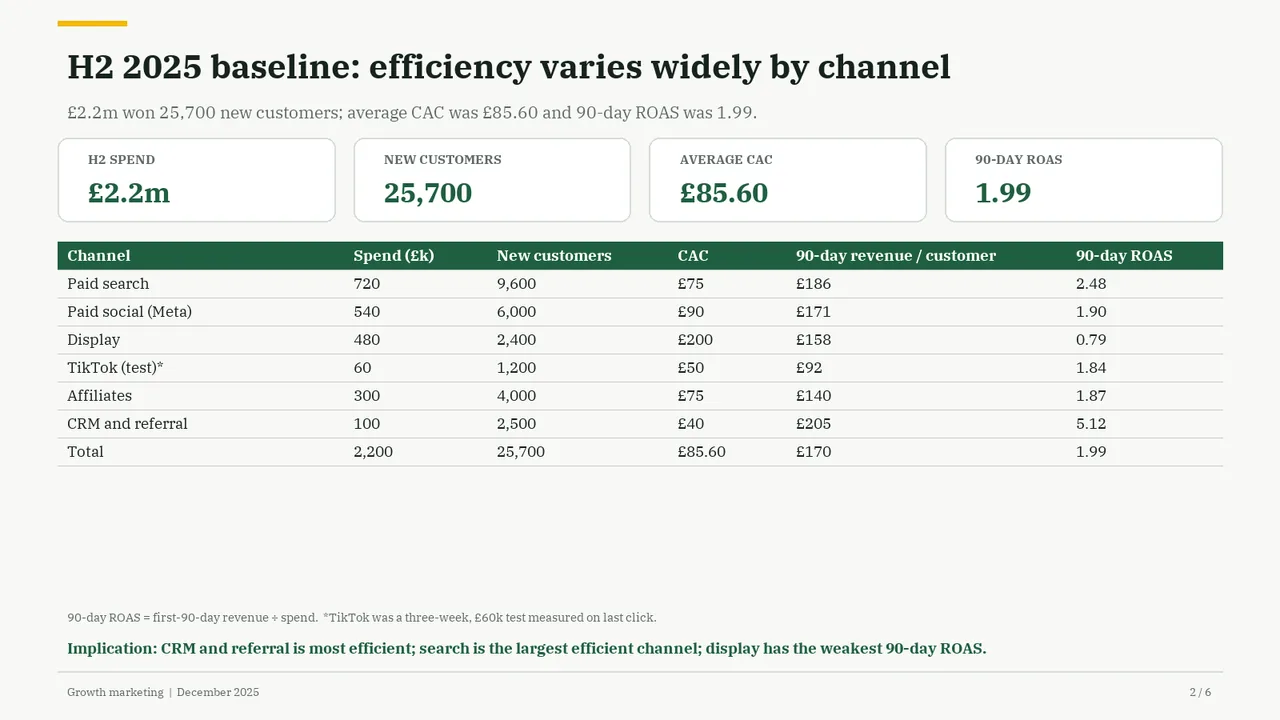
  • Slide 2: 4 text boxes set at 9.5 pt, too small to read
  • Slide 2: A text box set at 9 pt, too small to read
  1. Slide 1 of Kimi K3.1 Pro's deck
    Slide 1Download slide imageAcceptable In the first recommendation card, the two-line heading sits too close to the budget details beneath it; add vertical separation.In the first card, the two-line heading 'Search + CRM and referral' collides with the 'Search: £900k (+£180k)' line beneath it; the text overlaps.
  2. Slide 2 of Kimi K3.1 Pro's deck
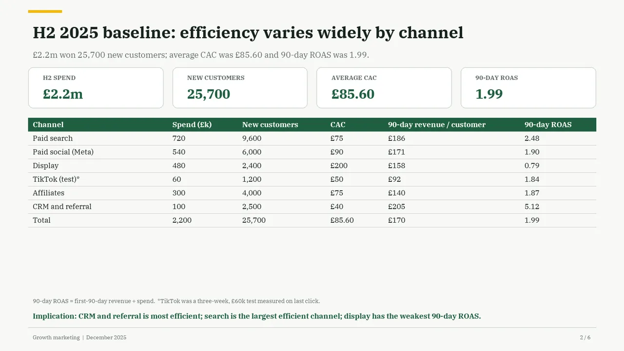
    Slide 2Download slide imageAcceptable The table gives all channel rows equal visual weight, leaving the key efficiency differences unhighlighted.Large empty gap between the table and the footnote; the lower third of the slide is wasted.
  3. Slide 3 of Kimi K3.1 Pro's deck
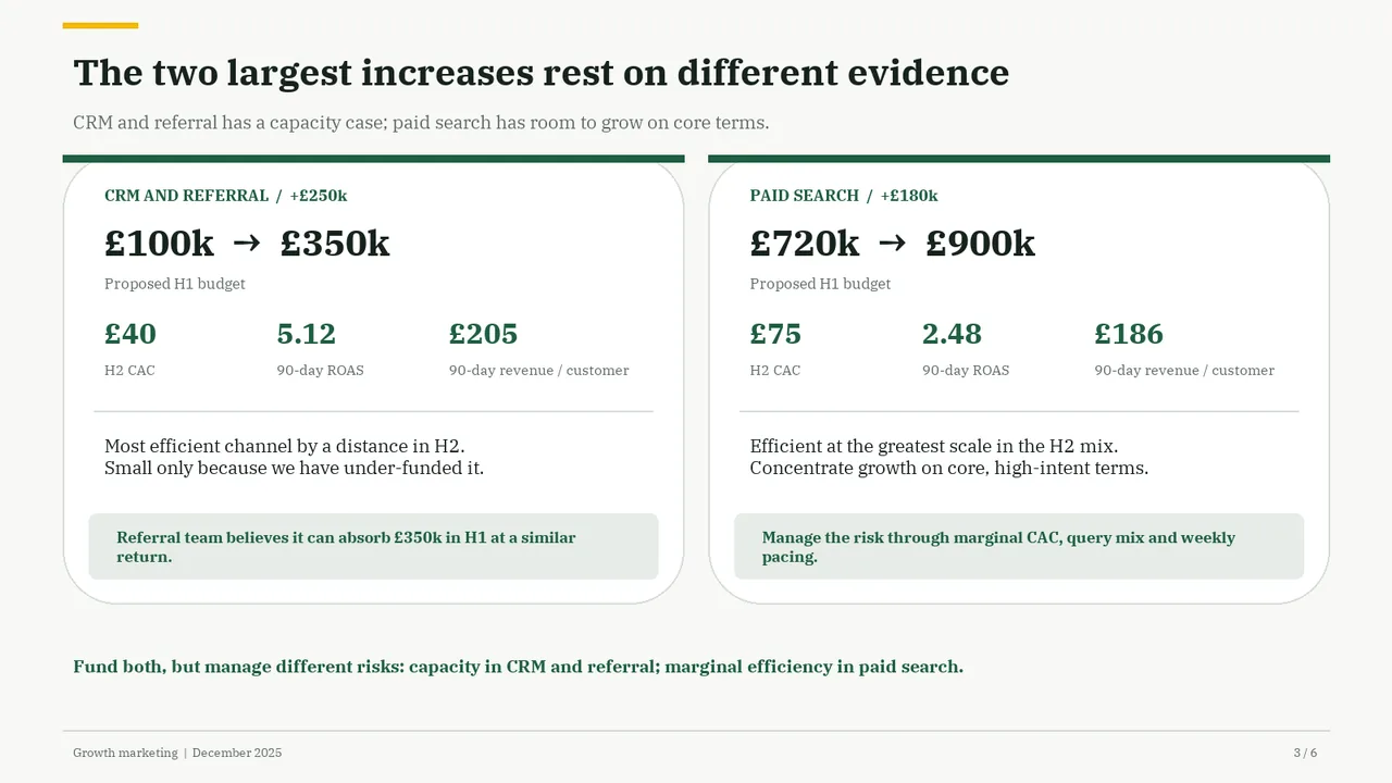
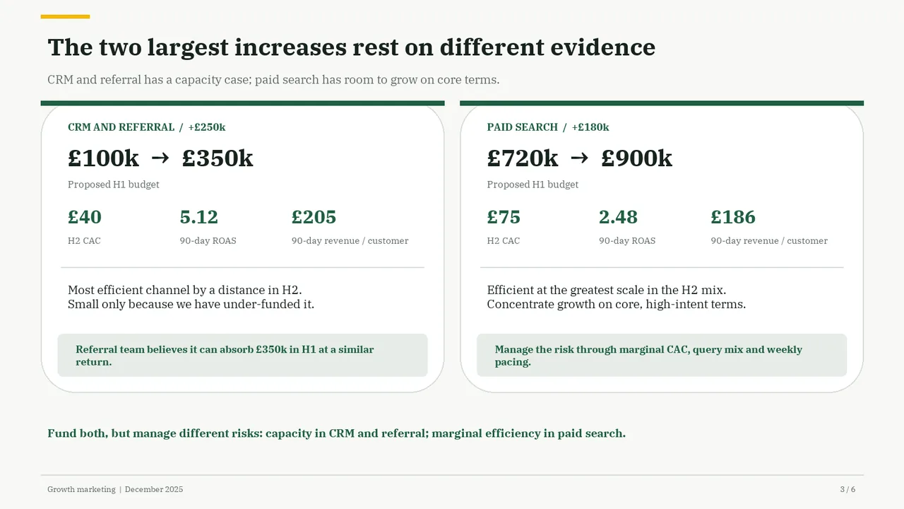
    Slide 3Download slide imagePolished
  4. Slide 4 of Kimi K3.1 Pro's deck
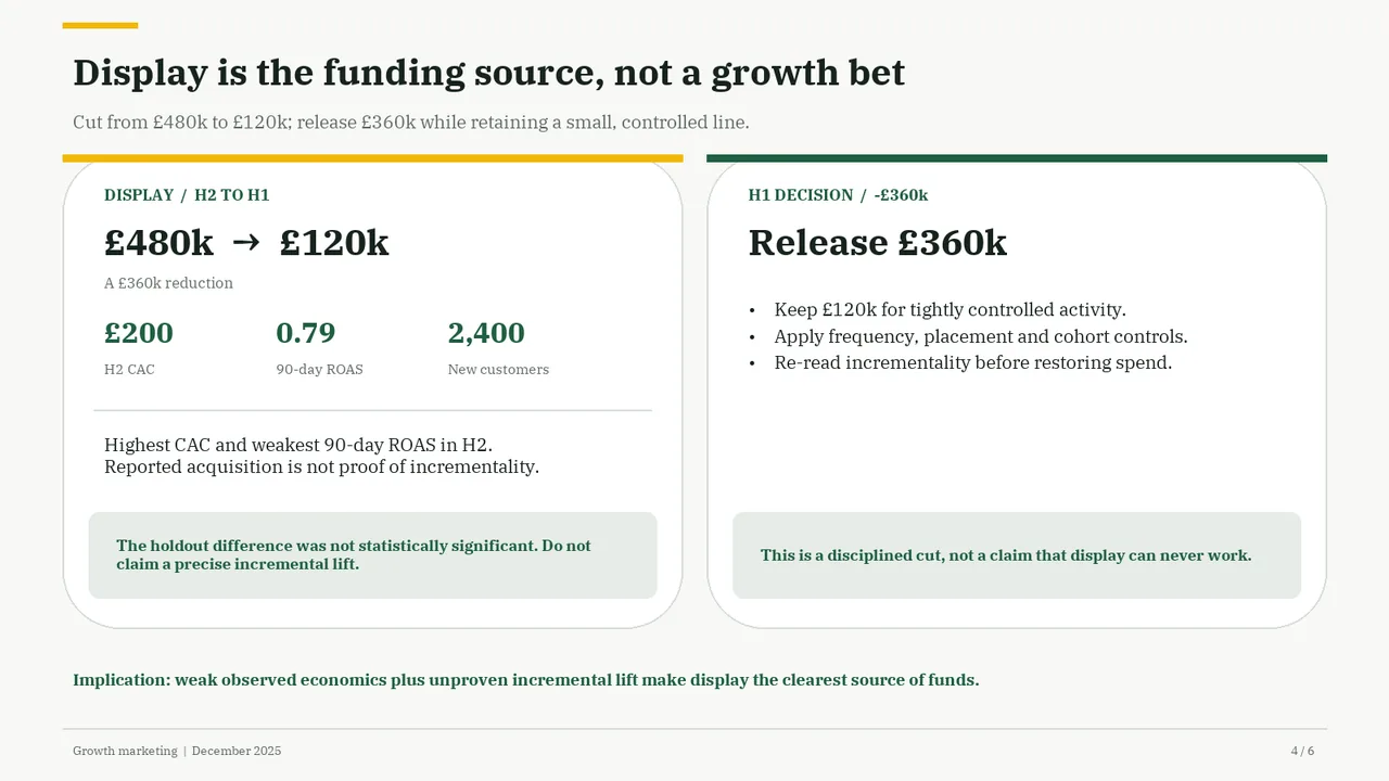
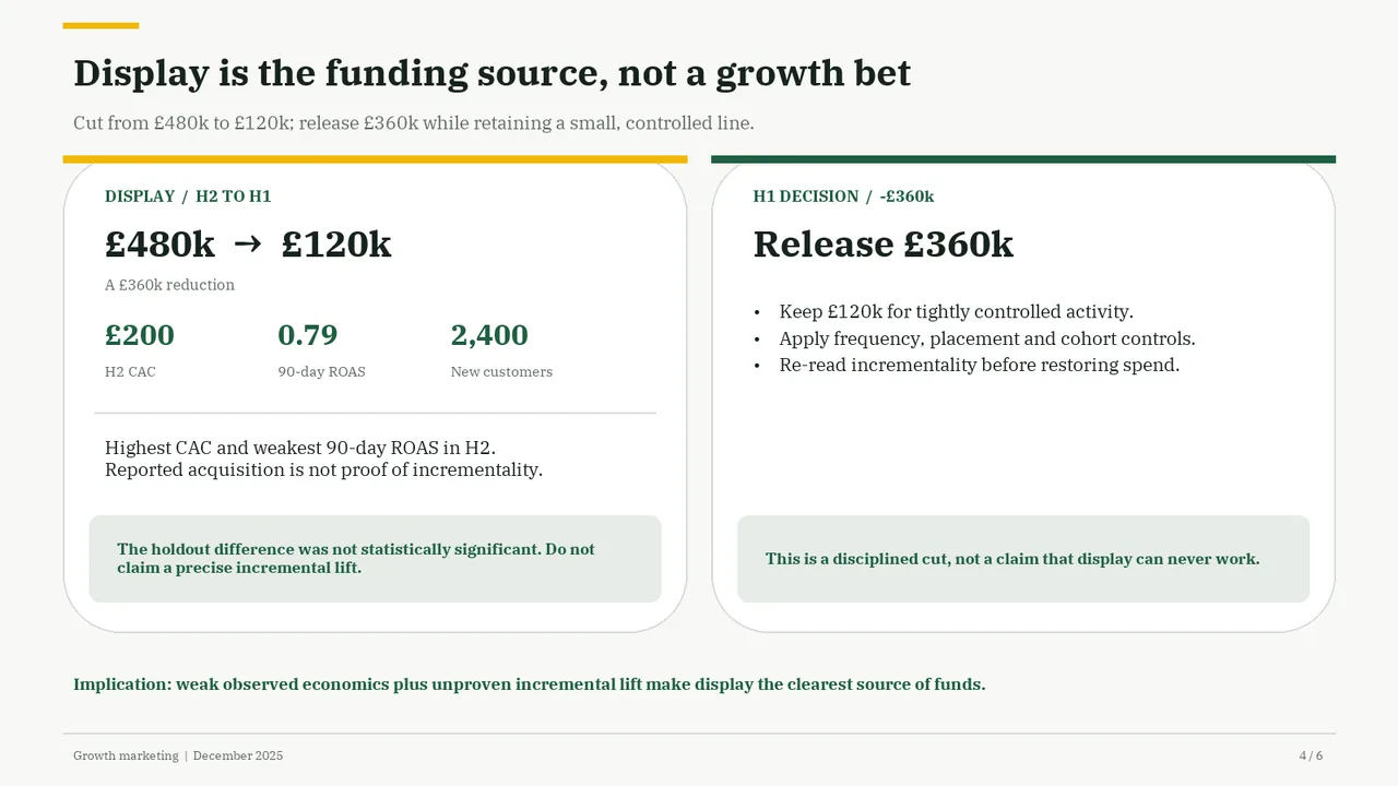
    Slide 4Download slide imagePolished The right card has a large empty gap between the bullets and the callout, so the two cards feel unbalanced.
  5. Slide 5 of Kimi K3.1 Pro's deck
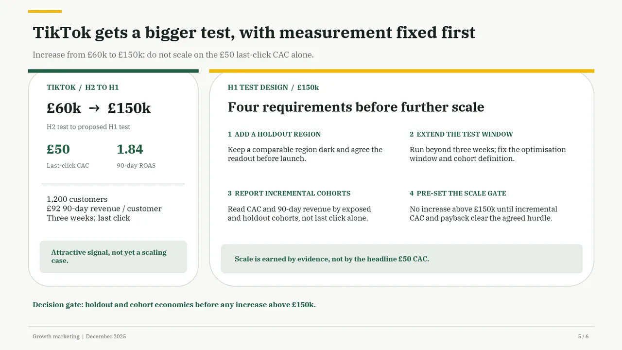
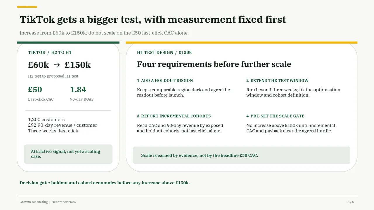
    Slide 5Download slide imagePolished
  6. Slide 6 of Kimi K3.1 Pro's deck
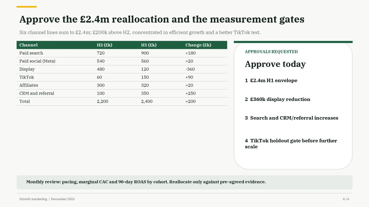
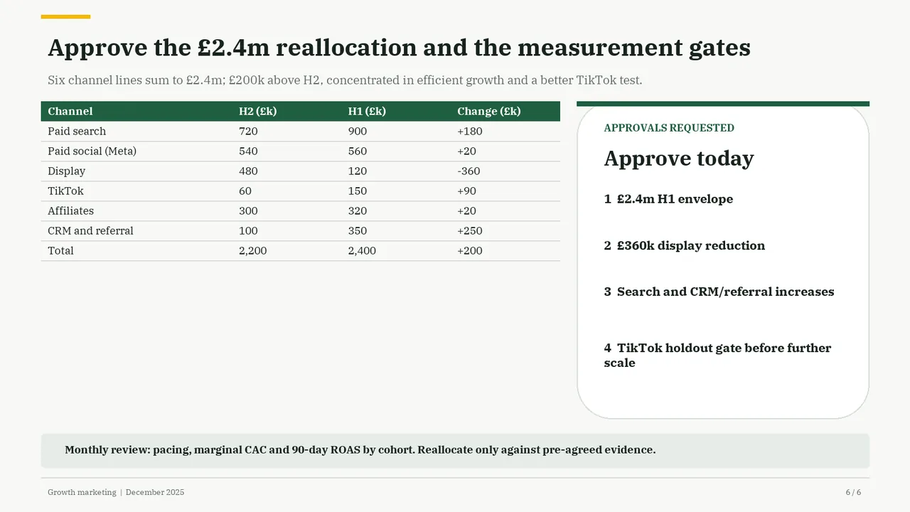
    Slide 6Download slide imageAcceptable The short table beside the tall approval card leaves a large unused area beneath the table, making the layout feel unbalanced.Large empty space below the table on the left half of the slide.