Benchmarks / DeckBench / Pantry Lane

Measured by Spring Prompt

Gemini 4 Carbon: Paid media: H1 2026 allocation

For the CMO and the finance director. The decision it supports: how to allocate the £2.4m paid media budget for H1 2026.

Verdict
Not presentable
Deck rating
1,021
Slides
6 (brief: 5-8)
Design quality
75%

Why it is not presentable

  • Layout defect: something off the slide, colliding, too small or too faint to read

In detail

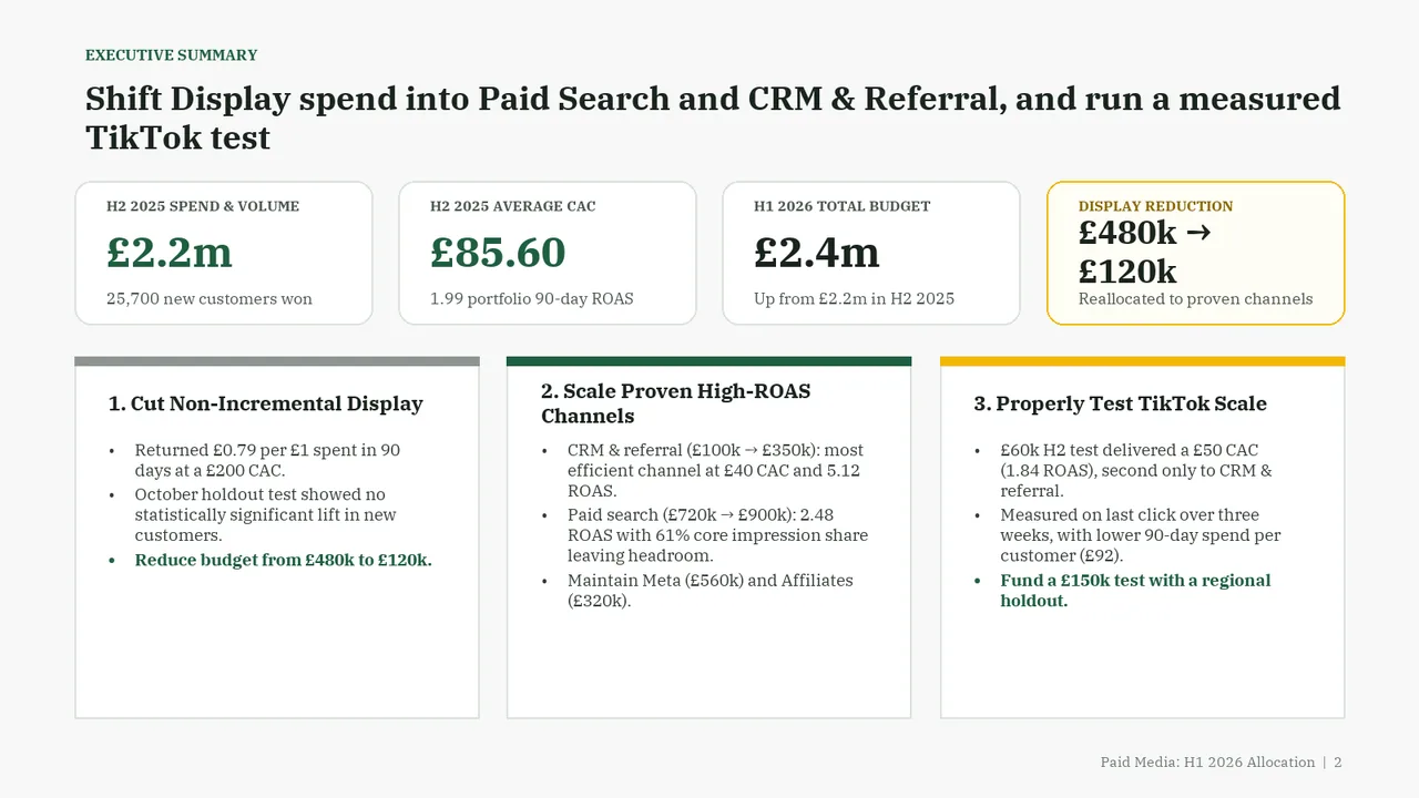
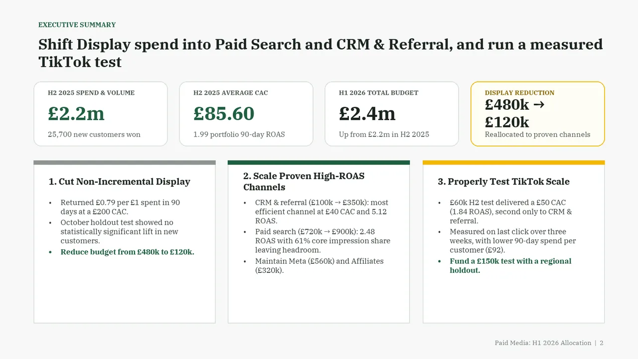
  • Slide 2: 4 text boxes set at 9.5 pt, too small to read
  • Slide 2: 4 body text boxes set at 11.5 pt, too small to read
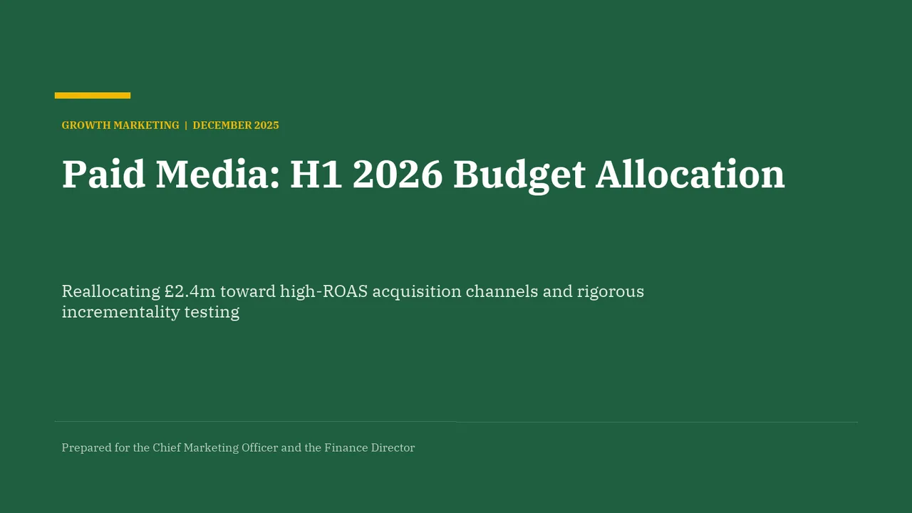
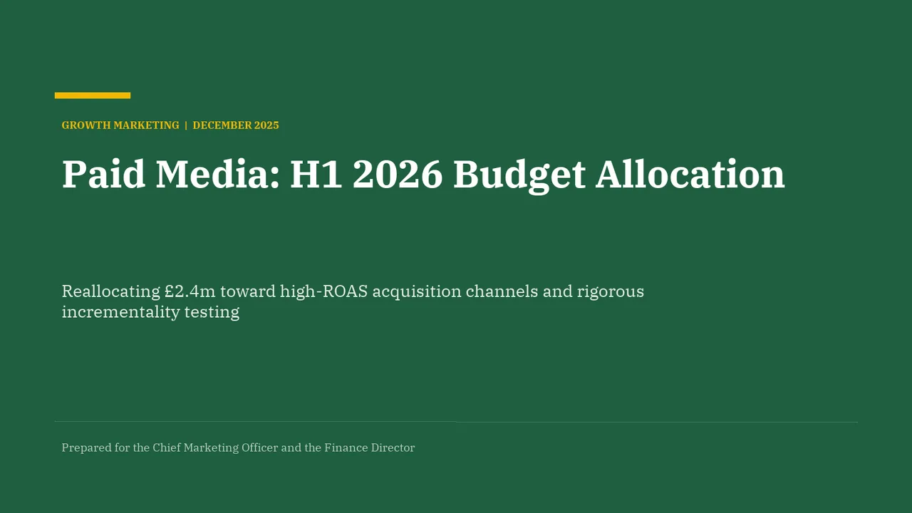
  1. Slide 1 of Gemini 4 Carbon's deck
    Slide 1Download slide imagePolished
  2. Slide 2 of Gemini 4 Carbon's deck
    Slide 2Download slide imageAcceptable The three lower panels are text-heavy for an executive summary, requiring sustained reading beyond the headline and KPI cards.Fourth KPI card ('£480k → £120k') wraps onto two lines, crowding its label and caption against the card edges
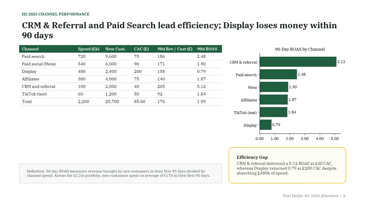
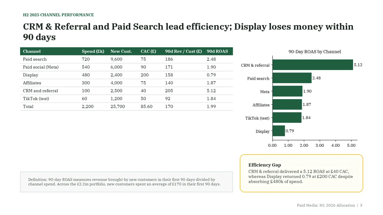
  3. Slide 3 of Gemini 4 Carbon's deck
    Slide 3Download slide imageAcceptable A large empty area between the table and the definition box makes the left side feel disconnected and less balanced than the right.Large empty area below the table on the left; the definition box floats at the bottom, detached from the table
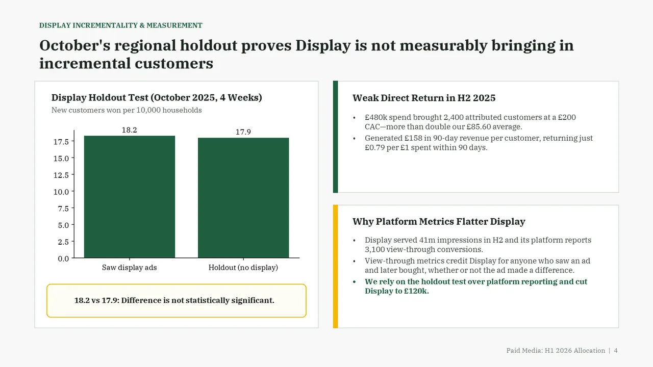
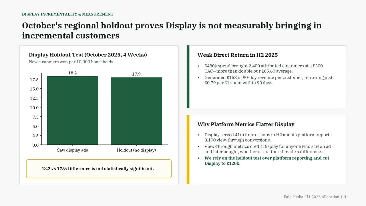
  4. Slide 4 of Gemini 4 Carbon's deck
    Slide 4Download slide imagePolished
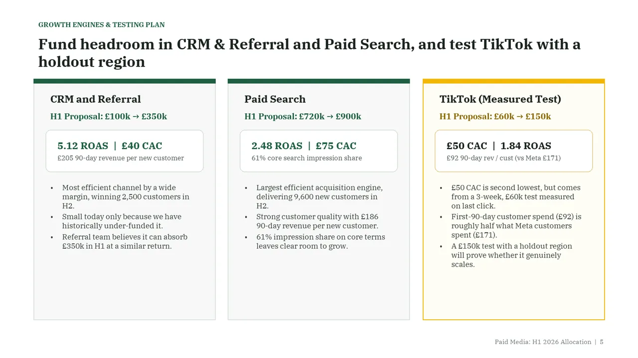
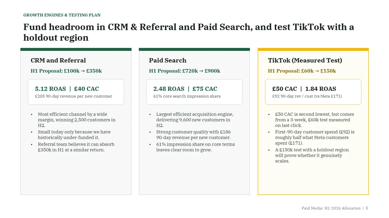
  5. Slide 5 of Gemini 4 Carbon's deck
    Slide 5Download slide imageAcceptable Three parallel panels of multi-line bullets make the slide text-heavy despite the useful metric highlights.The bottom third of all three cards is empty, so space is unbalanced
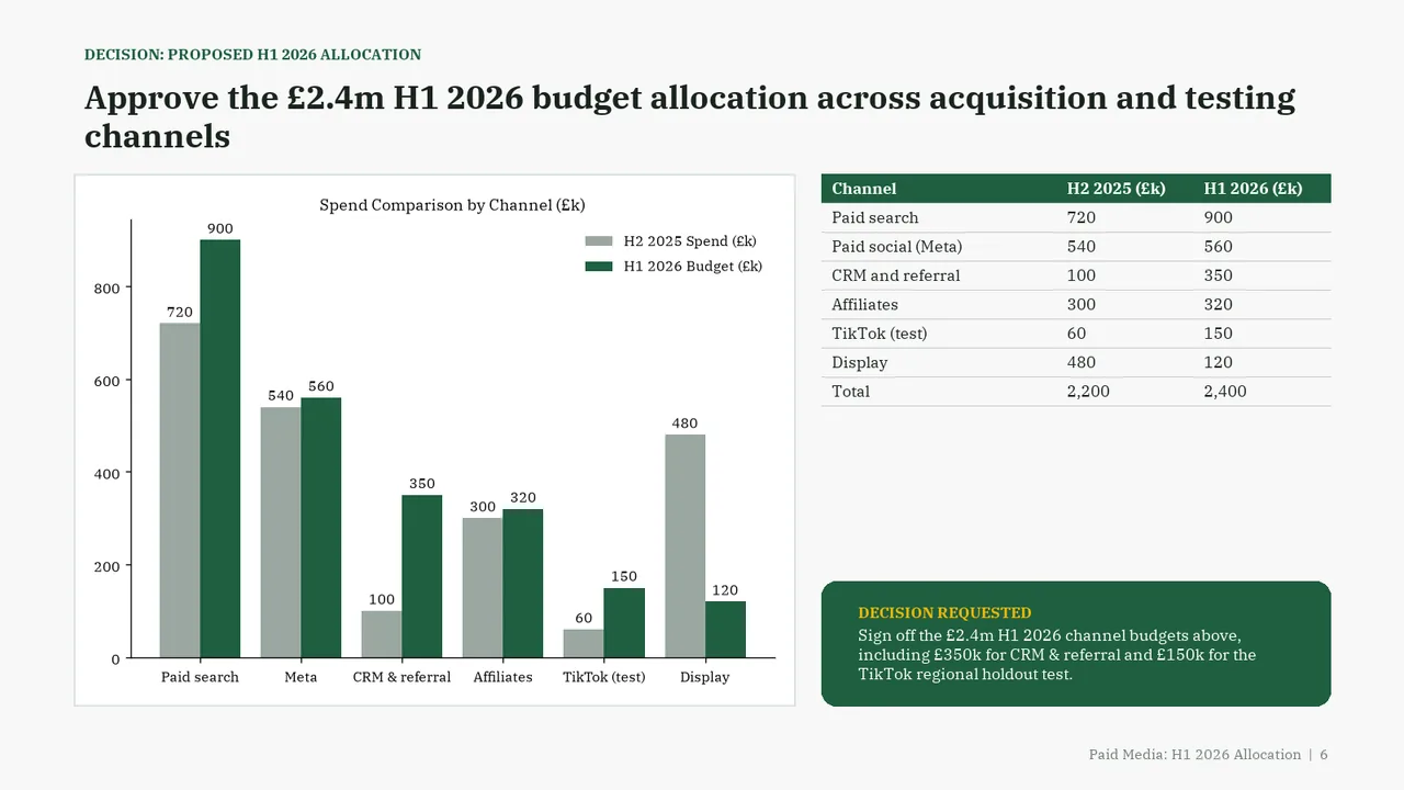
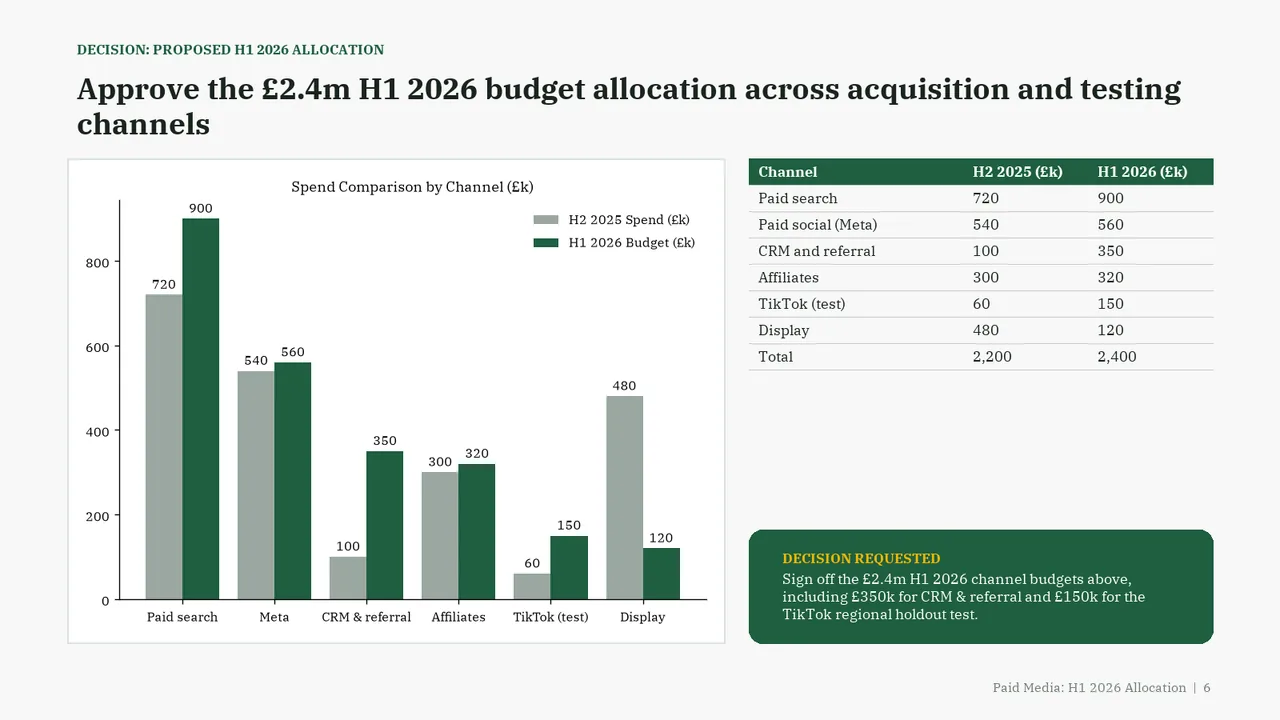
  6. Slide 6 of Gemini 4 Carbon's deck
    Slide 6Download slide imagePolished Large empty gap between the table and the Decision Requested box