Benchmarks / DeckBench / Pantry Lane

Measured by Spring Prompt

Gemini 4 Hydrogen: Paid media: H1 2026 allocation

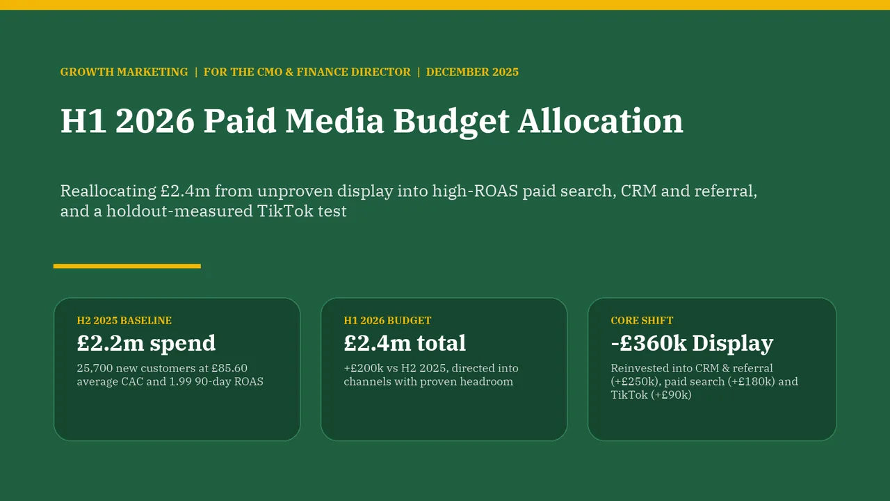
For the CMO and the finance director. The decision it supports: how to allocate the £2.4m paid media budget for H1 2026.

Verdict
Not presentable
Deck rating
1,147
Slides
6 (brief: 5-8)
Design quality
67%

Why it is not presentable

  • Layout defect: something off the slide, colliding, too small or too faint to read

In detail

  • Slide 1: 3 body text boxes set at 11 pt, too small to read
  • Slide 2: A body text box set at 11.5 pt, too small to read
  • Slide 2: A text box set at 9 pt, too small to read
  • Slide 3: A text box set at 9 pt, too small to read
  • Slide 4: 2 body text boxes set at 11.5 pt, too small to read
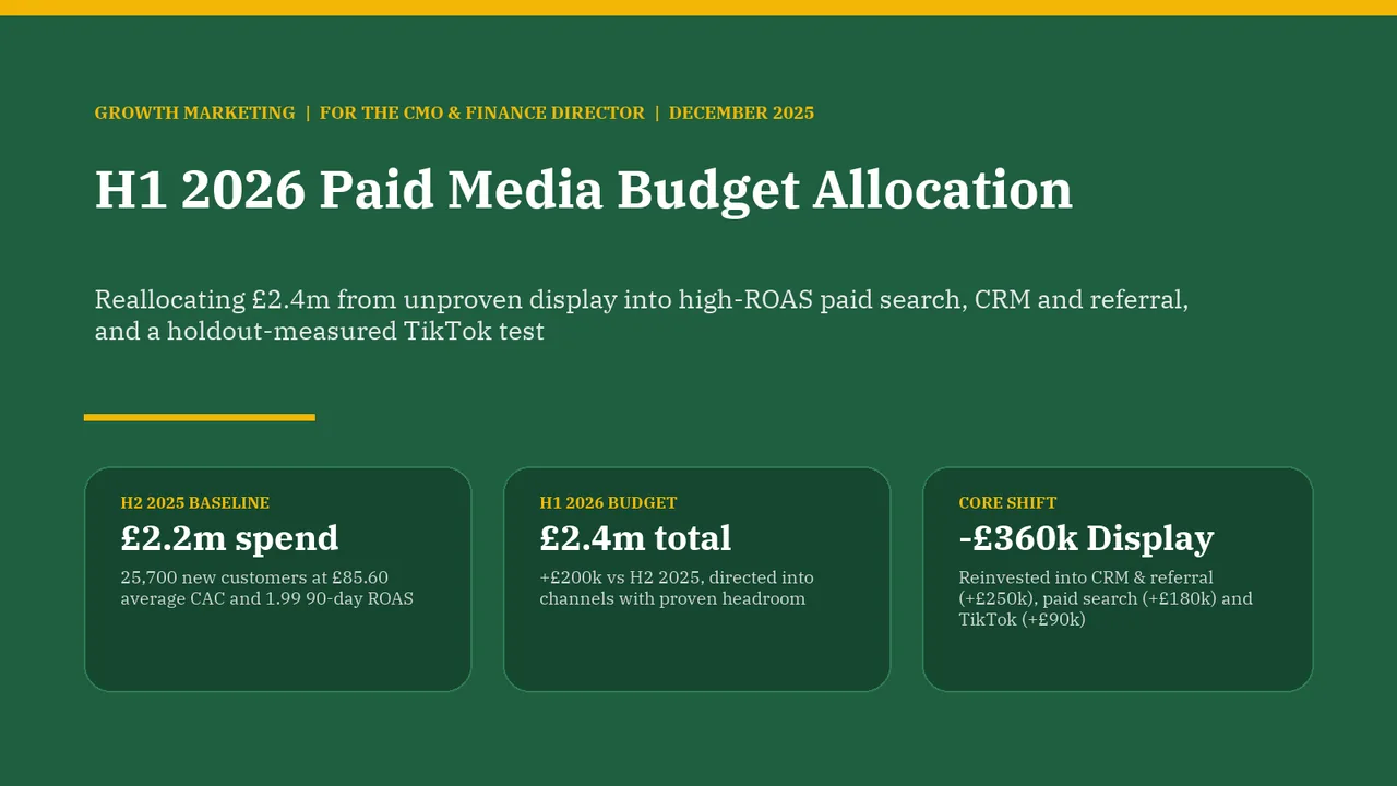
  1. Slide 1 of Gemini 4 Hydrogen's deck
    Slide 1Download slide imagePolished
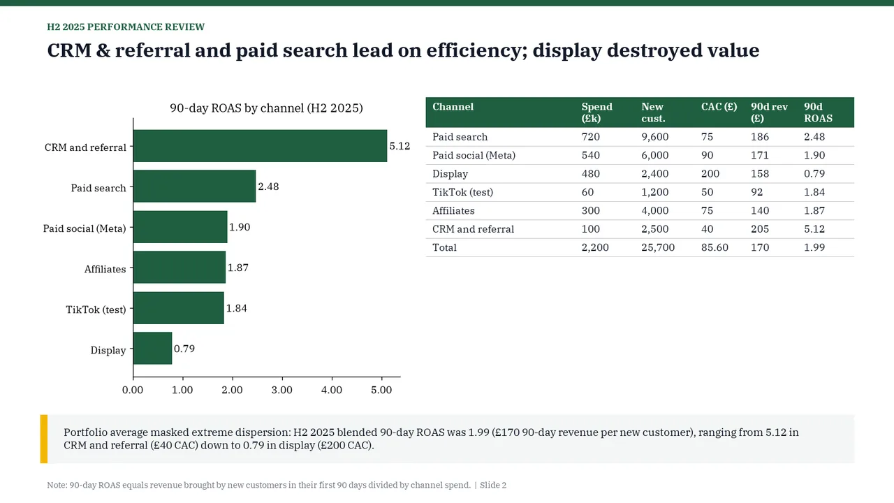
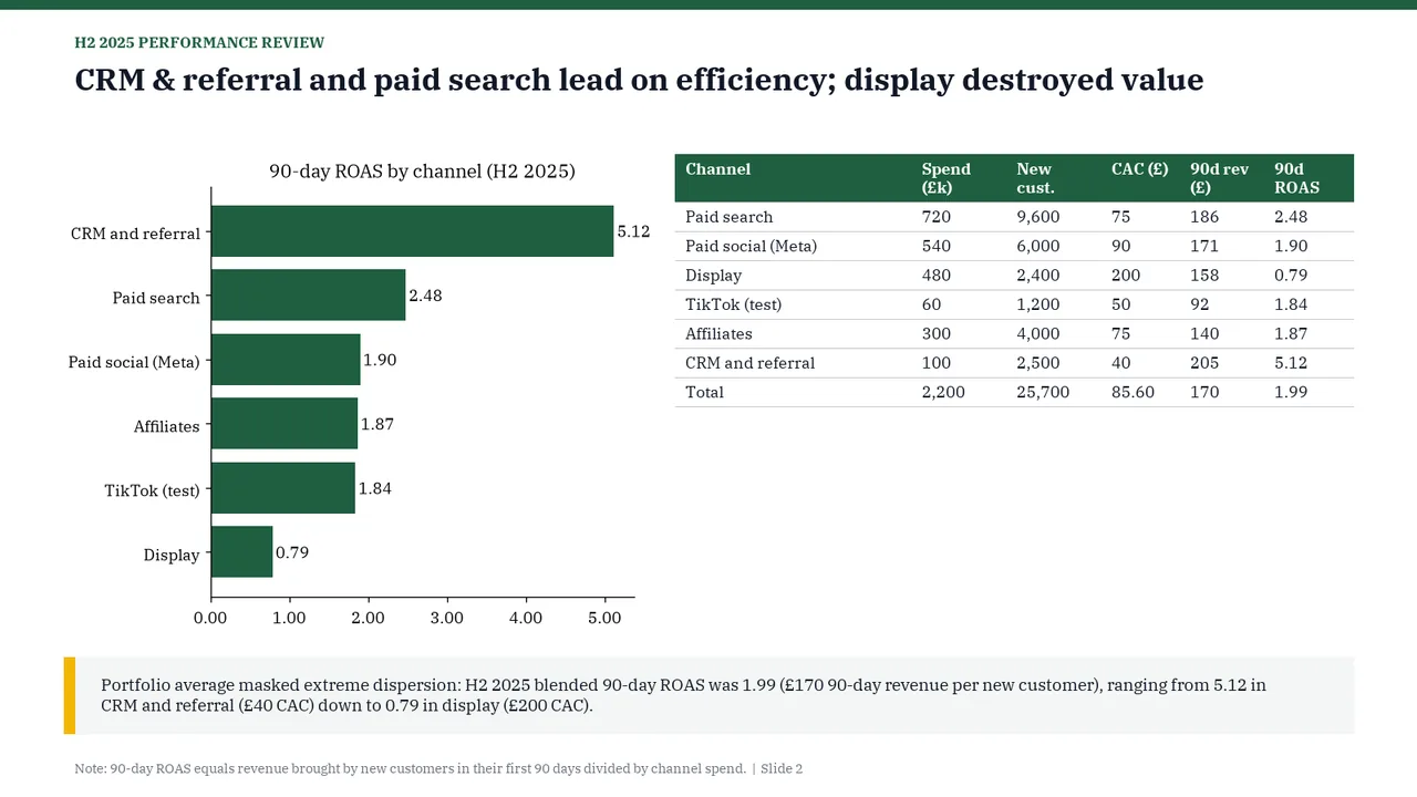
  2. Slide 2 of Gemini 4 Hydrogen's deck
    Slide 2Download slide imageAcceptable The tall chart and shallow table leave a large unused area beneath the table, making the body layout feel unbalanced.Table repeats the chart's ROAS data, so the two compete for attention
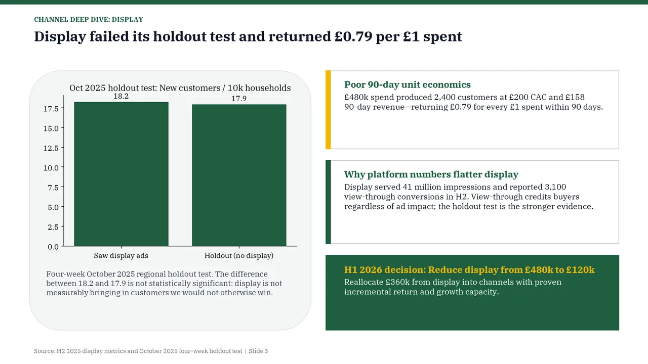
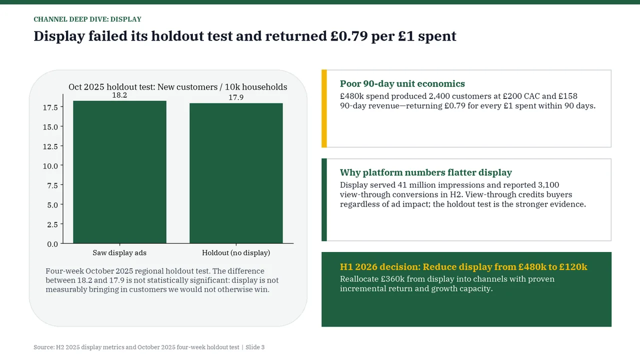
  3. Slide 3 of Gemini 4 Hydrogen's deck
    Slide 3Download slide imageAcceptable Chart title sits tight against the 18.2 / 17.9 data labelsThe data points (18.2 and 17.9) exceed the maximum value of the y-axis (17.5), causing the bars to visually extend past the top gridline.
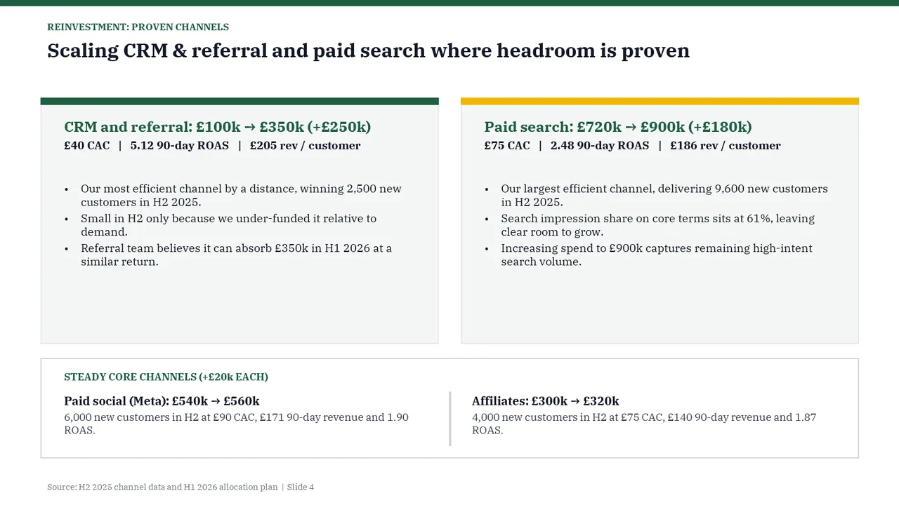
  4. Slide 4 of Gemini 4 Hydrogen's deck
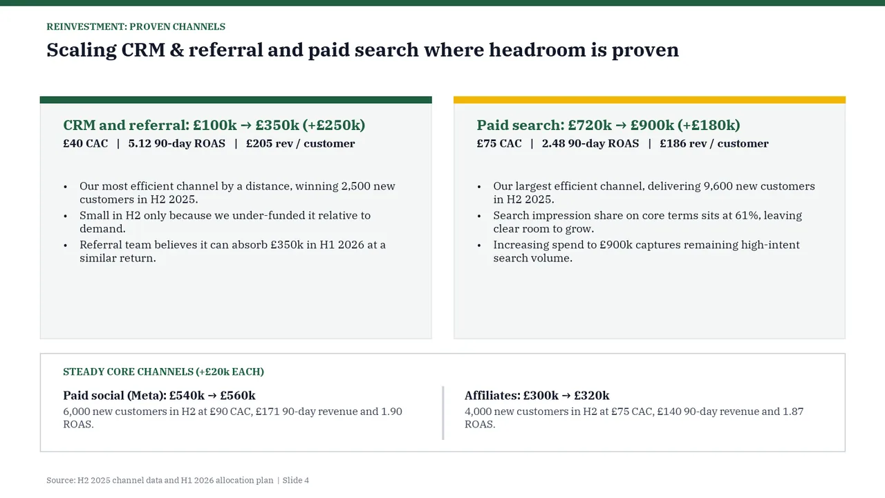
    Slide 4Download slide imageAcceptable The main panels rely on paragraphs and bullets rather than a visual comparison of the proposed increases.Text-only layout with no visual to carry the message
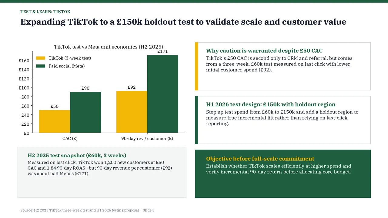
  5. Slide 5 of Gemini 4 Hydrogen's deck
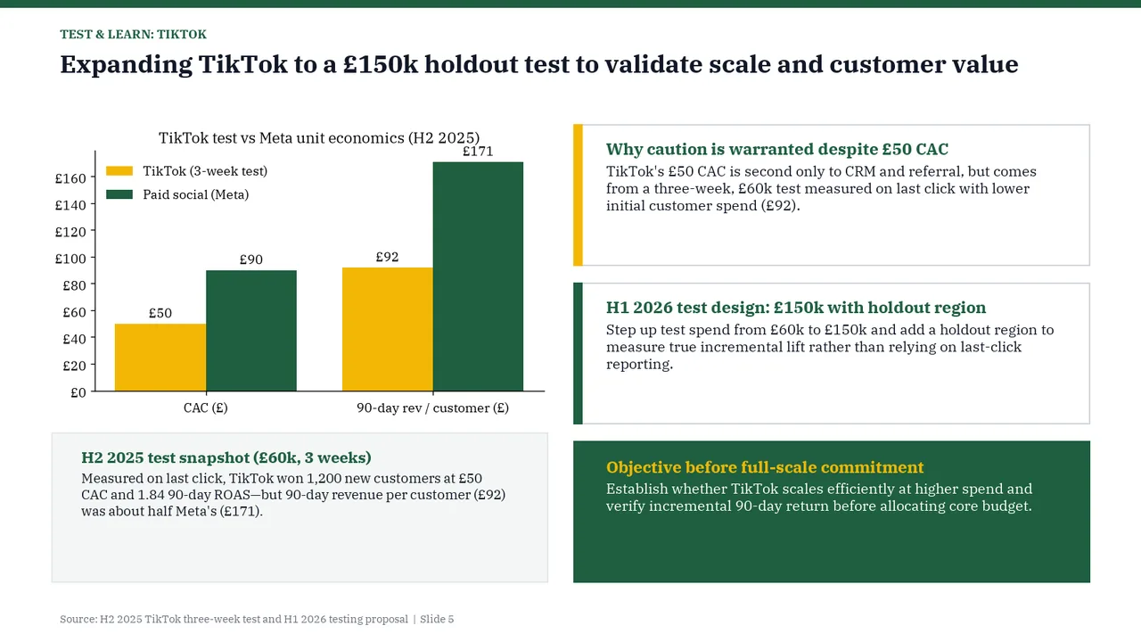
    Slide 5Download slide imageAcceptable Four substantial text boxes make the slide text-heavy alongside the chart.£171 data label and the tallest bar collide with the chart title
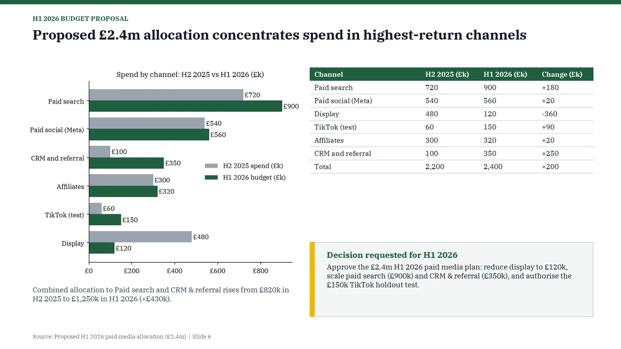
  6. Slide 6 of Gemini 4 Hydrogen's deck
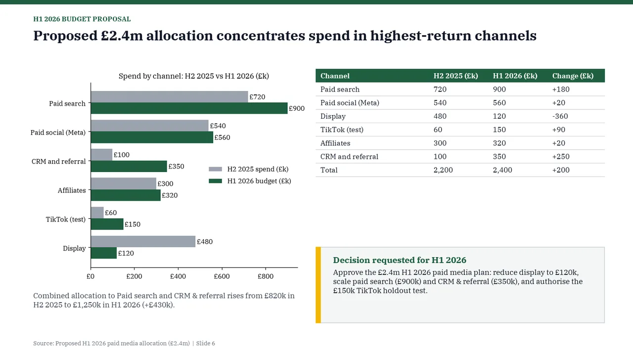
    Slide 6Download slide imagePolished Legend sits inside the plot area, crowding the CRM and Affiliates bars