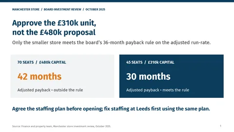
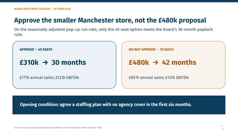
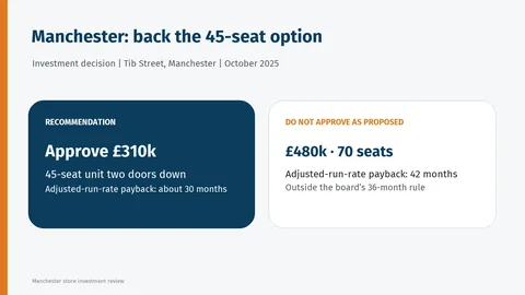
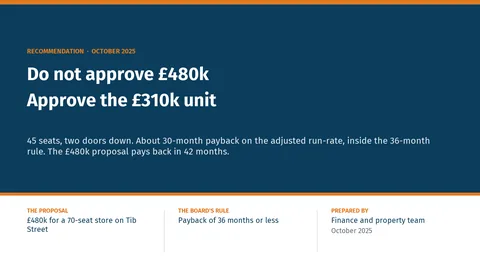
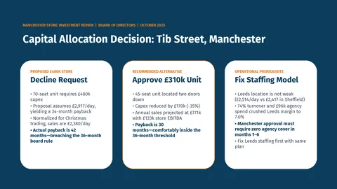
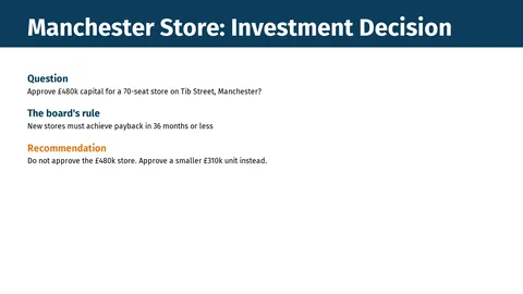
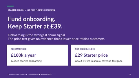
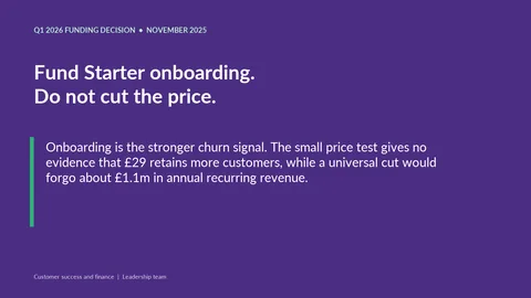
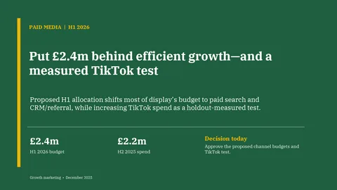
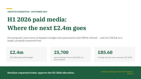
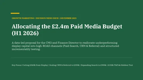
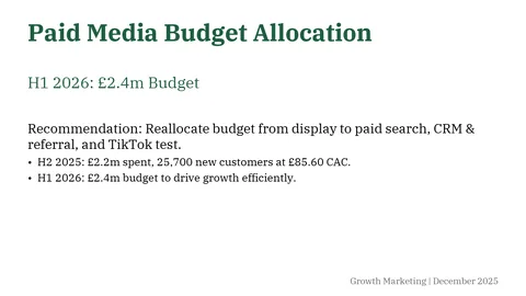
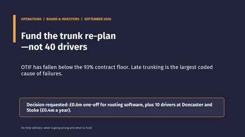
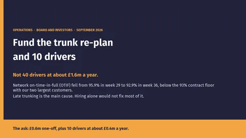
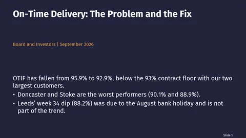
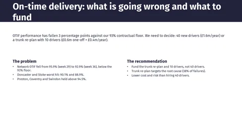
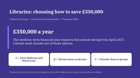
The task
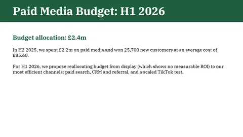
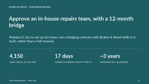
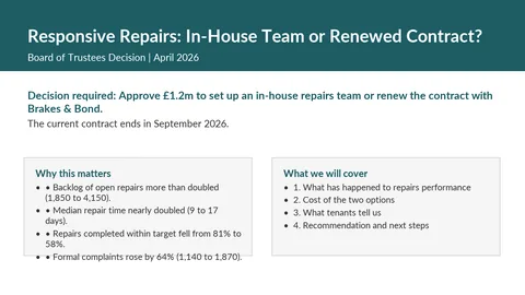
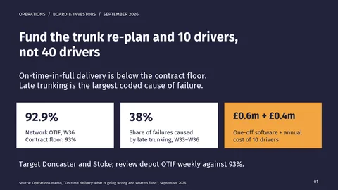
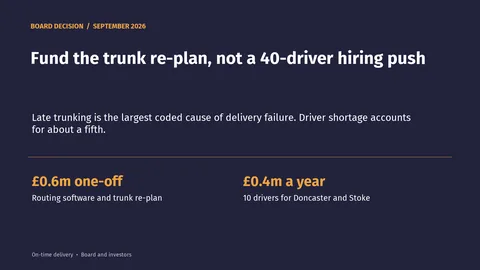
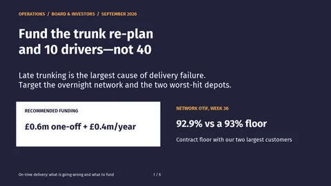
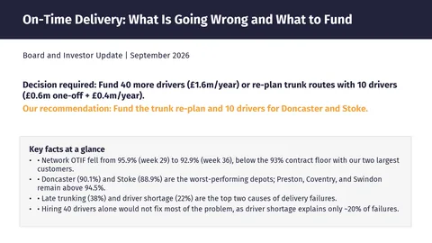
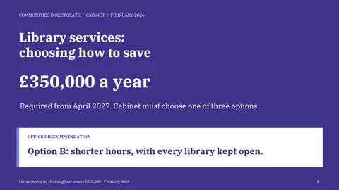
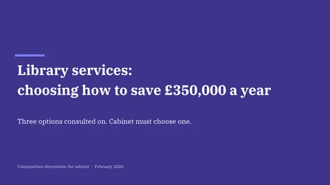
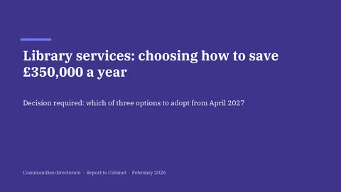
Turning an analysis into slides is one of the most common things people ask AI to do at work, and the risk is not ugly slides: it is a number that is not in the analysis, a caveat that falls off, or a draft figure that ends up in front of the board.
Each task is an invented company's analysis written for the benchmark, with planted traps: a caveat that must travel with its number, a figure the memo says not to quote, a metric it warns is misleading, and a finding that contradicts a senior stakeholder's view.
What makes a deck presentable
- Layout
- Nothing off the slide or colliding, body text at least 12 points, and text readable against its background. Text wraps from real font metrics, so overflow is measured.
- Numbers
- Every number on a slide, in a chart or in a table must come from the analysis; numbers code cannot match go to the judges.
- Story
- The key findings, the recommendation within the first two slides, caveats with their numbers, and no misleading metric used as evidence.
- Design
- Each slide rated polished, acceptable or needs work. A presentable deck has no slide that needs work.
Why a rating as well
Presentable is a bar: once the best models clear it on every task, it stops telling them apart. The head-to-head rating does not run out of room, because a deck only has to be preferred to another one. Each deck meets about six others per task; a 400-point gap means the higher-rated model's deck is preferred about ten times out of eleven.